❤️ Would you like to save this?
The 1980s aerobics look understood one thing perfectly: workout clothes did not have to be shy. Then it kept going. Neon collided with acid wash, leg warmers stacked themselves over already-busy tights, plastic belts bisected leotards, and every available seam seemed to demand its own contrasting color. Jane Fonda could sell the fantasy because the excess was part of the spectacle. Forty years later, wearing all of those ideas at once can make the clothes arrive several seconds before the woman inside them.
Updating that language is more interesting than simply draining the color out. The strongest modern activewear still borrows shamelessly from dance studios and VHS workout tapes: unitards, bike shorts, high rises, contour seams, cropped tops, flares, ribbed knits, even a little strategic shine. What changes is the editing. A seam can shape instead of merely decorate. A saturated color gets the entire outfit rather than competing for one panel. Matte fabric can make an outrageous silhouette feel almost quiet; metallic fabric can make a simple one feel extravagant. Proportion, texture, and construction start carrying the drama that neon piping once had to do alone.
These 25 AI before-and-after restyles take that old aerobics vocabulary apart and put it back together with better manners. Some go monochrome, some keep the color loud, some strip everything down to oat, charcoal, or dove gray. There are unitards, flares, bike shorts, ribbing, sculpted seams, piping, zippers, metallic finishes, and enough red to prove restraint does not have to mean beige. The point is not to erase the 1980s. It is to decide which parts still deserve another lap.
FYI, thanks to AI imagery software, we’re able to create very specific fashion and hairstyle examples to illustrate the points being made. In some cases, imagery is exaggerated to hammer home the point. Also, assume links that take you off the site are affiliate links such as links to Amazon. this means we may earn a commission if you buy something.
25. Deep Plum Keeps the Aerobics Drama and Deletes the Color Collision
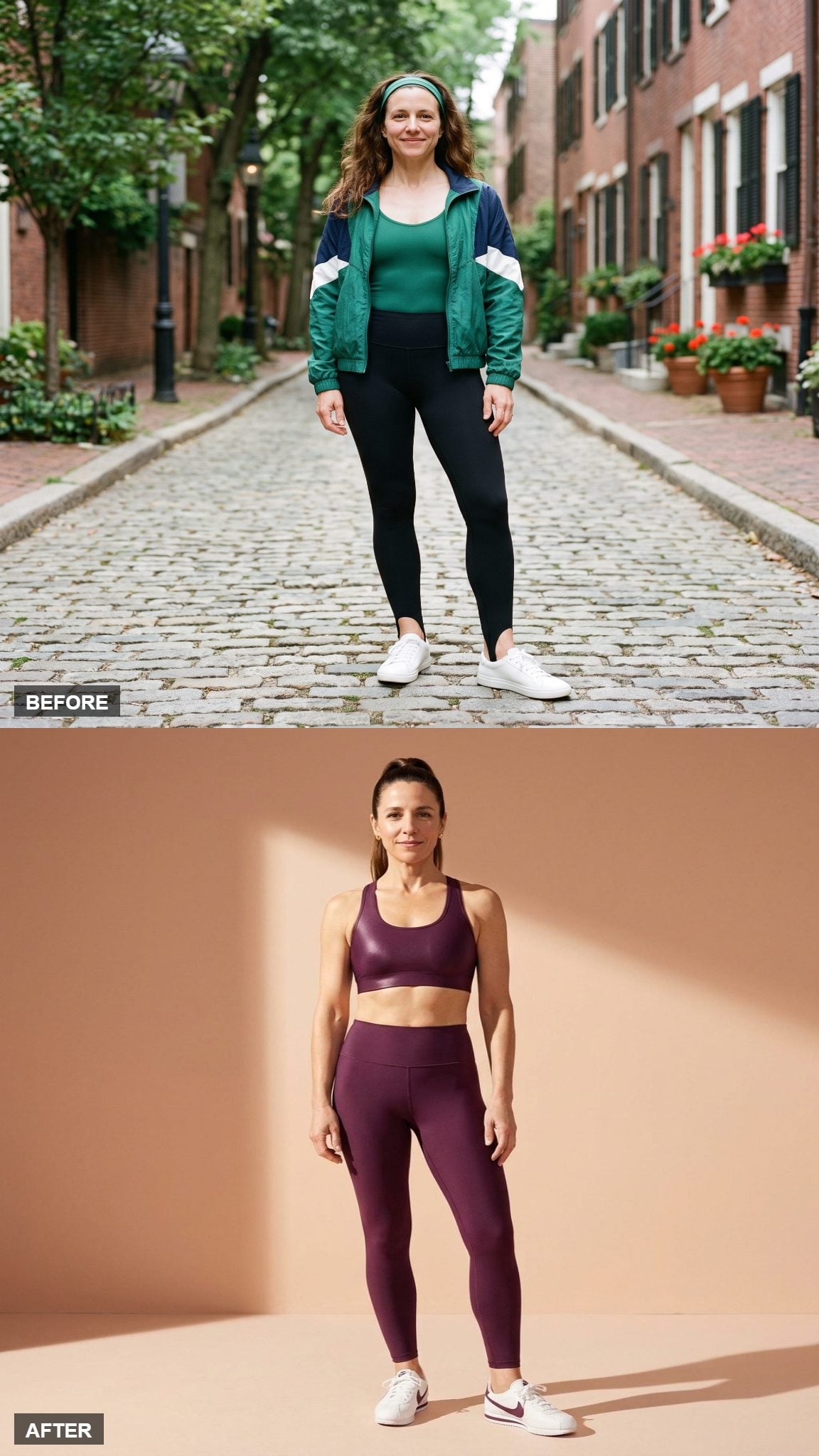
The old look tried to generate energy by stacking neon, denim, accessories, and competing edges. This deep-plum look gets there with one committed color and lets the high-shine finish provide the movement.
The plum high-waisted leggings meet the top cleanly at the natural waist, so there is no plastic belt or contrasting elastic fighting for attention. The silhouette is still unapologetically athletic. It has simply stopped yelling in four directions at once.
24. White With Navy Piping Makes the Construction the Graphic
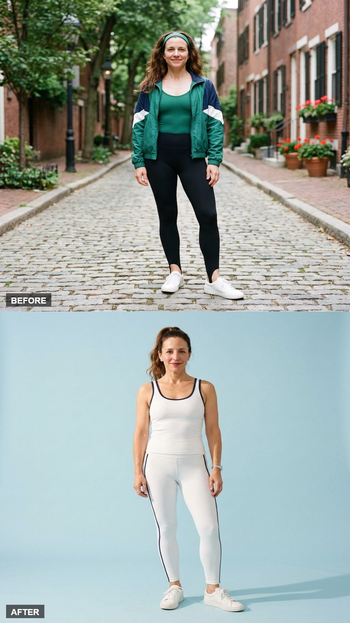
White activewear is hardly an invention of the present, but here it provides a clean field for the detail the outfit actually wants you to notice: navy piping.
The contrast traces the tank and runs along the leggings without turning the set into a patchwork of competing panels. Against all that white, the dark line feels almost architectural. The effect has a tennis-club crispness rather than a step-class frenzy.
23. Soft Sage Gives the Unitard Its Redemption Arc
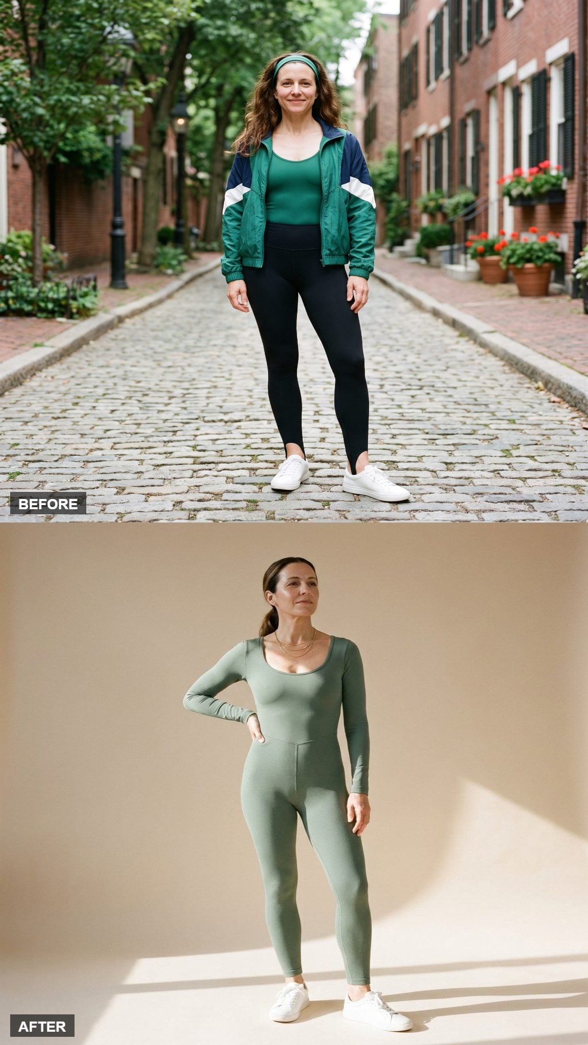
The aerobics era did not exactly leave the unitard with a reputation for subtlety. Layered over tights, belted, colorblocked, and occasionally accessorized as though the gym had a cocktail hour, it became shorthand for the decade’s refusal to stop.
In soft sage, the same basic silhouette suddenly looks almost spare. One piece removes the visual boundary between top and bottom, while the muted green keeps the body line from competing with the color. Delicate gold jewelry nudges it out of pure gym territory without pretending it has become eveningwear.
22. Cobalt Lets Curved Seams Supply the Drama
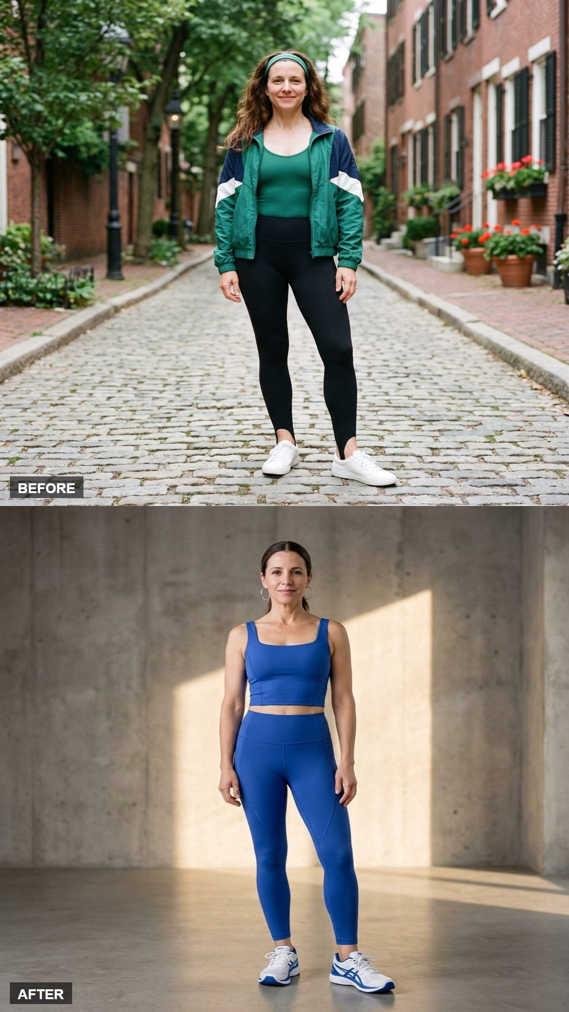
Cobalt still has the electric confidence that made 1980s activewear fun, but it is deep enough to carry the whole set without backup dancers.
The more interesting detail is the contour seaming. Curved panels follow the leg and give a simple crop-and-legging combination structure without introducing another print. A flat field of blue would be bold; the seams make it designed.
21. Molten Bronze Proves Shine Was Never the Actual Problem
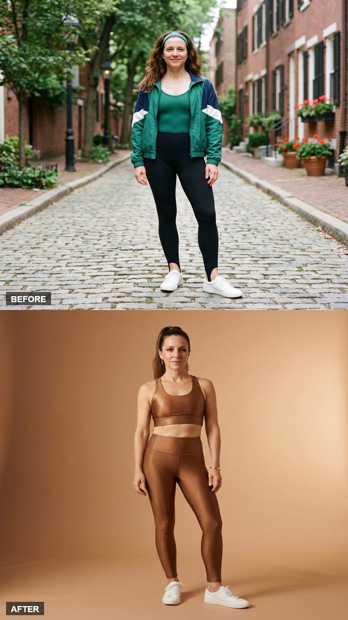
There was plenty of shine in 1980s workout gear. The problem came when shine had to share the stage with neon, piping, belts, scrunch socks, and three other ideas before breakfast.
This bronze set lets surface finish carry the entire performance. Light moves across the wet-sheen texture as she moves, giving a very simple bra-and-legging silhouette far more depth than a print would.
20. Warm Oat Makes Ribbing More Interesting Than Another Logo
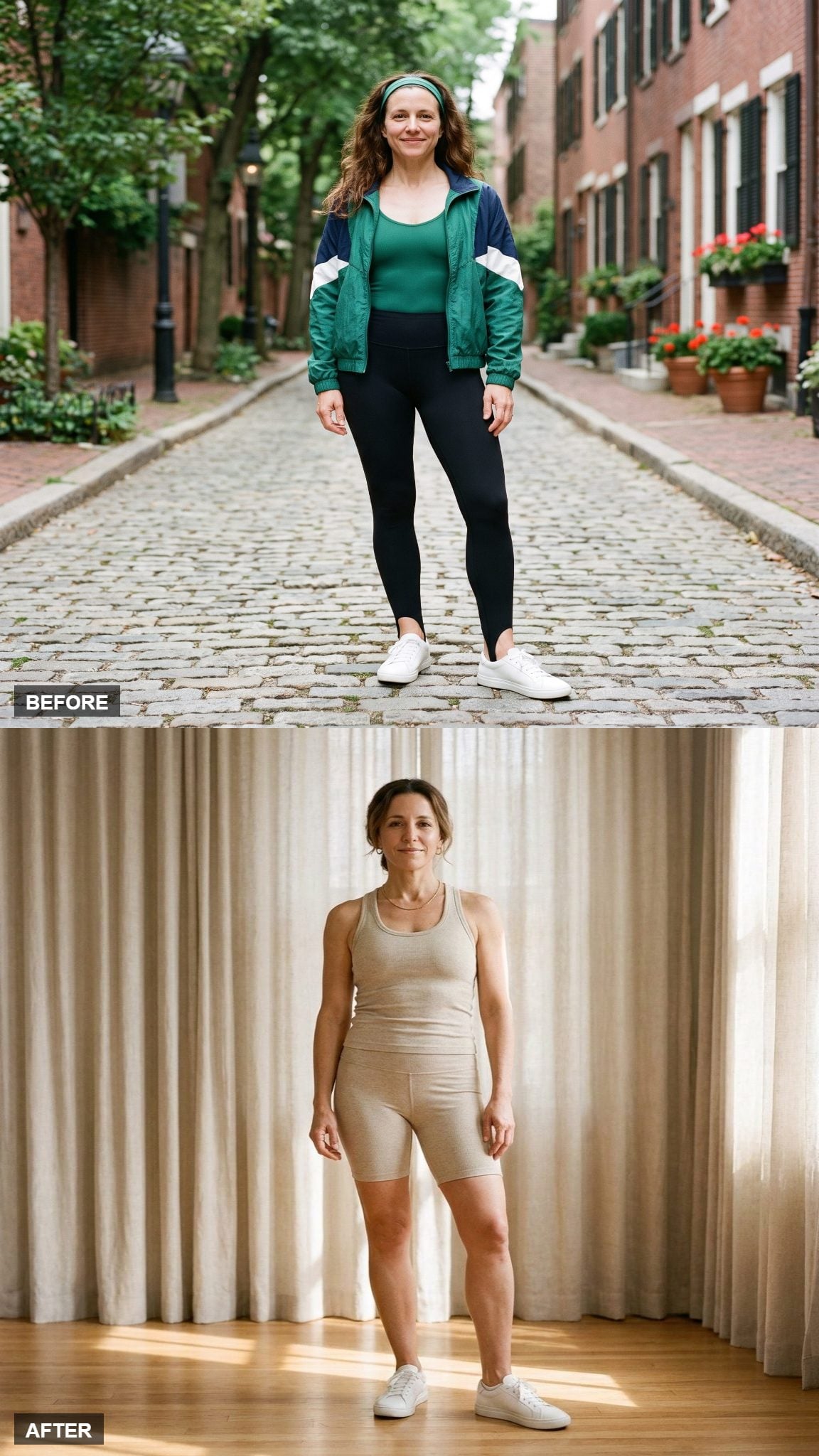
Sporty does not automatically require a fluorescent color or a brand name large enough to read from the parking lot. This warm-oat look gets its personality from surface rather than graphics.
The racerback and bike shorts use the same ribbed knit, so light and shadow travel differently across the fabric even though the color barely changes. That texture prevents the neutral palette from feeling blank.
19. Slate-Blue Flares Rescue the Dance-Pant Shape From Costume Territory
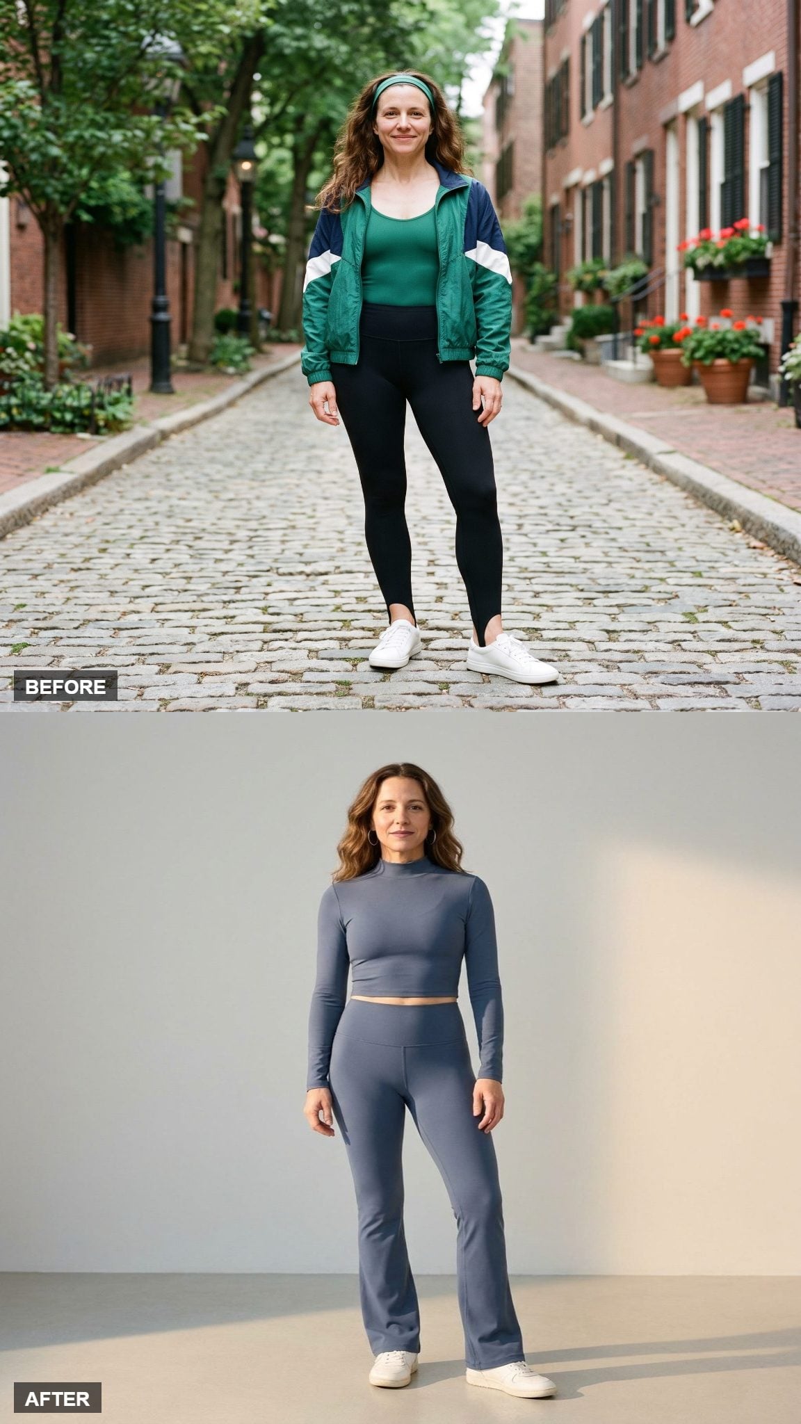
Dance-inspired flare pants have enough period memory built into them already. They do not need neon to explain the reference.
The slate-blue crop and matching flares keep the retro movement but give it a cooler, quieter palette. A fitted upper half and widening leg create shape through proportion rather than ornament, while the mock neck gives the top a sharper finish than the scooped leotards associated with the era.
18. Graphite and Ivory Turn Colorblocking Ninety Degrees
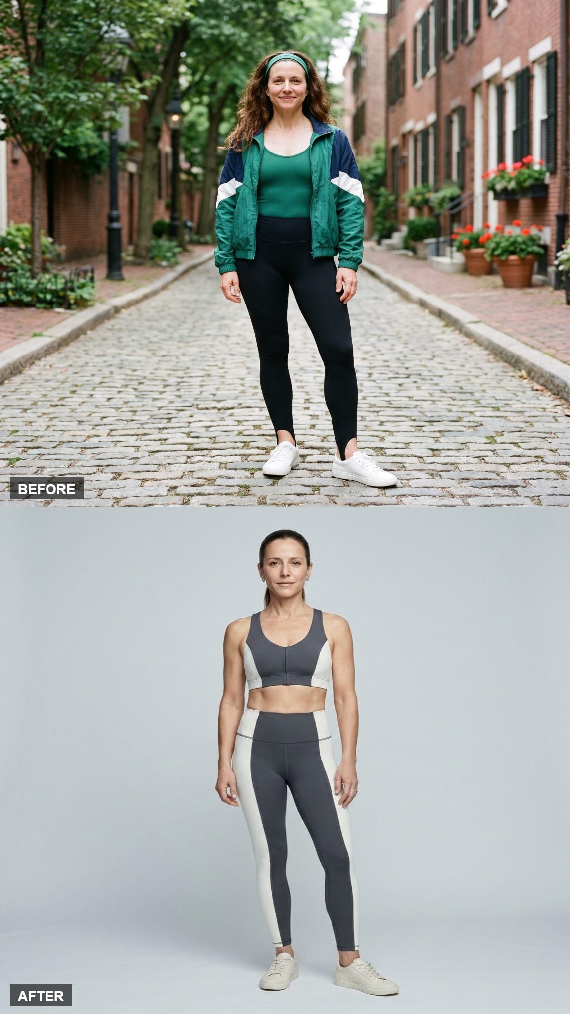
Colorblocking belonged all over 1980s sportswear, but it appeared in every direction imaginable: horizontal bands, diagonals, chevrons, asymmetric wedges, geometric panels. This version chooses one of the calmer possibilities.
Graphite and ivory meet along strong vertical divisions rather than exploding into a puzzle of shapes. The contrast is still graphic, but the geometry feels controlled. Same basic tool, much better editing.
17. Terracotta Lets the Longline Top Handle the Proportion
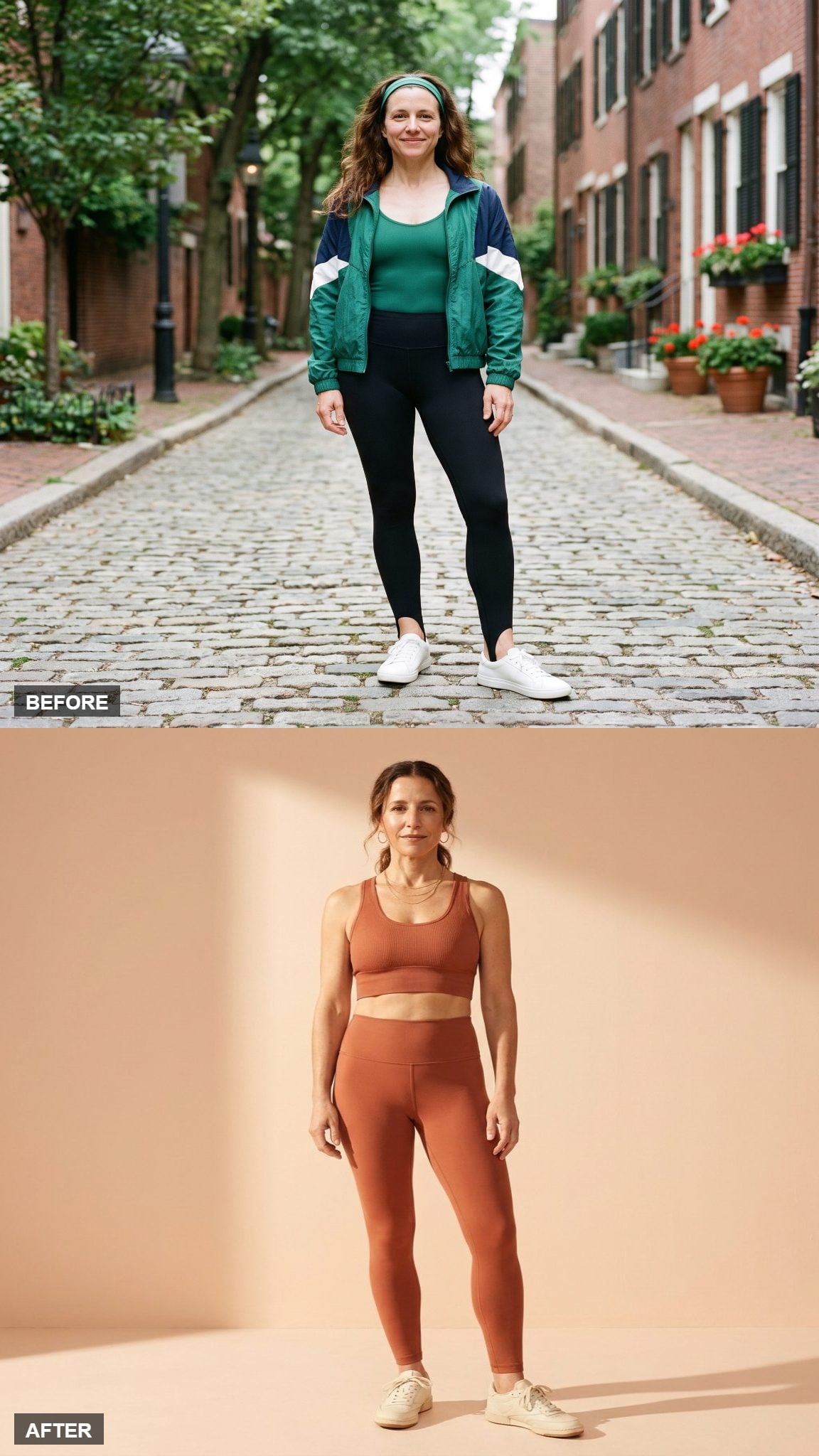
Terracotta brings plenty of warmth without requiring the chemical brightness of vintage neon. Whether it flatters a particular complexion depends on the person; the design advantage here is simpler than that.
The longline bra reaches much closer to the high-rise legging, reducing the strip of exposed midriff and changing the proportion of the set. Fine gold jewelry adds a little polish without confusing the athletic silhouette.
16. Charcoal Uses One Diagonal Panel to Break the Grid
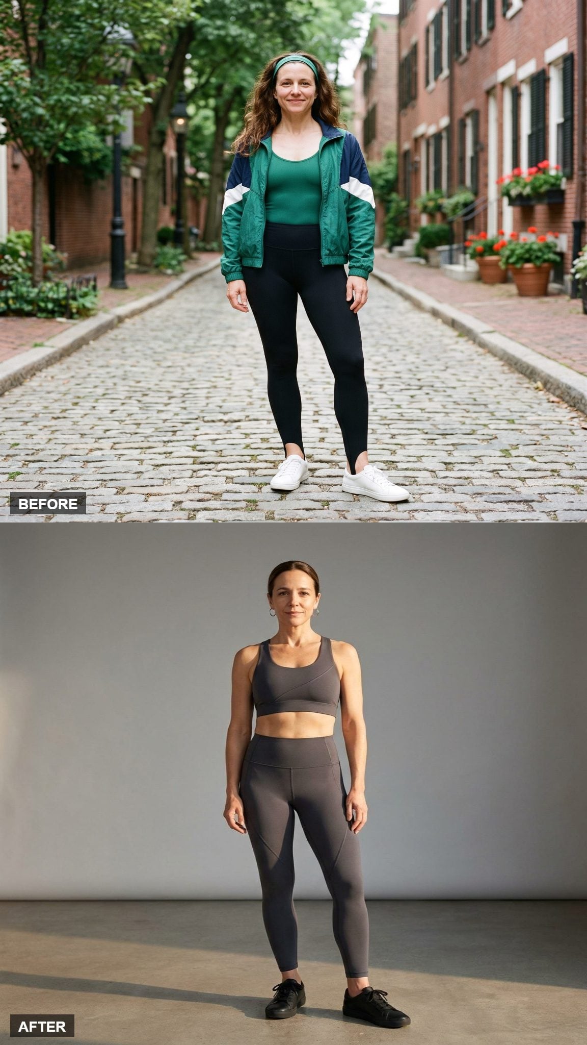
The interesting thing about this charcoal set is not that dark gray is slimming or serious or any of the other jobs neutral colors are constantly assigned. It is the angle.
A sculpted diagonal panel crosses the otherwise restrained set, breaking the expected horizontal division between athletic pieces. With no contrast piping or print competing for attention, that single seam becomes the graphic event.
15. Marigold Keeps the Loud Color and Loses Everything Else
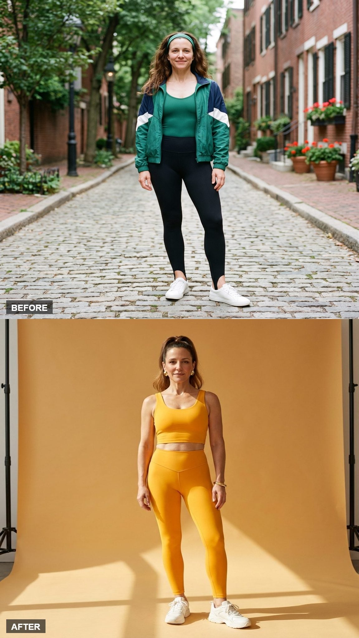
Not every update has to retreat into taupe. Marigold is bright, warm, conspicuous, and entirely capable of entering a room before the wearer does.
What keeps this from sliding backward into aerobics parody is the absence of competing devices. The waistband is clean and sculpted, the crop is simple, and the color gets to be the spectacle all by itself.
14. Camel Bike Shorts Turn the Warm Neutral Into a Texture Study
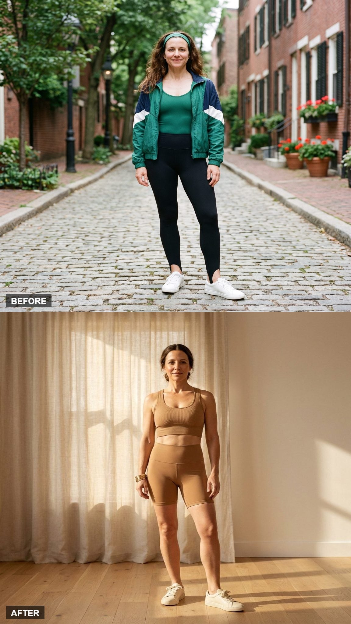
This camel set could have disappeared into the same neutral territory as the oat version, but the shorter silhouette changes the balance.
A ribbed bra and bike short expose more leg and make the texture feel sportier, while the sandy color keeps the effect understated. The set succeeds because the surface has enough character to carry a quiet palette without assistance from print.
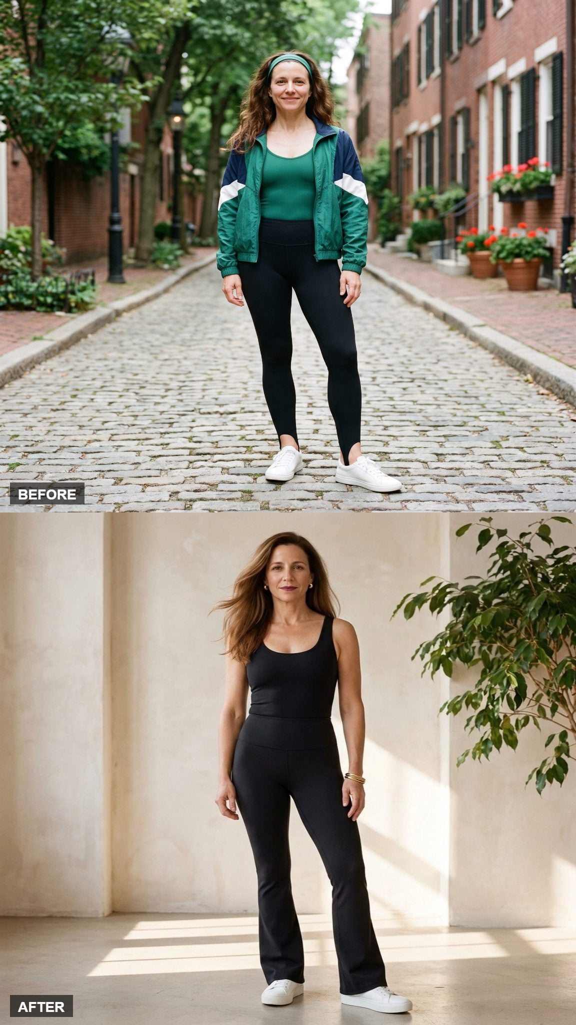
13. Black Flares Make the Silhouette More Important Than the Surface
❤️ Would you like to save this?
The flare is the reason this one belongs in the gallery. Matte black strips away almost every other distraction, leaving the widening leg below the knee to determine the shape.
A fitted tank, high rise, and black flare leggings make the outfit more about outline than decoration. It feels less like a nostalgic workout costume and more like dancewear that happens to have survived the decades.
12. Blush Uses Two Rose Tones Instead of Pretending Monochrome Means Exact Matching
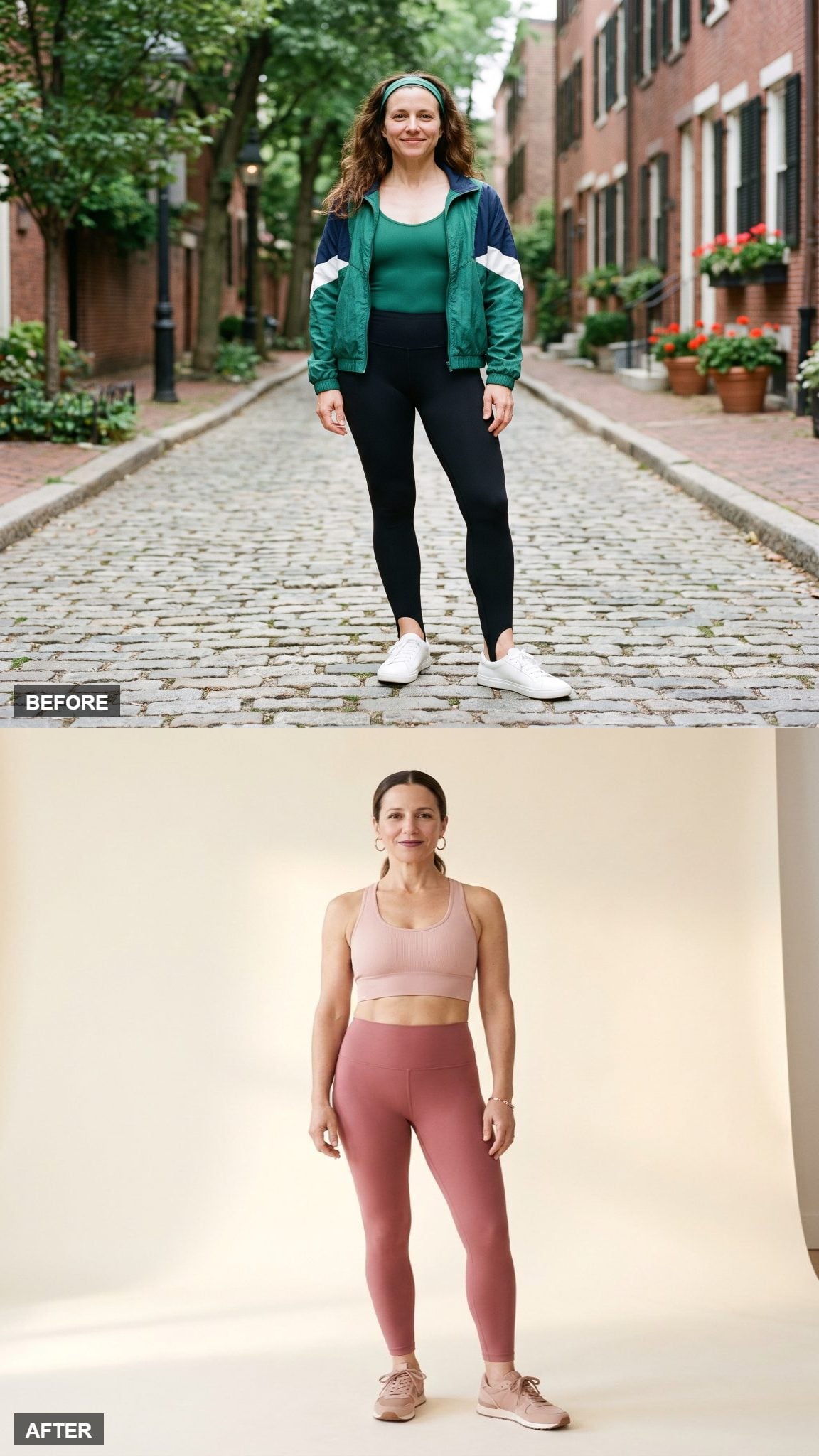
The bra sits a shade lighter than the leggings, giving this blush set enough variation to avoid looking like a single piece cut in half.
Ribbed texture adds another layer of difference while the matte finish keeps the rose from sliding toward the glossy hot pink associated with the decade. The effect is gentle without becoming precious, and much more dimensional than a perfect color match would have been.
11. A Teal Zip Gives the Flare Set a Piece of Hardware Worth Noticing
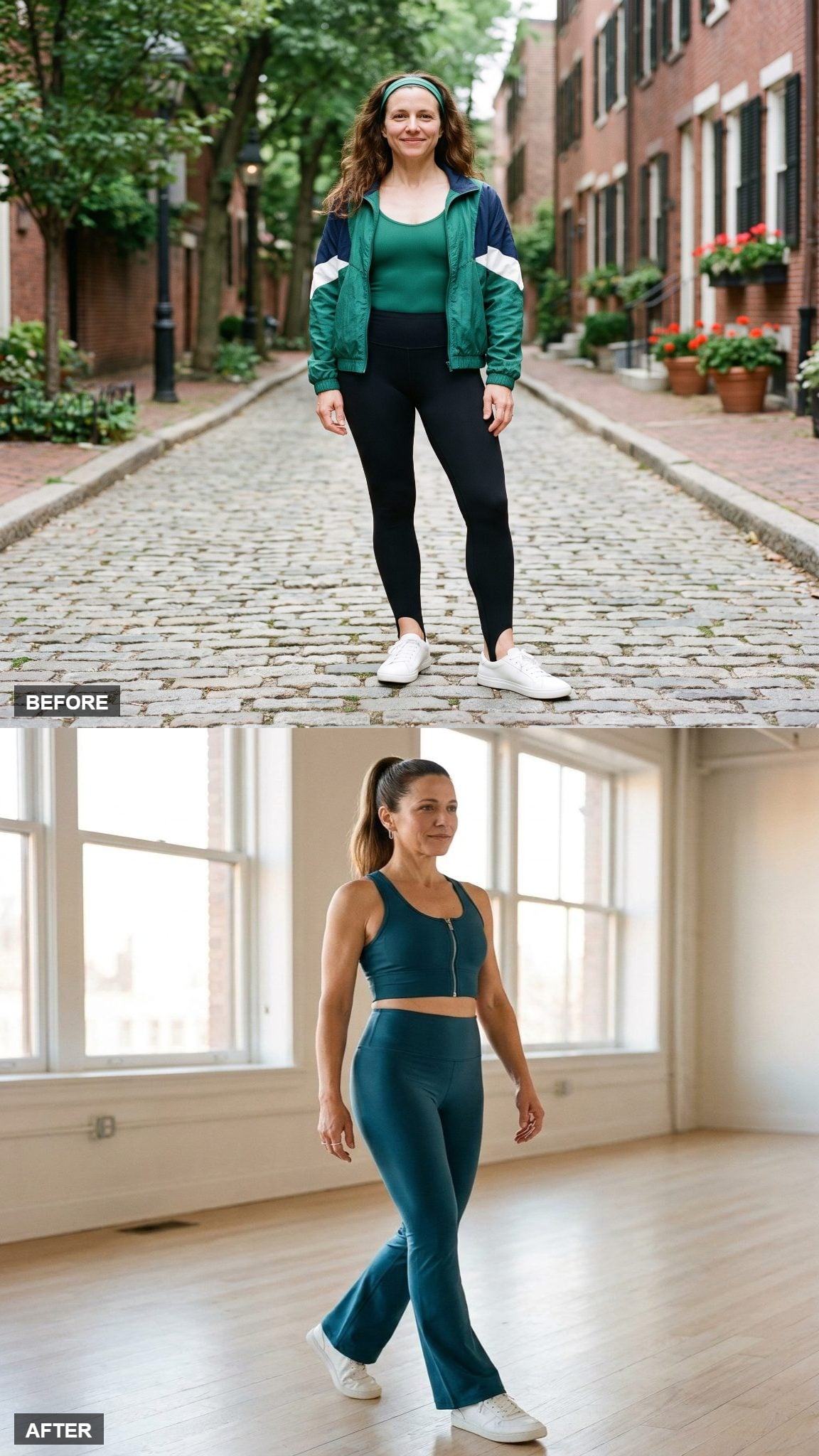
The teal flares already carry plenty of dance-studio history, so this look lets the top bring in the modern detail.
A short center-front zip interrupts the crop with one precise piece of hardware. Open it and the neckline changes; close it and the top becomes sharper. The flare below still supplies the movement, but the zipper keeps the outfit from feeling like a simple recoloring of vintage gym wear.
10. Liquid Black Lets Shine Replace the Neon
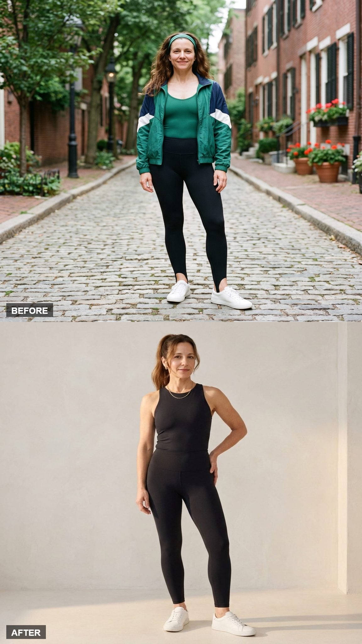
Black can be quiet, but this version is not interested in disappearing. The subtle liquid finish catches enough light to keep the surface active, while the monochrome palette prevents the shine from competing with color.
A sculpted scoop neckline gives the top its shape and the ankle-length legging keeps the proportions clean. A gold chain provides the only warm note. Composed, yes. Anonymous, absolutely not.
9. Rust Makes the Longline Cut the Main Event
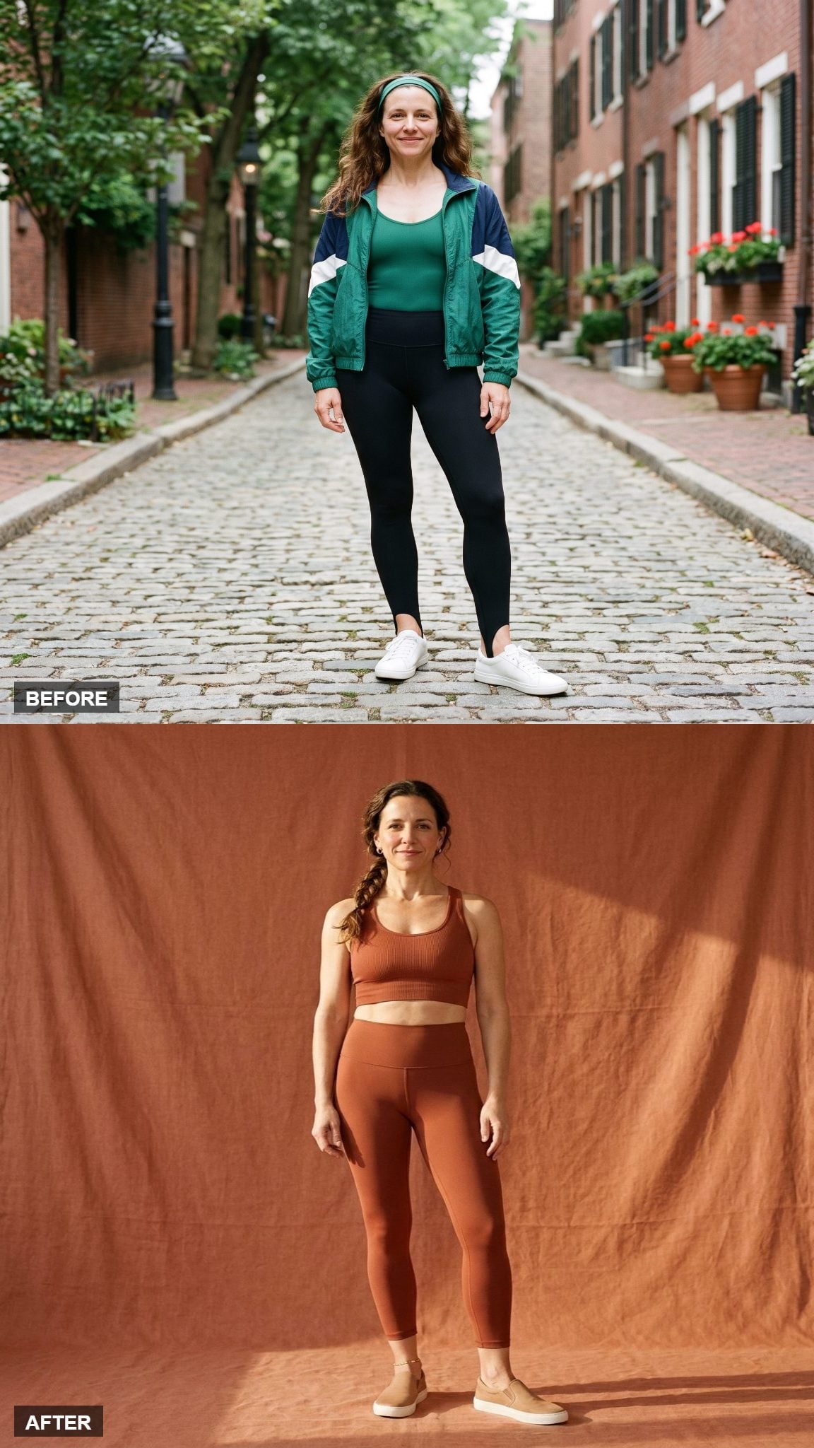
The longline top is what separates this rust set from the gallery’s other earth tones. It reaches toward the high waistband rather than leaving a large strip of torso between the two pieces.
Matte ribbing keeps the saturated rust from becoming slick or flashy. There is color here, but the proportion of top to legging is what gives the set its distinct identity.
8. Emerald Gives the Flare a Jewel-Tone Evening Shift
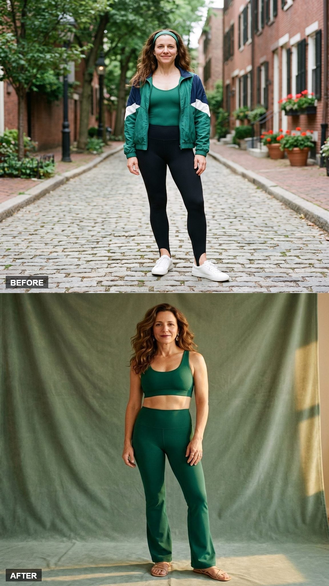
Emerald turns a familiar activewear silhouette into something surprisingly lush. The scoop bra stays simple while the flare below takes on most of the movement.
Flat sandals change the styling context more than another sneaker would, pushing the set toward casual daywear without pretending it is no longer athletic clothing. The jewel tone does the rest.
7. Mocha Makes the Bike-Short Set Almost Ruthlessly Simple
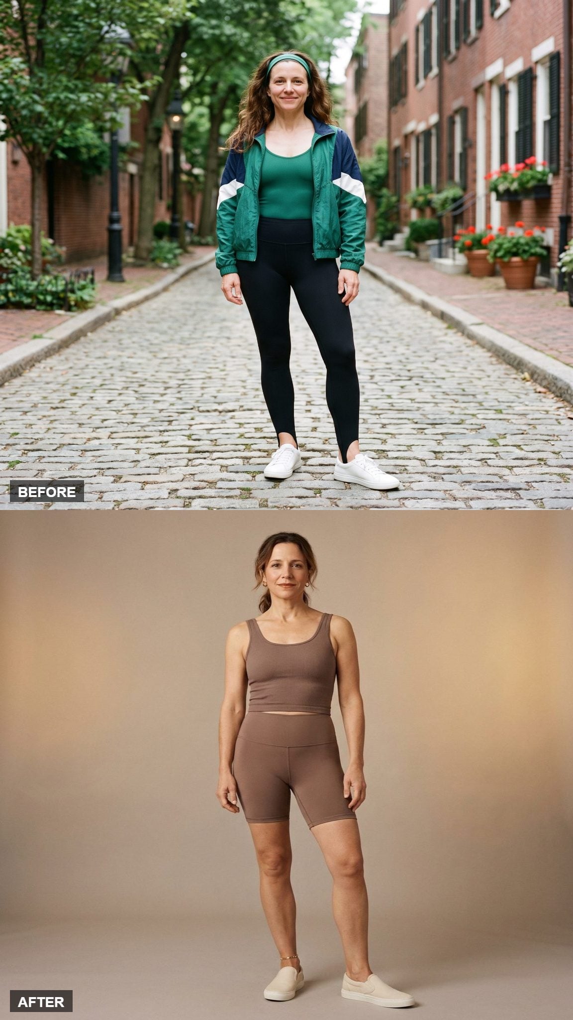
Mocha works here as a true neutral rather than as a claim about which skin tones it supposedly flatters. The color is subdued enough that cut and fabric become the first things you notice.
A simple tank and bike short in buttery matte knit create the kind of set that can disappear under an open shirt, jacket, or coat without fighting whatever comes next.
6. Crimson Takes the Tank-and-Legging Set Back Into Full Saturation
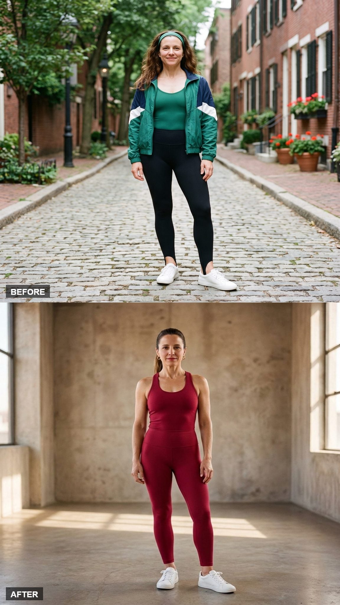
The old set used several colors to create excitement. This one bets everything on one.
A deep red tank and matching legging turn saturation into the entire design strategy. The high waist is broad and clean, the tank is spare, and there are no multicolor panels asking the eye to choose a favorite. Red still gets to command the room. It just no longer has to fight for it.
5. Ochre Softens the Crop-and-Legging Formula With Brushed Texture
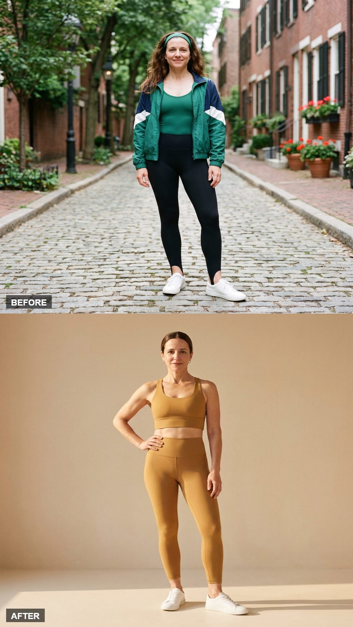
Ochre has enough yellow in it to feel lively and enough brown in it to stay far away from highlighter territory. Against the original era’s synthetic brights, that difference alone changes the mood.
The longline cut brings the top closer to the waistband while the brushed finish reduces glare. The look is still clearly athletic, but the fabric has a softness the old glossy spandex rarely aimed for.
4. Dove Gray Shows How Far Seamless Construction Can Carry a Quiet Set
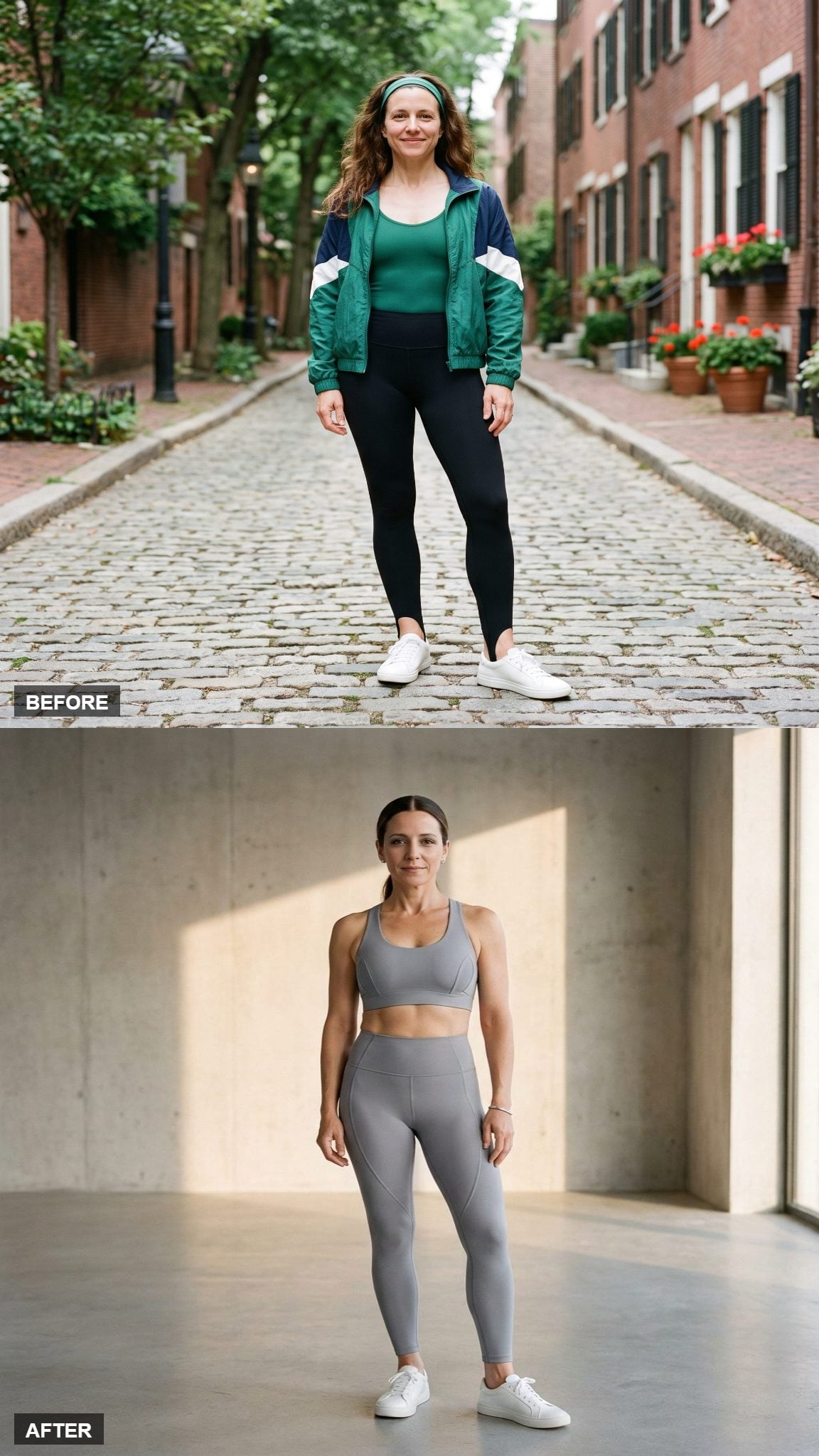
Seamless construction is the real story here. Instead of outlining every opening with thick elastic or contrast trim, the dove-gray set keeps those transitions restrained.
A curved side panel gives the leg enough shape to prevent the neutral color from becoming featureless. The result is quiet because the construction is precise, not because expensive clothes have some magical obligation to whisper.
3. Soft Clay Lets Ribbed Knit Do More Than Flat Spandex Ever Needed To
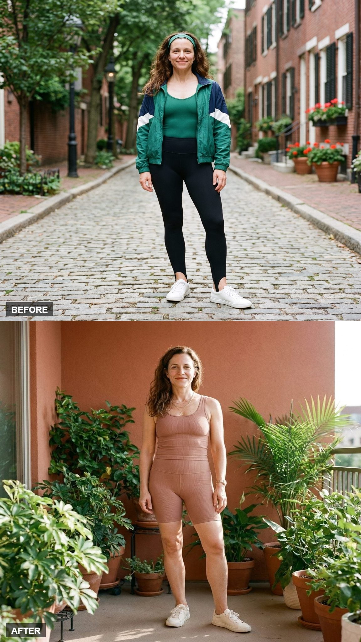
Clay sits somewhere between pink, brown, and terracotta, which gives this bike-short set more color than a neutral without pushing it toward a conventional bright.
The ribbed knit catches light along the ridges and gives the simple tank-and-short silhouette enough texture to stand on its own. A gold layered necklace breaks the matte surface with one small metallic detail.
2. Poppy Red Strips the 1980s Energy Down to One Clean Hit
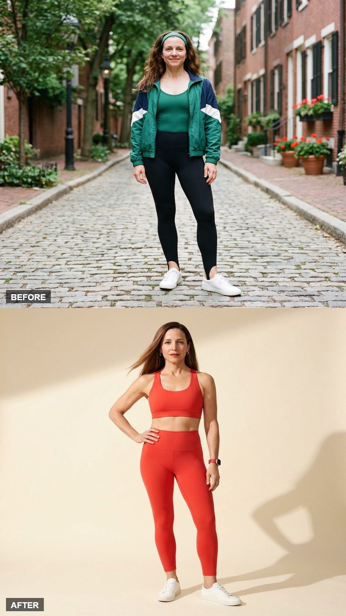
Red does not need much assistance. This poppy set keeps the scoop bra, high-rise leggings, and matte fabric clean enough that the color can carry the entire image.
What makes it feel current is not that red somehow escaped the 1980s. It is the editing: no extra ruching, no novelty belt, no conflicting side stripe, no leg warmer arriving halfway through the conversation. One saturated color is plenty.
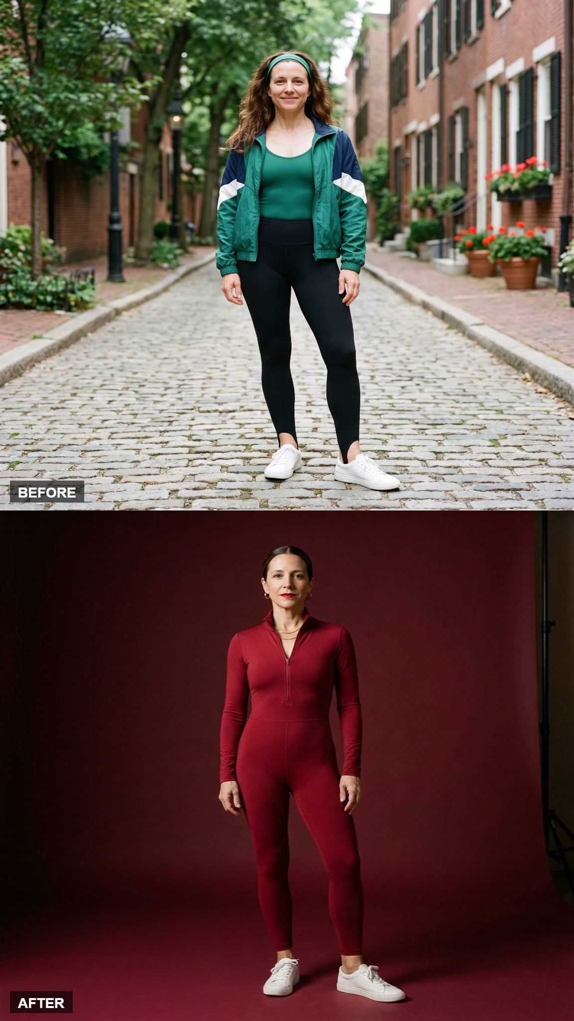
1. A Crimson Zip-Neck Unitard Finishes by Giving the 1980s Exactly One Thing Back
❤️ Would you like to save this?
The final look returns to perhaps the most unmistakably aerobics-coded silhouette in the gallery and refuses to apologize for it.
Deep crimson covers the entire unitard while a half-zip mock neck introduces one sharp piece of structure at the top. There is no belt, no contrasting tight underneath, no geometric panel announcing the hips. The shape is still bold enough to have walked straight out of a workout tape; the styling simply gives it one idea at a time.
Across all 25 restyles, the biggest change is not that neon disappeared. Sometimes it did not. Red stayed loud. Cobalt stayed bold. Bronze kept the shine. Flares, bike shorts, unitards, cropped tops, and body-conscious leggings all survived the edit.
What changed was the number of ideas competing in the same square foot of fabric. The best updates let color, seam, texture, silhouette, or surface finish take turns being the interesting thing. That may be the most useful lesson the aerobics era left behind: excess can be exhilarating. It just works better when somebody knows when to stop.