❤️ Would you like to save this?
Matching your handbag to your shoes used to be less a styling suggestion than the final piece of punctuation. Black patent met black patent. Navy answered navy. Ivory stayed ivory all the way from heel to handle. Sometimes the belt joined in. Sometimes the gloves did too. The pleasure was in the precision: two small objects, separated by an entire outfit, carrying on the same conversation.
These 24 looks show how much range that supposedly rigid rule actually allowed. Matching could be quiet, graphic, playful, severe, summery, jewel-toned, metallic, or extravagantly textured. The clothes in between did not disappear; they became the field on which the accessories did their work. Somewhere along the way fashion loosened the rule, probably for good reason. Looking back at these combinations, though, you can understand why women kept returning to it.
FYI, thanks to AI imagery software, we’re able to create very specific fashion and hairstyle examples to illustrate the points being made. In some cases, imagery is exaggerated to hammer home the point. Also, assume links that take you off the site are affiliate links such as links to Amazon. this means we may earn a commission if you buy something.
24. Black Patent Pumps + Black Patent Frame Handbag
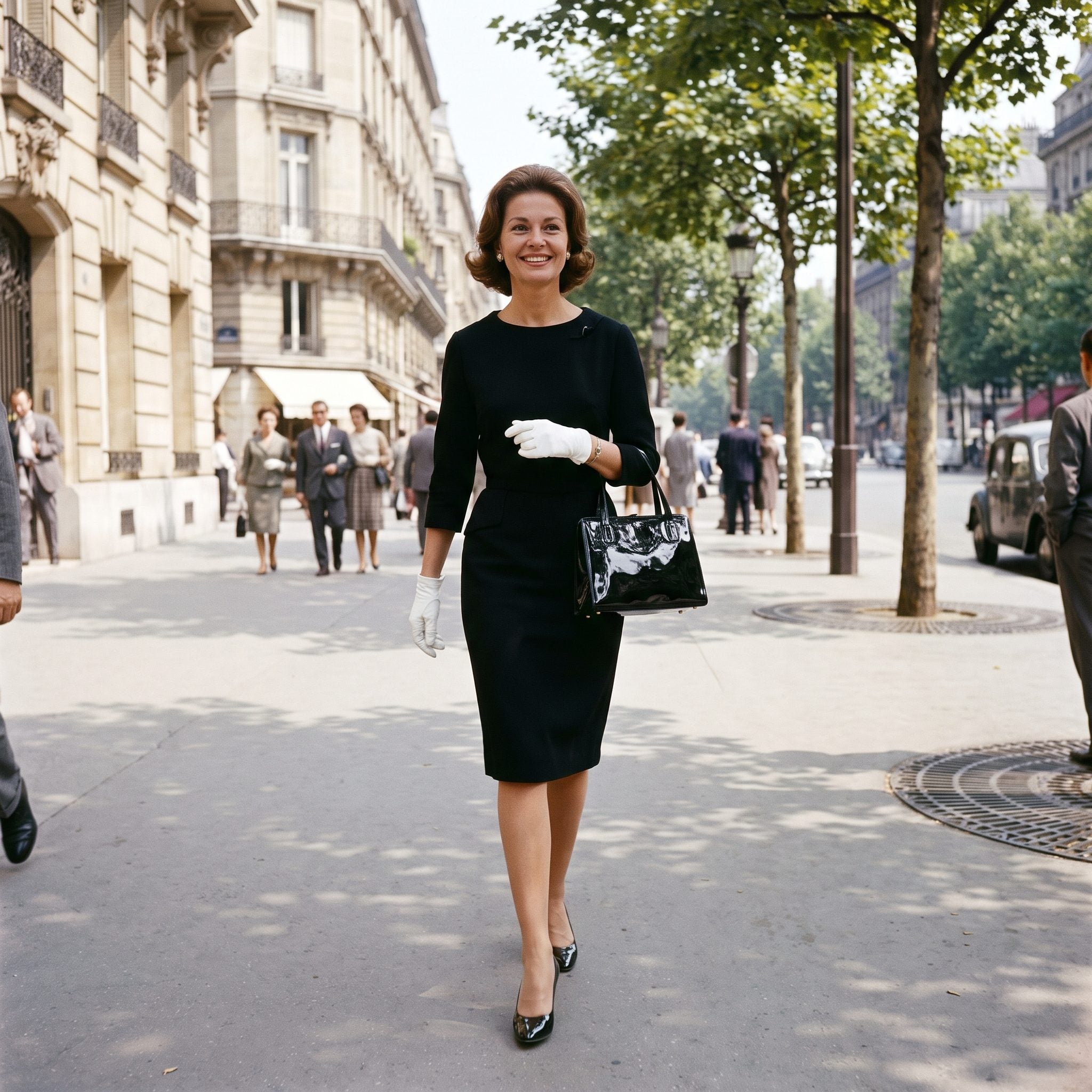
Start with the version that explains the whole idea in one glance. Black patent at the foot, black patent in the hand, the same hard shine repeated against a matte black dress. Nothing complicated happens, which is precisely why the coordination looks so exact.
The dress keeps the palette disciplined, while the glossy pumps and structured bag catch the light at opposite ends of the outfit. White gloves break the black just enough to keep the look from becoming one solid block. The accessories frame the outfit instead of disappearing into it.
History Corner: Mid-century fashion placed enormous emphasis on coordinated accessories, and shoe-and-handbag sets were an easy way to finish a polished look. Patent leather made that coordination especially visible because the matching sheen could be read from across the room.
Navy Pumps + Navy Structured Handbag

Navy offered all the authority of black with a little less severity. Here the suit already works in cream and navy, so the accessories do not introduce another color. They simply deepen one that is already built into the outfit.
That is the difference between coordination and clutter. The bag and shoes finish an argument the clothes have already started instead of arriving with a new one.
23. Beige Pumps + Beige Structured Handbag
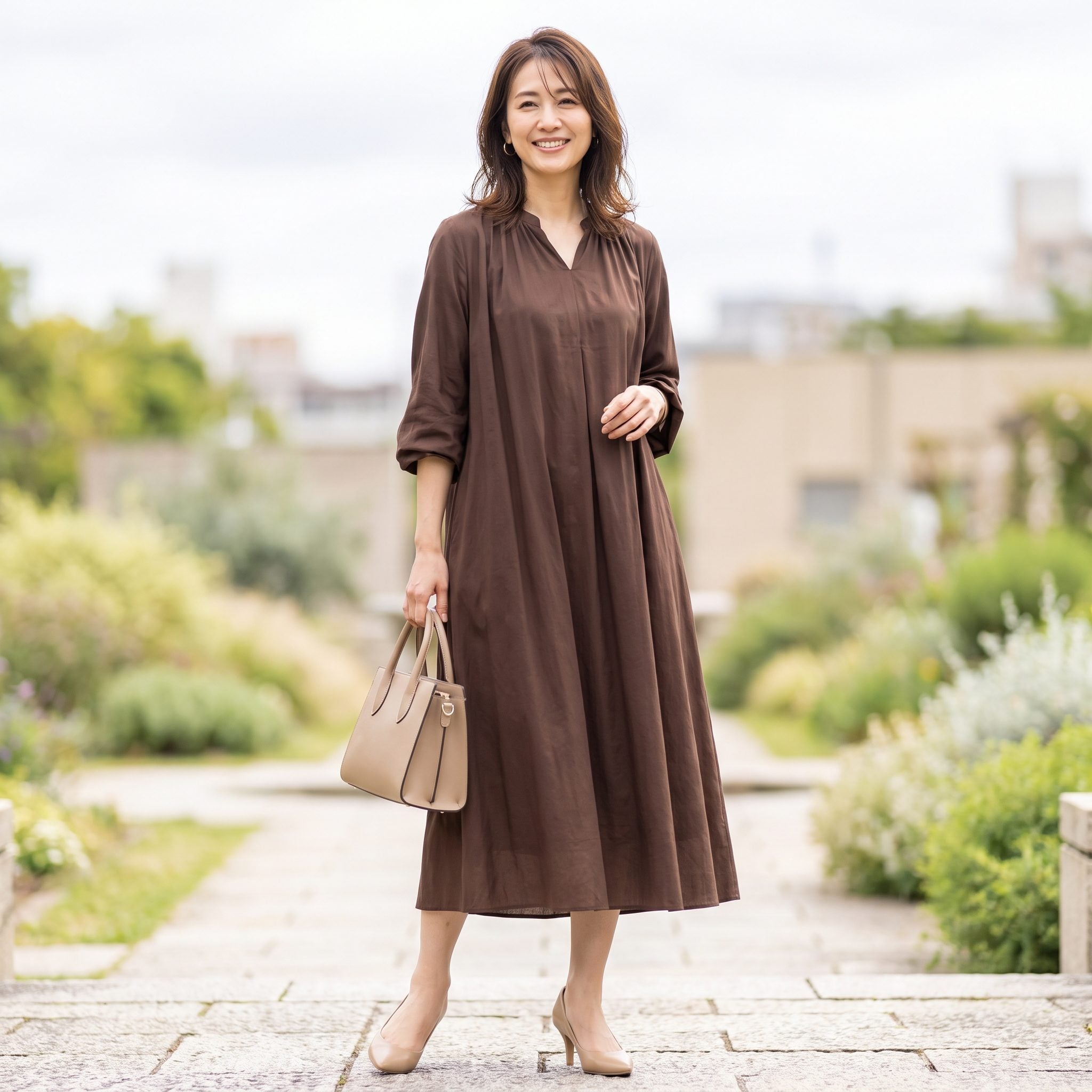
This is matching at its quietest. Beige shoes, beige bag, chocolate-brown dress. Instead of using the accessories as bright punctuation, the outfit stacks related neutrals and lets the silhouette do more of the talking.
The fitted waist and full skirt draw the eye inward before the pale accessories pull it back out again. The matching bag and shoes never compete with the dress. They give the darker brown a clean edge.
22. Chocolate-Brown Pumps + Brown Leather Handbag
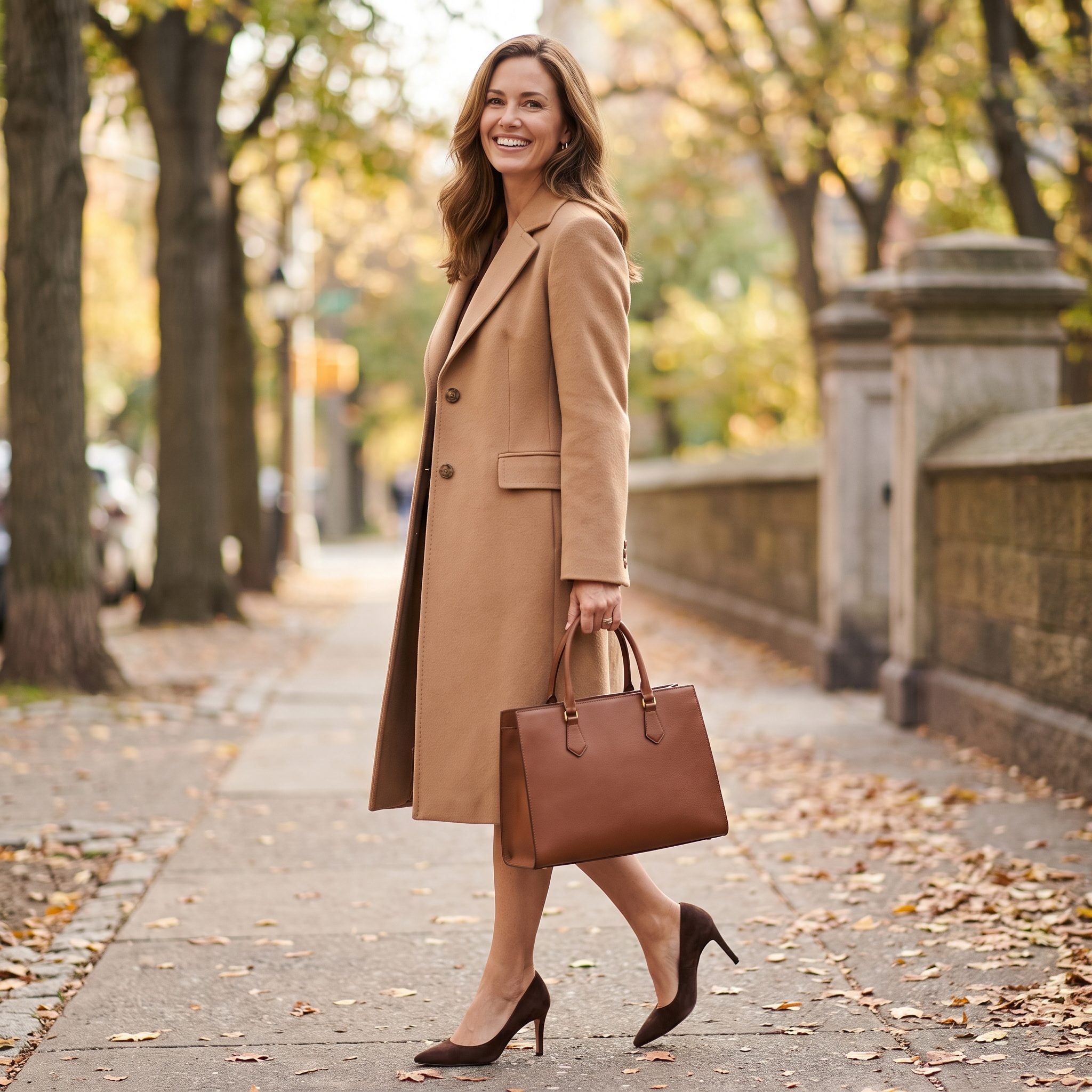
Brown never needs to shout. That is exactly why this palette works so well: camel coat, rust dress, chocolate accessories, three warm tones moving from light to dark without leaving the same family.
The shoes and bag sit at the deepest end of the scale and give everything above them more definition. Autumn dressing rarely needs more drama than this. The richness comes from layering related browns rather than searching for contrast.
21. Gray Pumps + Gray Structured Handbag
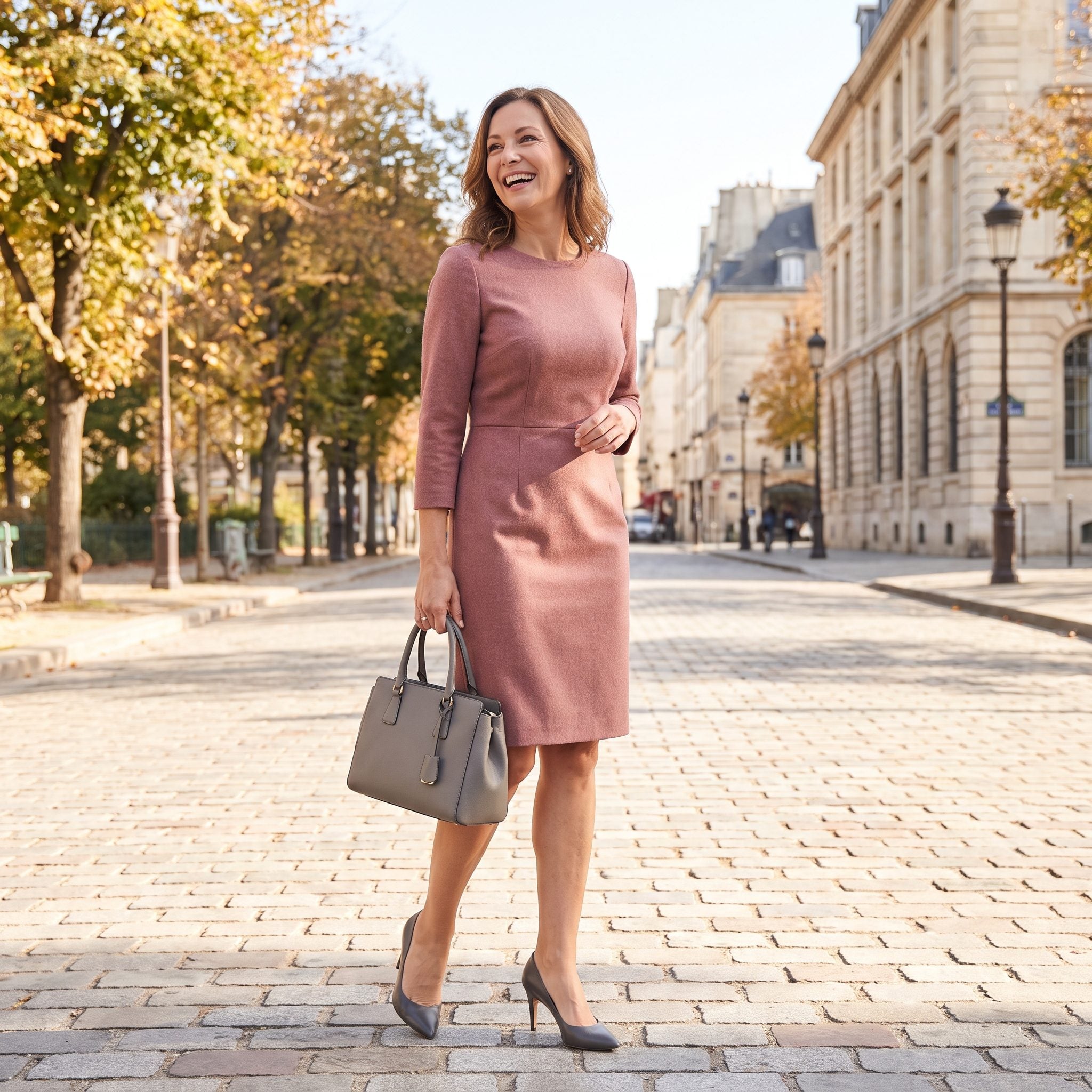
Gray accessories can disappear completely if the rest of the outfit gives them nothing to play against. Dusty rose fixes that problem. The wool dress warms the palette while the pumps and structured bag keep the edges cool and controlled.
This is coordination without a spotlight. The accessories are not supposed to be the first thing you notice. They are there to keep the soft pink from drifting into sweetness and to give the whole look a firmer outline.
20. Ivory Kitten Heels + Ivory Top-Handle Purse
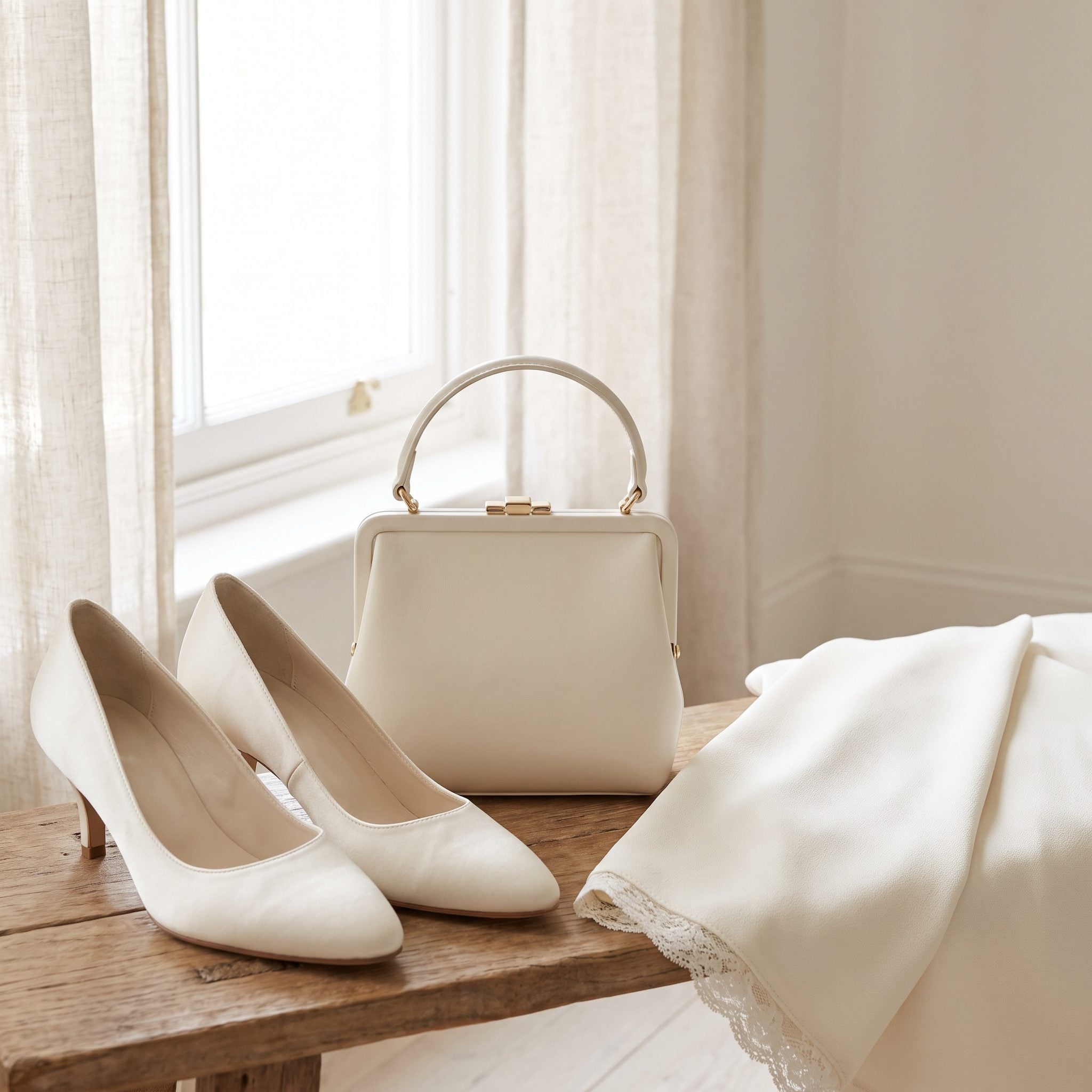
Ivory-on-ivory is harder than it appears. If one piece runs creamy and the other goes stark, the difference can look accidental. Here the two accessories sit close enough in tone to act as a single soft frame around the powder-blue dress.
The kitten heel matters too. It keeps the look light and daytime rather than severe, while the structured purse prevents all that pale color from becoming vague. Gentle does not have to mean shapeless.
19. White Pumps + White Frame Handbag
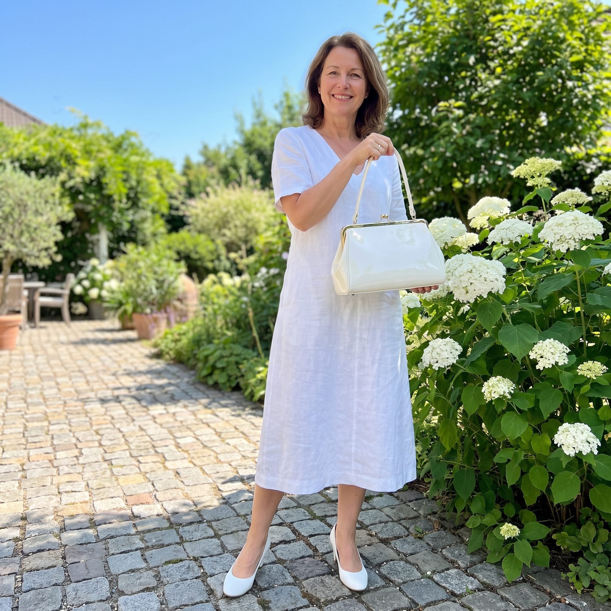
White shoes once carried a much stronger seasonal association than they do now, and that is part of what makes this pairing feel so emphatically summery. Against navy, both the pumps and frame bag read almost like reflected light.
The crisp white borders the printed dress without fighting it. Nothing needs embellishment because the contrast is already doing the work.
18. Powder-Blue Kitten Heels + Powder-Blue Handbag
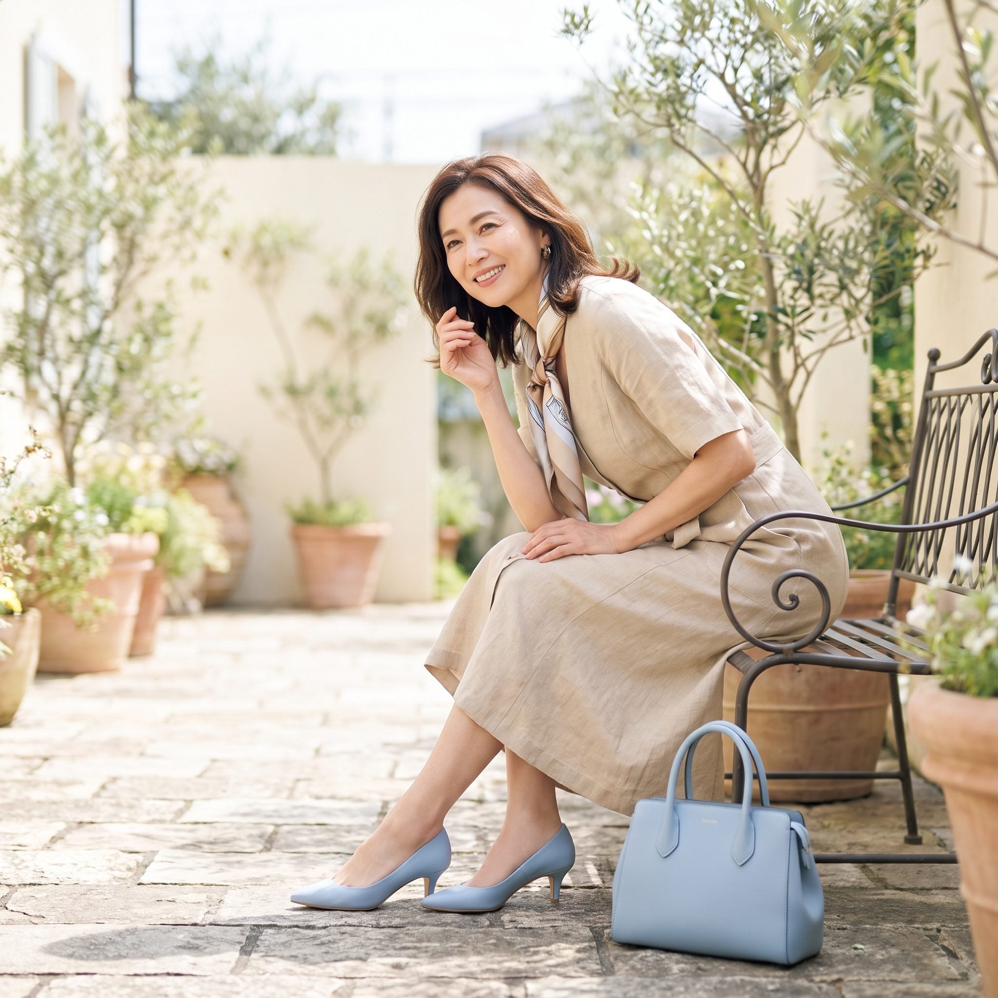
Powder blue is where matching stops being merely practical and starts becoming a real color decision. Neither shoe nor handbag could disappear into the background, so the repetition has to look intentional.
The narrow blue belt pulls the color into the center of the outfit, while the ivory shirtwaist gives all three blue accents a clean field. Instead of a bright accessory dropped onto a neutral dress, the color moves through the figure in stages.
17. Blush-Pink Pumps + Blush-Pink Handbag
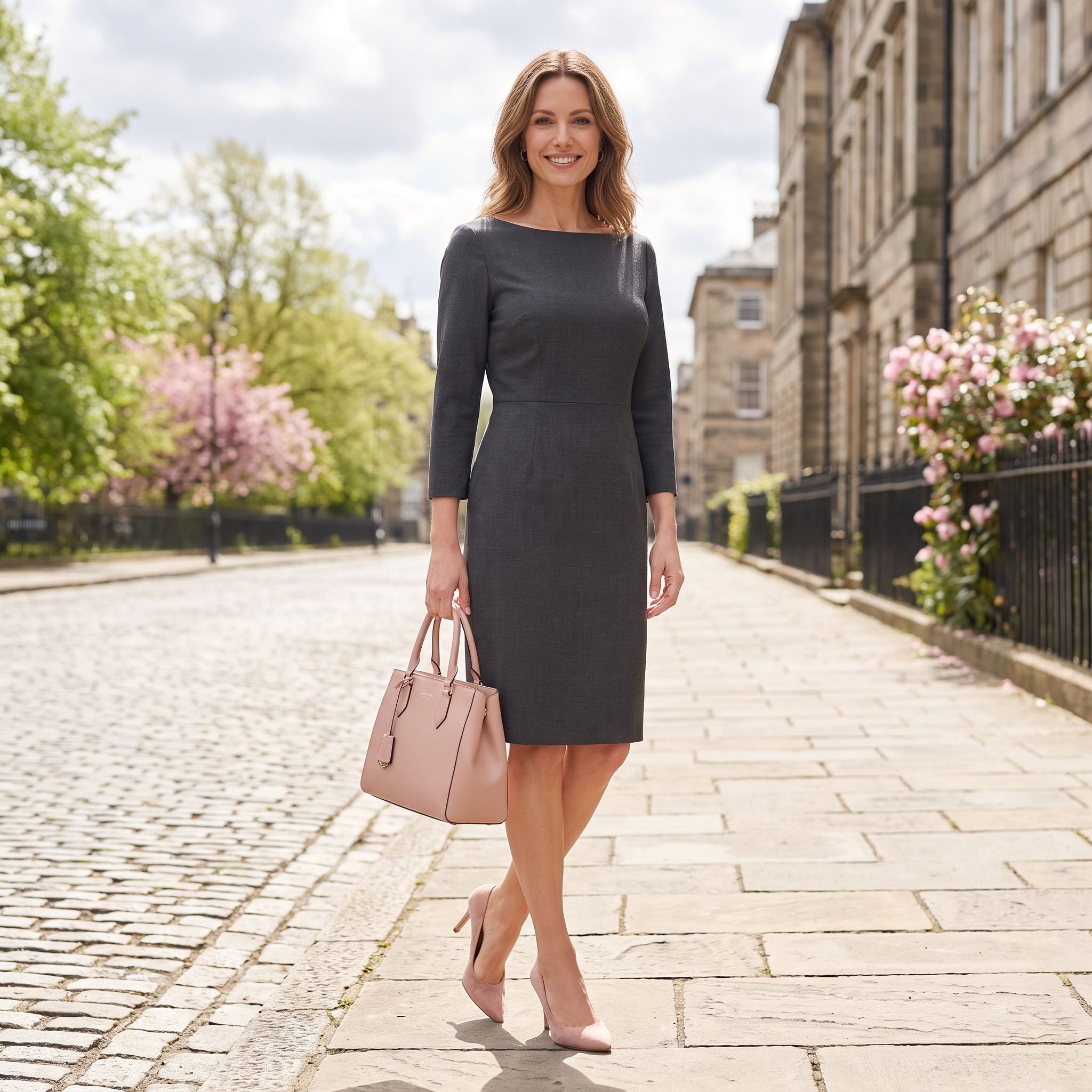
Charcoal and blush still looks remarkably current. The bateau-neck dress is disciplined and dark; the pink accessories change its temperature without disturbing the clean silhouette.
That is the real strength of the matching set here. One pale color appears twice, far apart, and softens the entire dress between them. Nothing else needs to turn pink for the point to register.
16. Cherry-Red Pumps + Cherry-Red Box Handbag
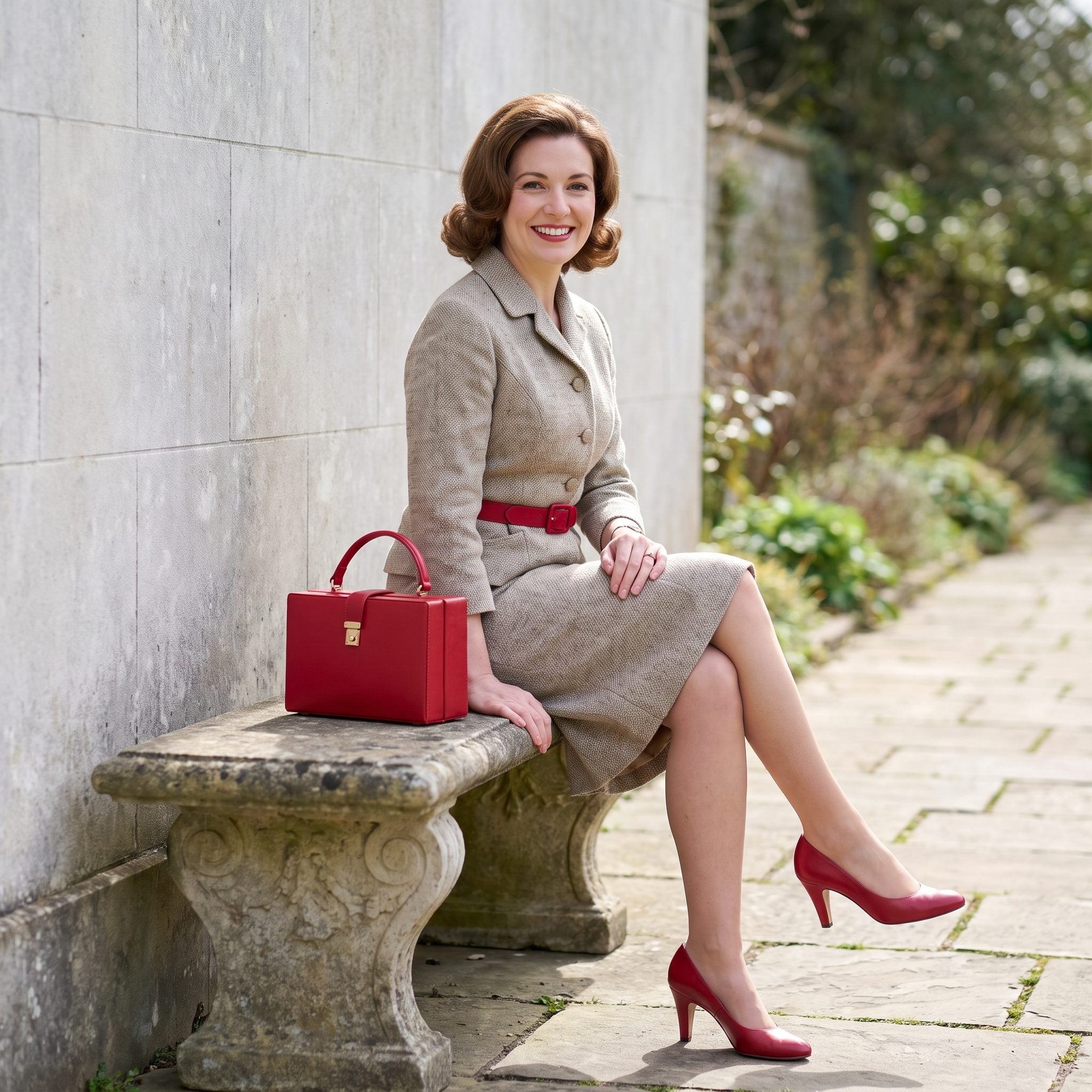
Now matching gets louder. Cherry-red shoes and a box handbag already create two strong points of color, but the narrow belt brings that red through the middle and turns the whole arrangement into a deliberate three-part rhythm.
Cream underneath keeps the saturation clean instead of theatrical. Red gets the attention; the neutral dress gives it somewhere to land.
15. Forest-Green Pumps + Forest-Green Leather Purse
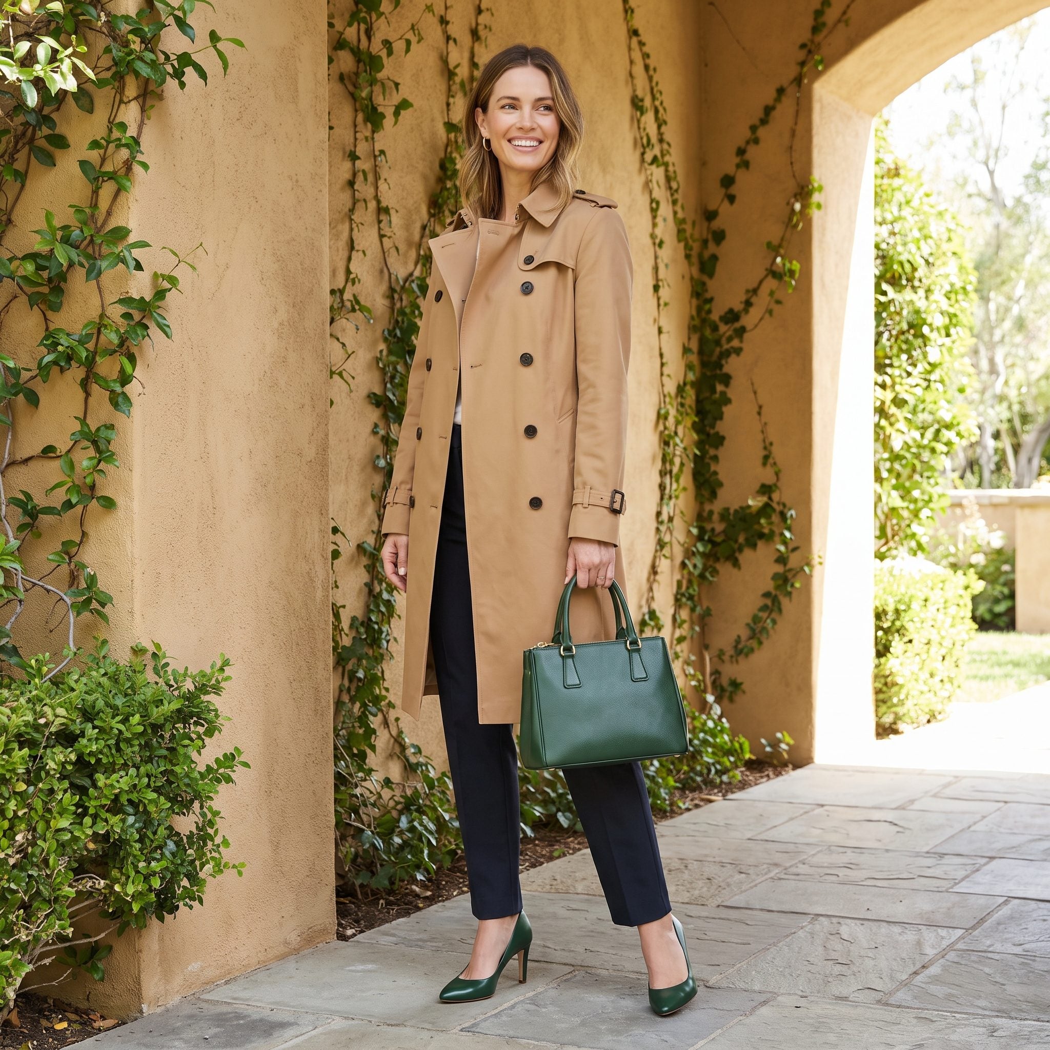
Forest green against camel is one of those combinations that looks almost architectural: warm neutral structure, deep cool color dropped into the openings. Nothing else needs to compete.
The matching shoes and bag give the camel suit a much stronger point of view, and the green gloves push the color farther through the outfit. By the time it reaches the hands, the green is no longer an accessory accent. It is half the palette.
14. Burgundy Pumps + Burgundy Handbag
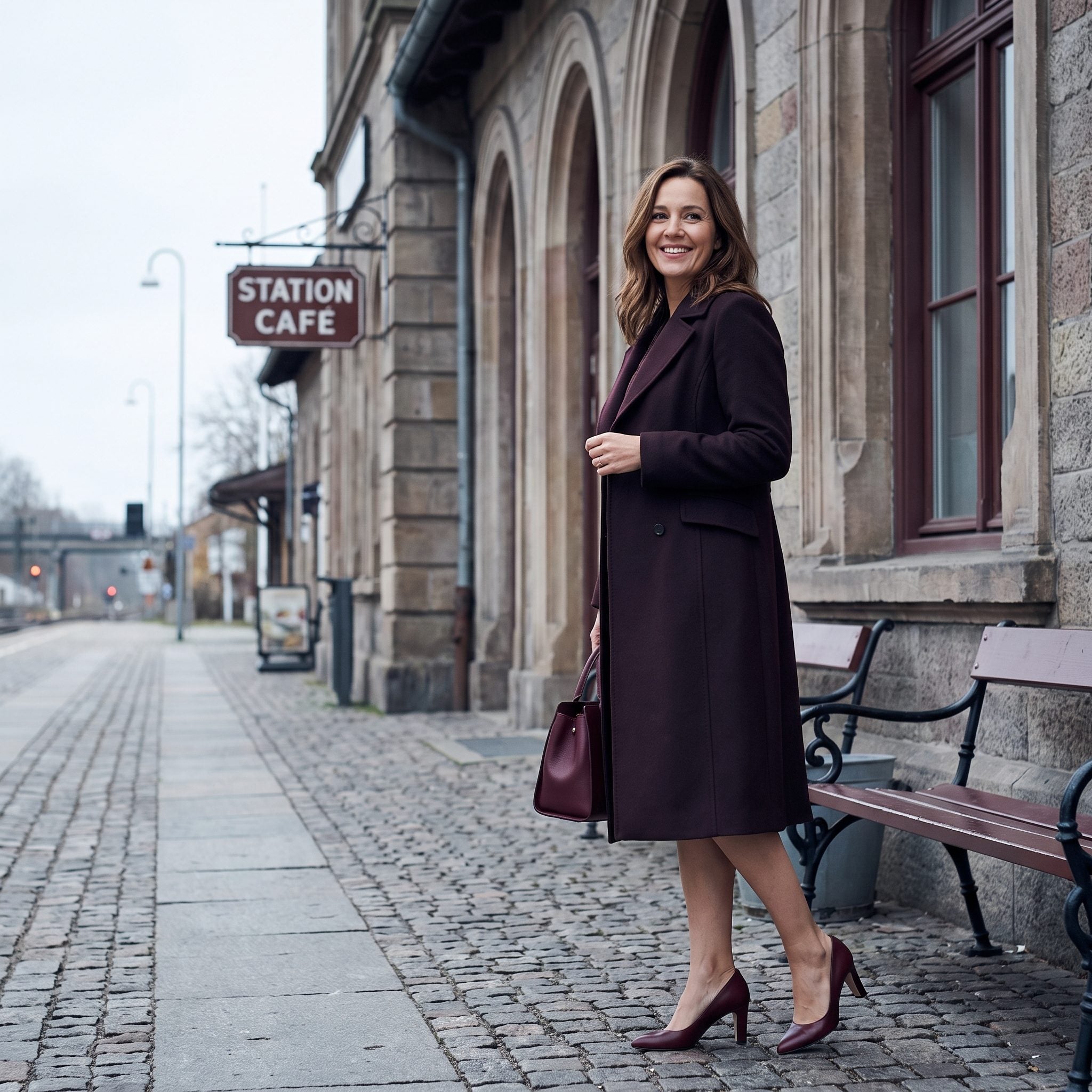
Burgundy does what bright red cannot: it gives the outfit color while staying close to the authority of a neutral. Against charcoal and cream, the pumps and handbag look rich rather than flashy.
The matching gloves extend the color upward and keep the accessories from clustering at the bottom of the outfit. Three burgundy points against all that gray wool create enough repetition to feel luxurious without making the coordination obvious from a block away.
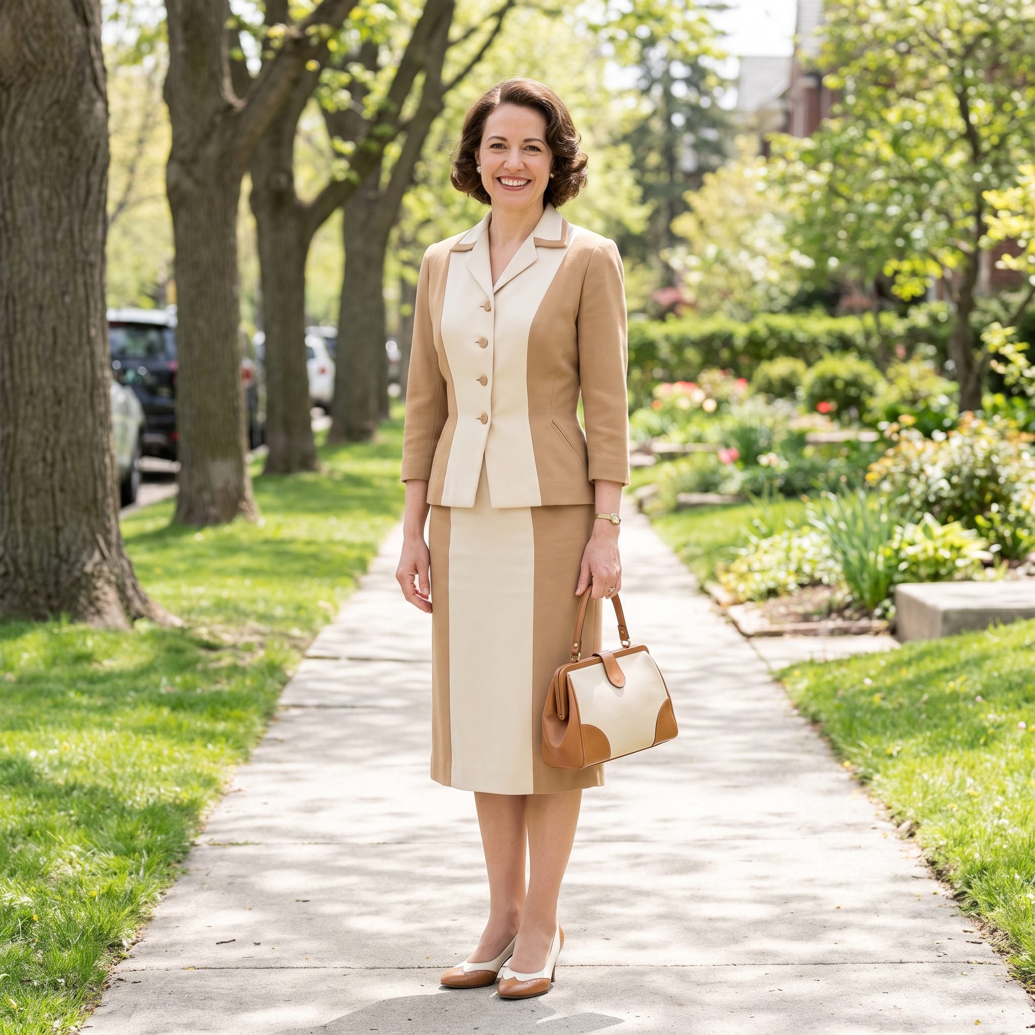
13. Tan-and-Cream Spectator Pumps + Two-Tone Handbag
❤️ Would you like to save this?
Two-tone accessories make matching much more demanding because the repetition has to work twice. Tan and cream appear in the shoe, then turn up again in the handbag, creating a graphic pattern instead of a single-color echo.
Forest green gives those pale accessories enough contrast to stay crisp. The little tan hat carries one of the accessory colors upward, so the palette does not stop at the waist.
12. White-and-Navy Two-Tone Shoes With the Handbag That Repeated the Combination
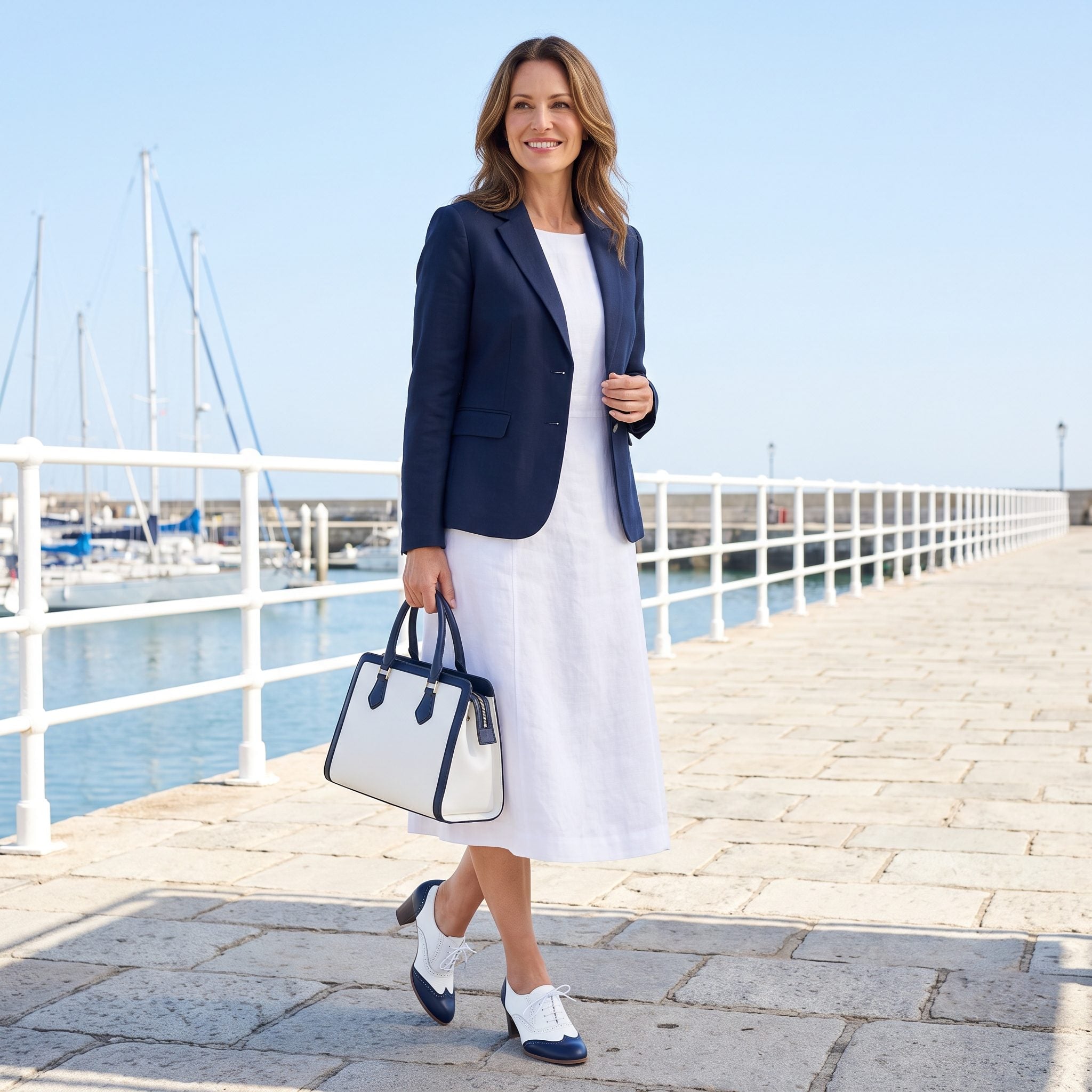
White and navy take the spectator idea somewhere cleaner and more summery. The shoe repeats its two colors in the handbag, giving the accessories enough detail to stand up to a solid red dress.
The red is what keeps this from becoming overly neat. It pushes hard against the blue and white and turns the matched set into a crisp graphic note. Pearls keep the neckline quiet, while the carried gloves add one more period detail without adding another color.
11. Black-and-White Spectator Shoes + Black-and-White Handbag
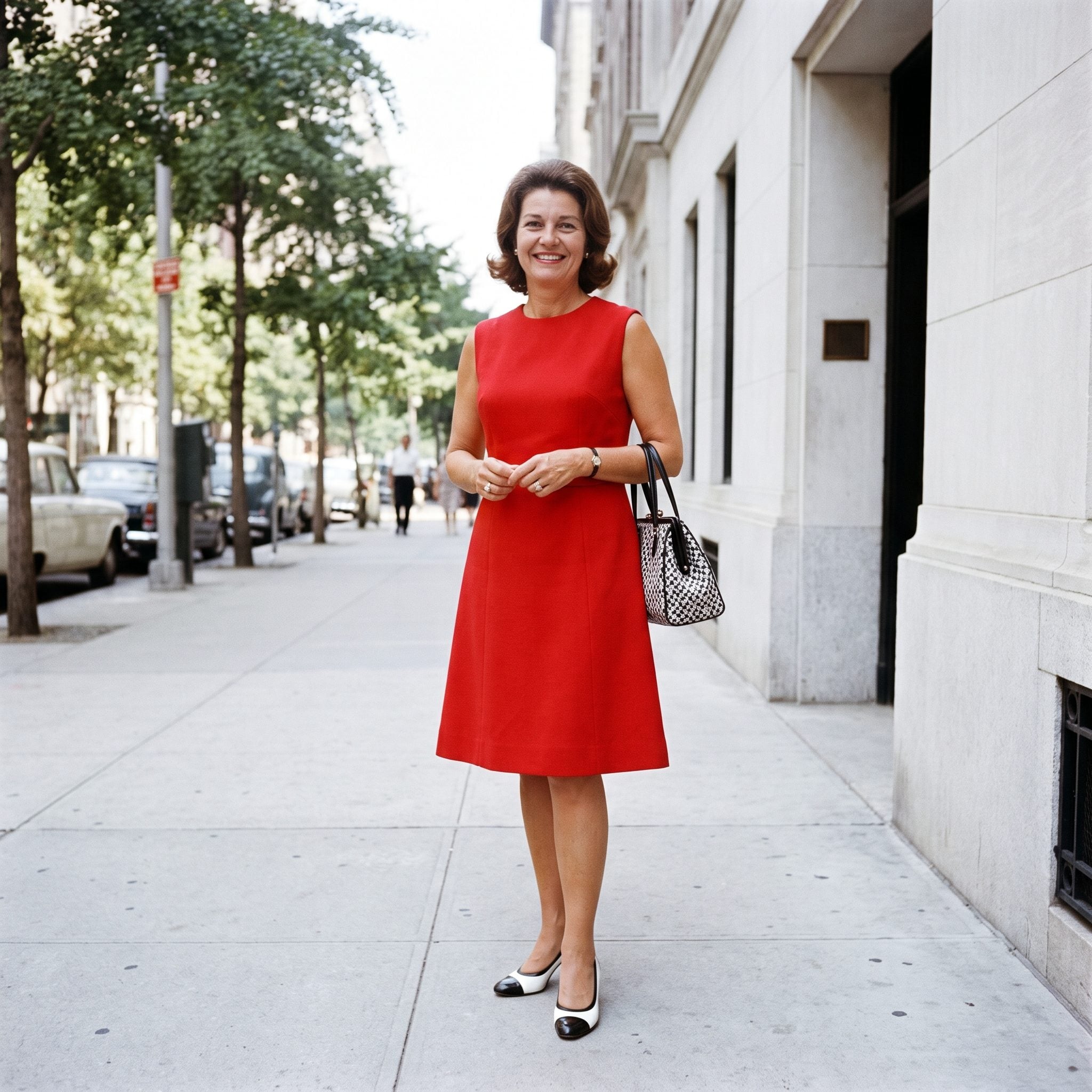
This is the highest-contrast version of the spectator formula. Black and white already move the eye sharply between panels; repeating the pattern in both shoe and handbag doubles the effect.
The solid red dress is what saves the outfit from becoming a checkerboard. All the graphic activity stays in the accessories while the dress gives it one uninterrupted field of color. The result feels composed rather than busy.
10. Red Slingback Heels + Red Top-Handle Handbag
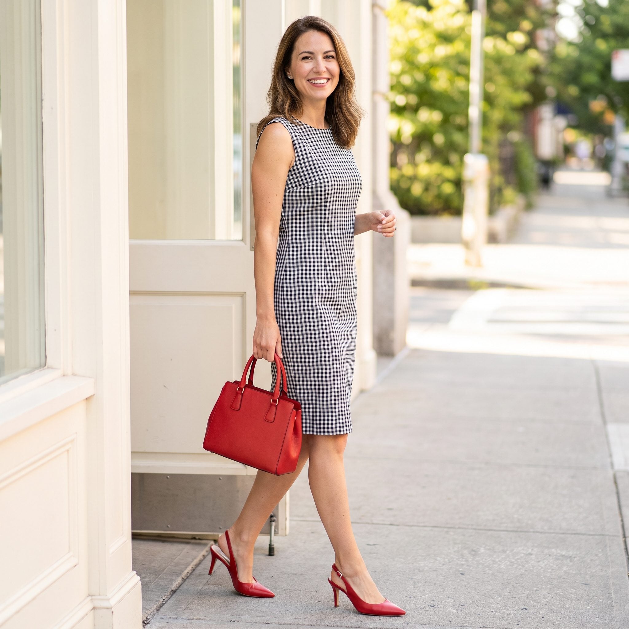
A black-and-white check sheath is nearly a neutral once bright red enters the room. The slingbacks and top-handle bag immediately become the color story because nothing else is trying to compete with them.
The open heel lightens the shoe compared with a closed pump, which makes the matching red feel less formal despite its intensity. Precision is still there; the silhouette simply carries it more lightly.
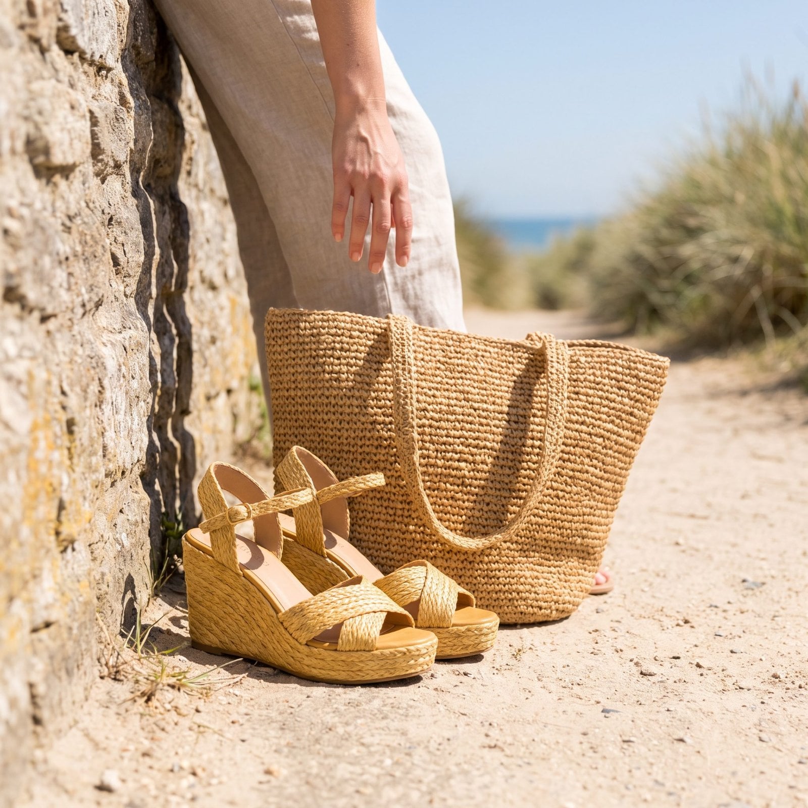
9. Raffia Wedges and the Woven Handbag in the Exact Same Straw Tone
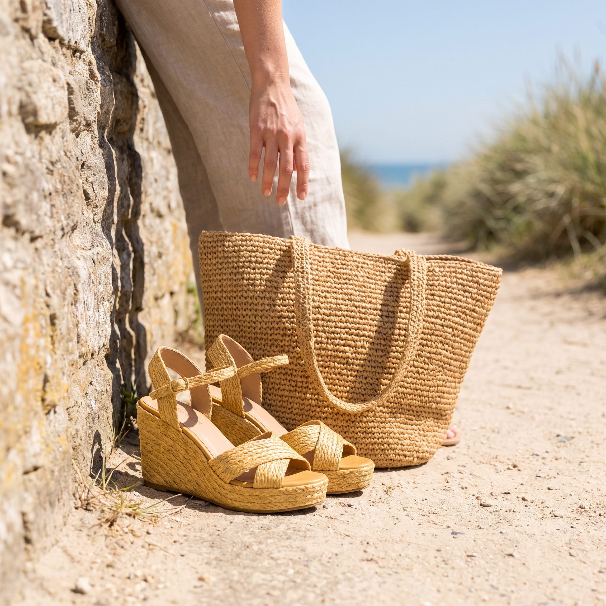
Summer matching did not have to mean polished leather. Here the coordination happens through fiber and color at once: woven straw at the foot, woven straw in the hand, both carrying the same warm natural tone.
The blue-and-white cotton keeps the outfit crisp while the straw softens its edges. Texture becomes the repeated element, turning the bag and wedges into a pair without requiring anything shiny or formal.
8. Cognac Slingbacks and the Cognac Envelope Bag in the Same Leather Tone
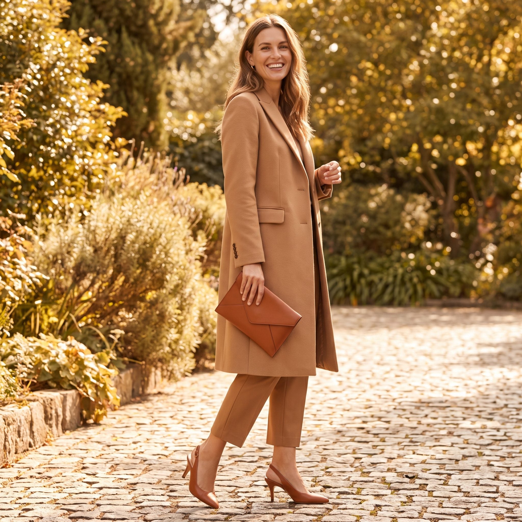
Cognac takes matching into earthier territory. The slingbacks and envelope bag share the same warm brown family, giving the olive outfit a restrained finish instead of a bright accent.
The narrow belt repeats the brown through the center, linking shoes and bag without turning the outfit into a three-piece accessory set. Olive and cognac understand each other immediately. Neither needs to raise its voice.
7. Black Suede Pumps + Black Suede Handbag
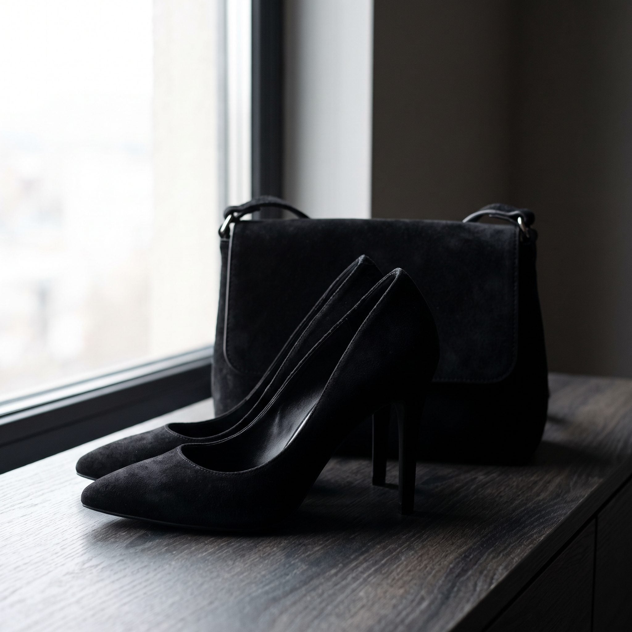
Suede changes the character of black completely. Instead of the hard reflection of patent, the nap absorbs light and makes the pumps and handbag feel softer, deeper, almost velvety.
Emerald supplies the saturation while the black suede supplies texture. The combination keeps an evening palette from flattening into dark dress, dark shoe, dark bag. Black is doing something here beyond simply matching.
Here, black does not need shine to look dressed. The suede gives it depth instead.
6. Cream Peep-Toe Heels + Cream Satin Clutch
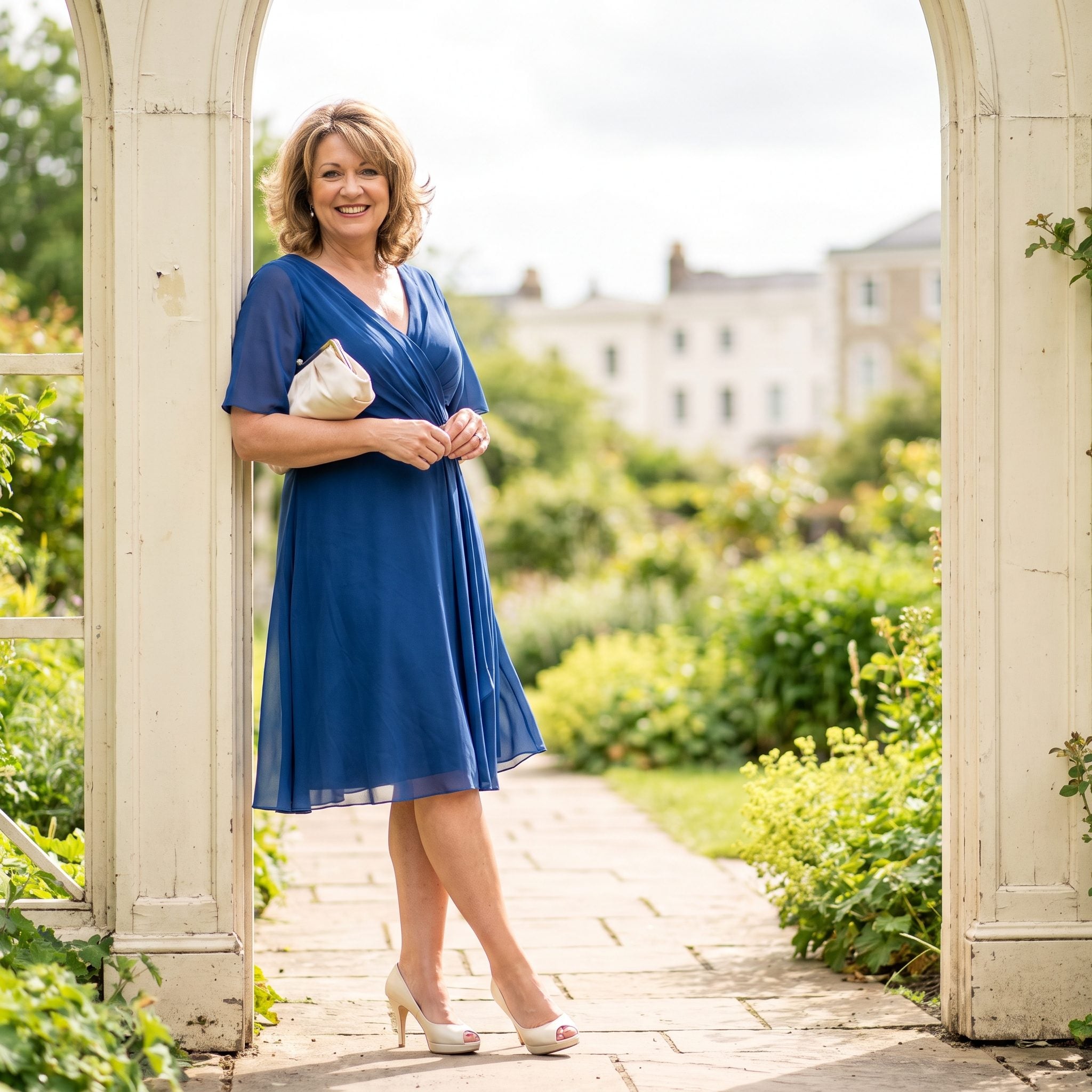
Sapphire and cream work because the contrast is so clean. The dress carries almost all the saturation, while the pale shoes and clutch lift the edges and keep the blue from becoming visually heavy.
The peep-toe opens the shoe and gives the outfit a lighter finish than a closed pump would. Satin repeats between heel and clutch, so the coordination happens through surface as well as color.
5. Black Satin Heels + Black Satin Envelope Clutch
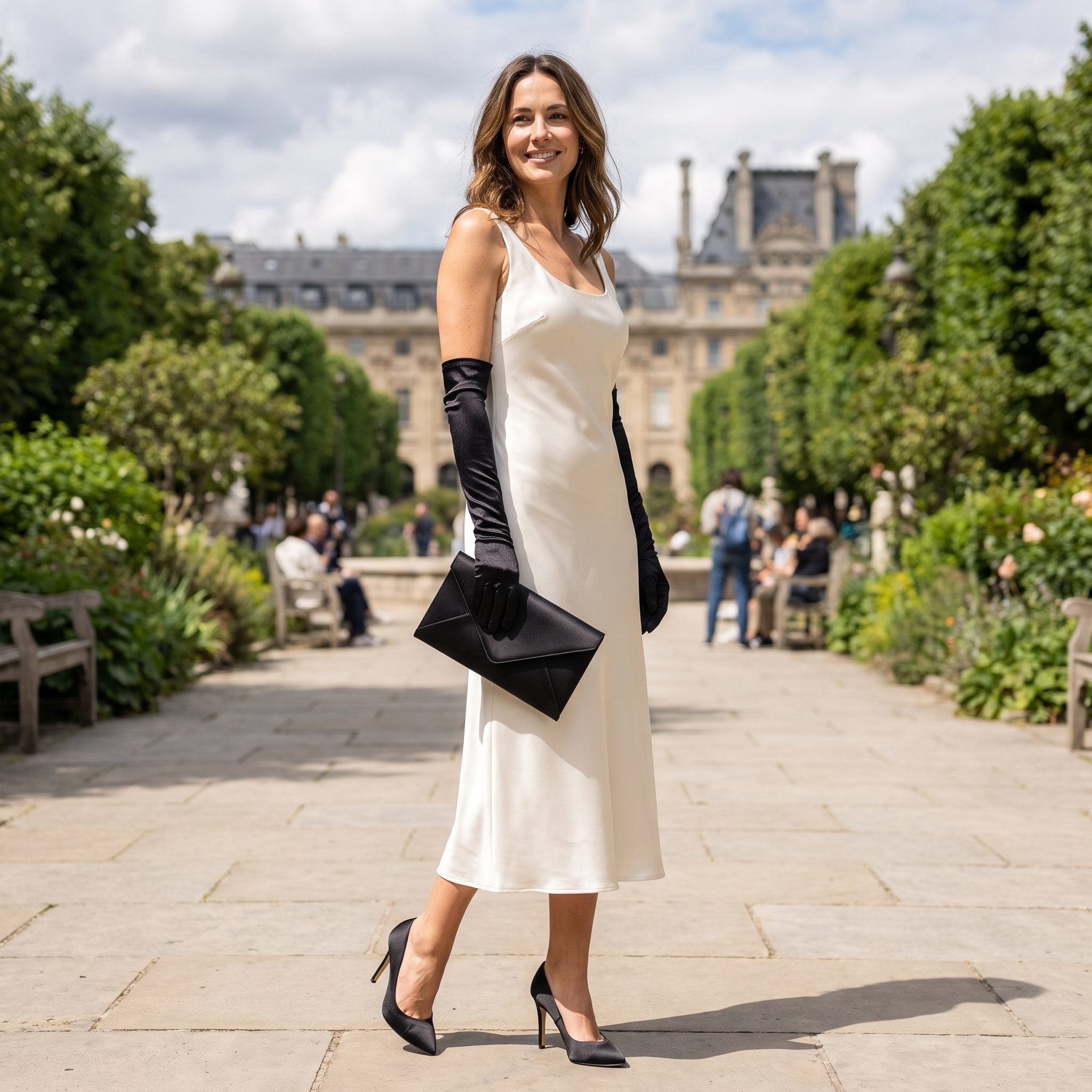
This is matching reduced to two colors and one sheen. Ivory dress, black satin heels, black satin clutch, long black gloves. Every dark element carries the same soft reflection, so the outfit feels connected without needing ornament.
The over-the-elbow gloves are the detail that pushes the whole thing firmly into formal territory. Black and ivory need no extra color when texture, proportion, and finish are already this controlled.
4. Gold Evening Heels + Gold Metallic Clutch
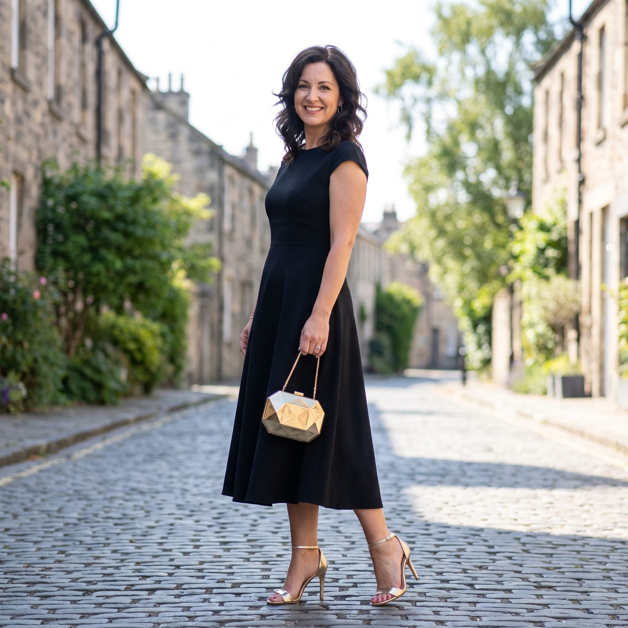
Against black, metallic gold behaves almost like jewelry. The heels and clutch pick up the available light, giving an otherwise severe silhouette two controlled places to sparkle.
The bateau neckline keeps the dress itself disciplined, which leaves the metallic accessories free to do the decorative work. Nothing else has to glitter. Gold gets two appearances and that is enough.
3. Silver Evening Sandals + Silver Structured Bag
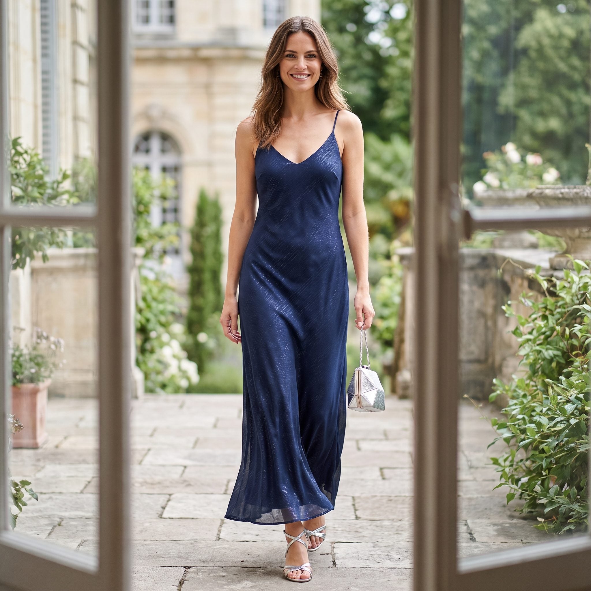
Silver against midnight blue is a cooler, sharper version of the metallic formula. The strappy sandals bring more exposed skin into the composition, while the structured bag keeps the silver from feeling delicate or incidental.
Draping at the waist softens the dress; the metallics sharpen it again. That push and pull is what keeps the combination from turning icy. The shine travels from foot to hand, but the dark blue still owns most of the frame.
2. Pastel-Pink Evening Heels With the Pink Beaded Purse That Matched to the Bead
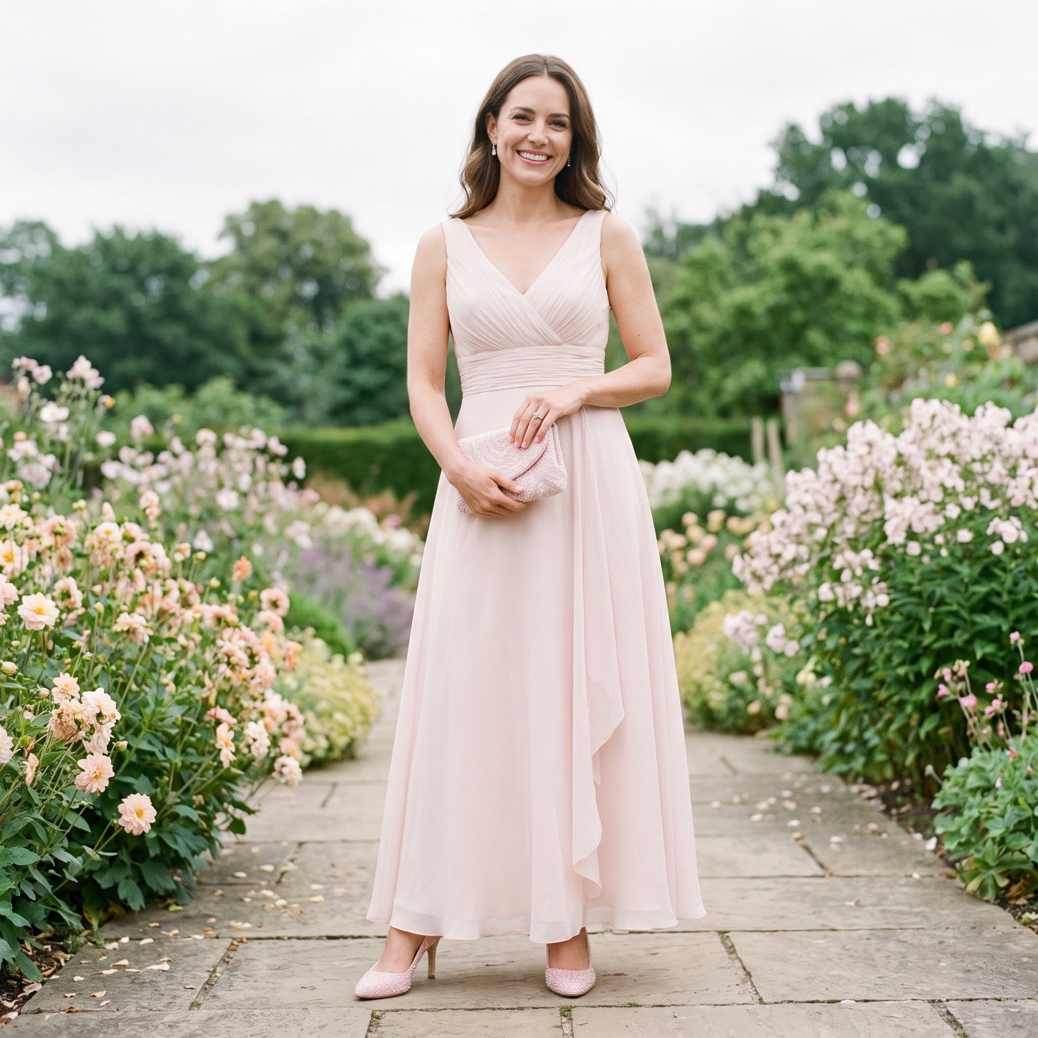
This is where matching becomes almost ceremonial. Pink satin at the foot, pink beading in the hand, the same delicate color repeated across two completely different surfaces.
Dove-gray tulle gives that pale pink enough room to register. The shoes provide sheen; the purse provides texture; the color ties them together. One would be pretty. The pair makes the outfit look finished.
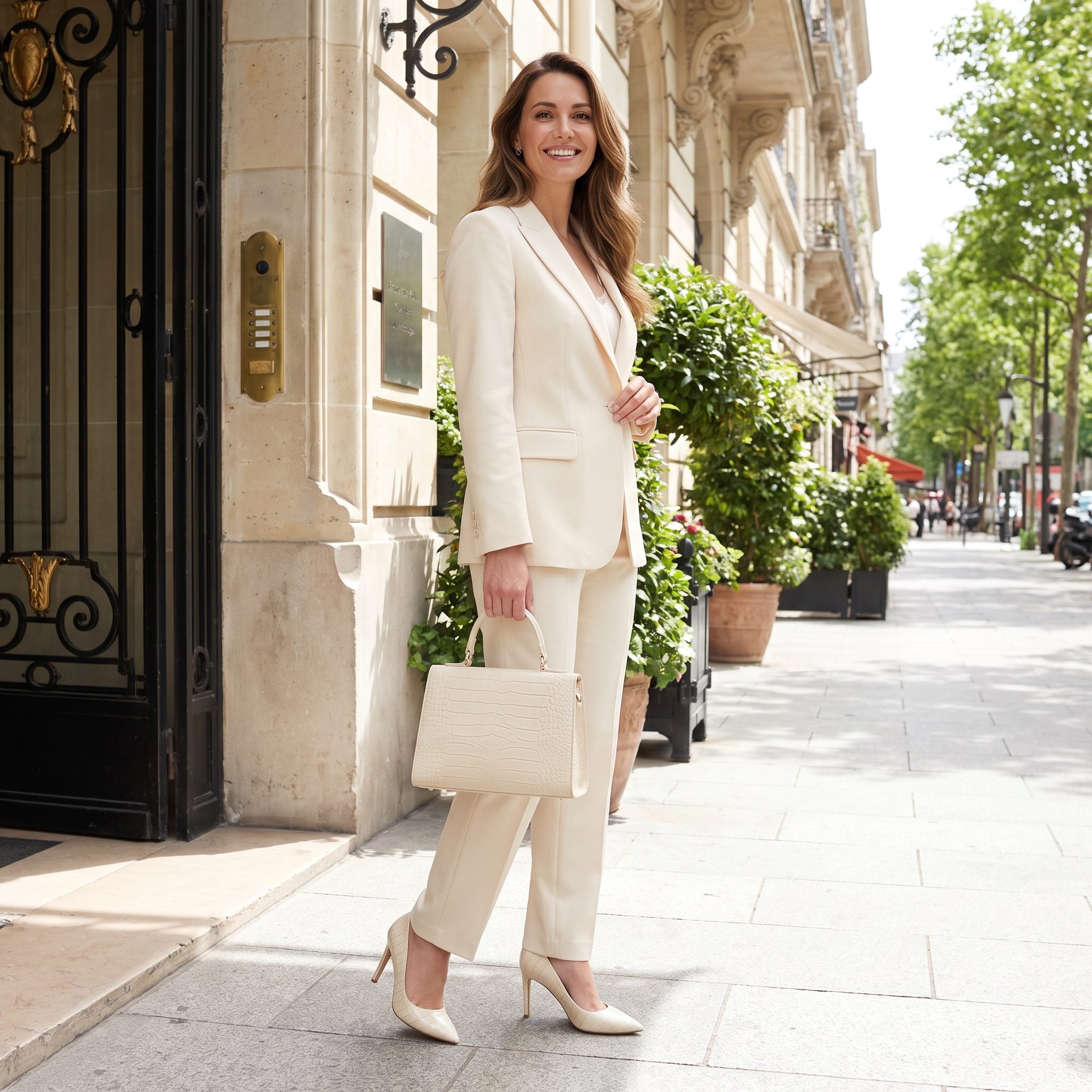
1. Cream Crocodile-Embossed Pumps and the Top-Handle Bag in the Same Embossed Texture
❤️ Would you like to save this?
Finish with the version that takes the rule beyond color entirely. Cream crocodile-embossed pumps meet a top-handle bag in the same pale reptile texture, creating a match you notice first through surface and only then through shade.
The teal suit is exactly strong enough to carry it. A saturated jewel tone gives the cream accessories somewhere to sit, while the repeated embossing handles the coordination without another bright color entering the picture. Matching texture asks more of the eye than simply repeating red or navy. That is what makes this one such a satisfying closer.
What these 25 looks make clear is that matching was never only about obedience to a rule. At its best, it was composition. Color could repeat, texture could repeat, shine could repeat, and one accessory could answer another from several feet away. The modern wardrobe gained freedom when that requirement loosened. Looking at these outfits, though, precision clearly had pleasures of its own.