❤️ Would you like to save this?
One color. How complicated could it possibly get? Quite complicated, as it happens. Monochrome dressing eliminates the obvious arguments between colors, then introduces a whole new set of negotiations. Undertones disagree. Fabrics reflect light differently. A handbag demands attention. Two perfectly matched garments somehow make each other look worse.
The difference between an expensive-looking ensemble and one that falls flat rarely comes down to the price tag. More often, it’s a question of proportion, texture, saturation, and where the eye lands first. Sometimes the smartest move is to introduce contrast. Sometimes it’s to remove the one detail making all the noise. These 27 outfits demonstrate how much can go right, wrong, or unexpectedly sideways when a wardrobe commits to one color family.
FYI, thanks to AI imagery software, we’re able to create very specific fashion and hairstyle examples to illustrate the points being made. In some cases, imagery is exaggerated to hammer home the point. Also, assume links that take you off the site are affiliate links such as links to Amazon. this means we may earn a commission if you buy something.
27. Champagne Tailoring Meets a Blouse That Wants the Spotlight
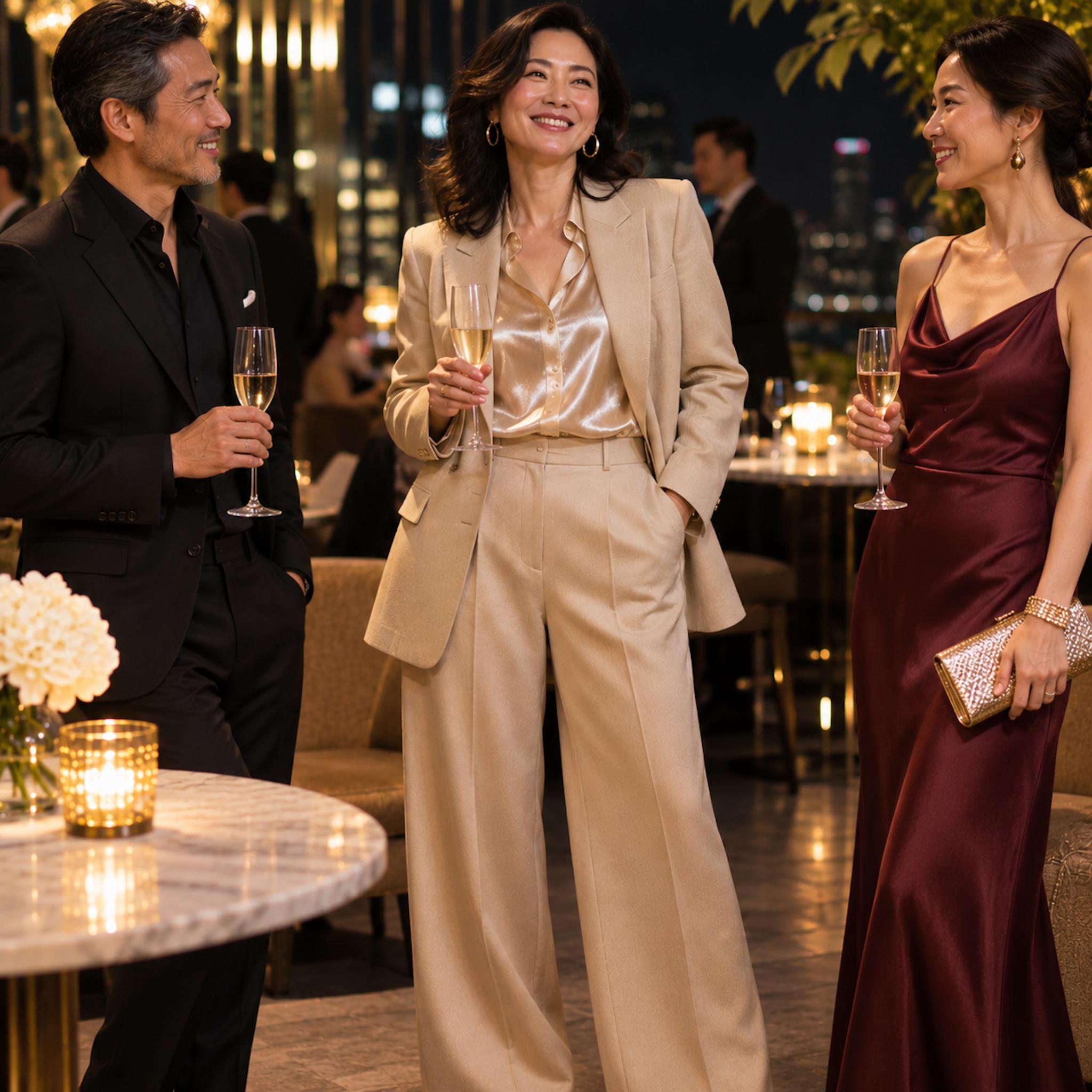
The champagne suit has everything going for it: beautifully cut trousers, a structured jacket, and a palette that looks particularly rich under evening lights. The satin blouse introduces the complication. Its reflective surface catches every glimmer of candlelight, creating a striking contrast with the softer, matte tailoring.
That contrast gives the outfit its evening character. A silk crepe blouse would produce a quieter, more understated result, while the glossy satin makes the upper body the focal point. Neither approach is inherently superior. The important distinction is that monochrome doesn’t eliminate contrast; it shifts the argument from color to finish. Here, the blouse makes a persuasive case for a little shine.
26. Five Reds, Five Different Opinions
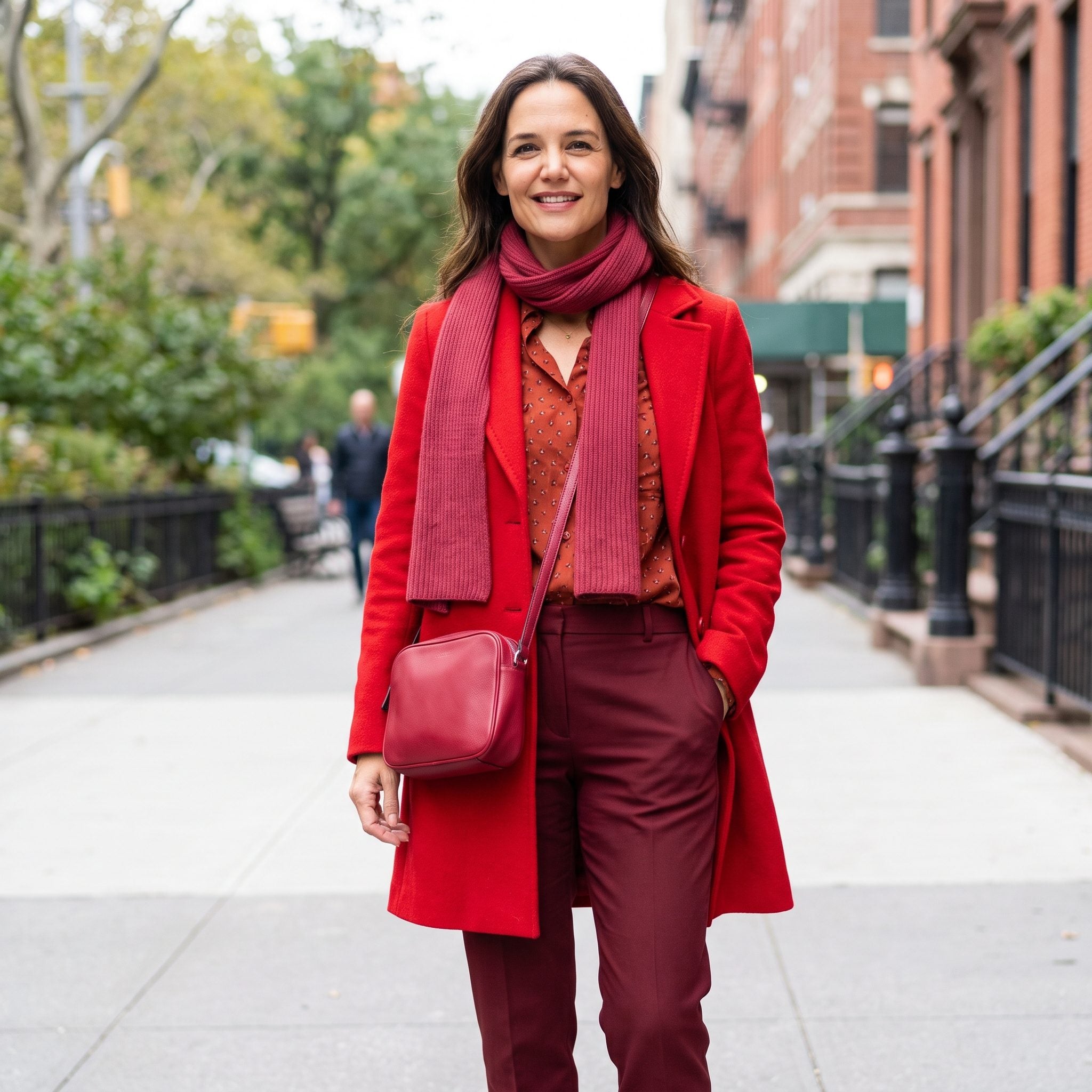
Red arrives with considerable confidence. Five versions of it arrive with five separate agendas. Tomato leans orange, burgundy heads toward violet, and scarlet refuses to be ignored. The result has plenty of color, though no obvious hierarchy.
Tonal dressing doesn’t require identical shades. A deep wine foundation with cooler red accents can be magnificent; tomato and brick can build an equally persuasive warm palette. Give the outfit a dominant temperature or a deliberate progression from light to dark, and those competing reds might finally agree on something.
25. Gray Has the Color Right and the Texture Wrong
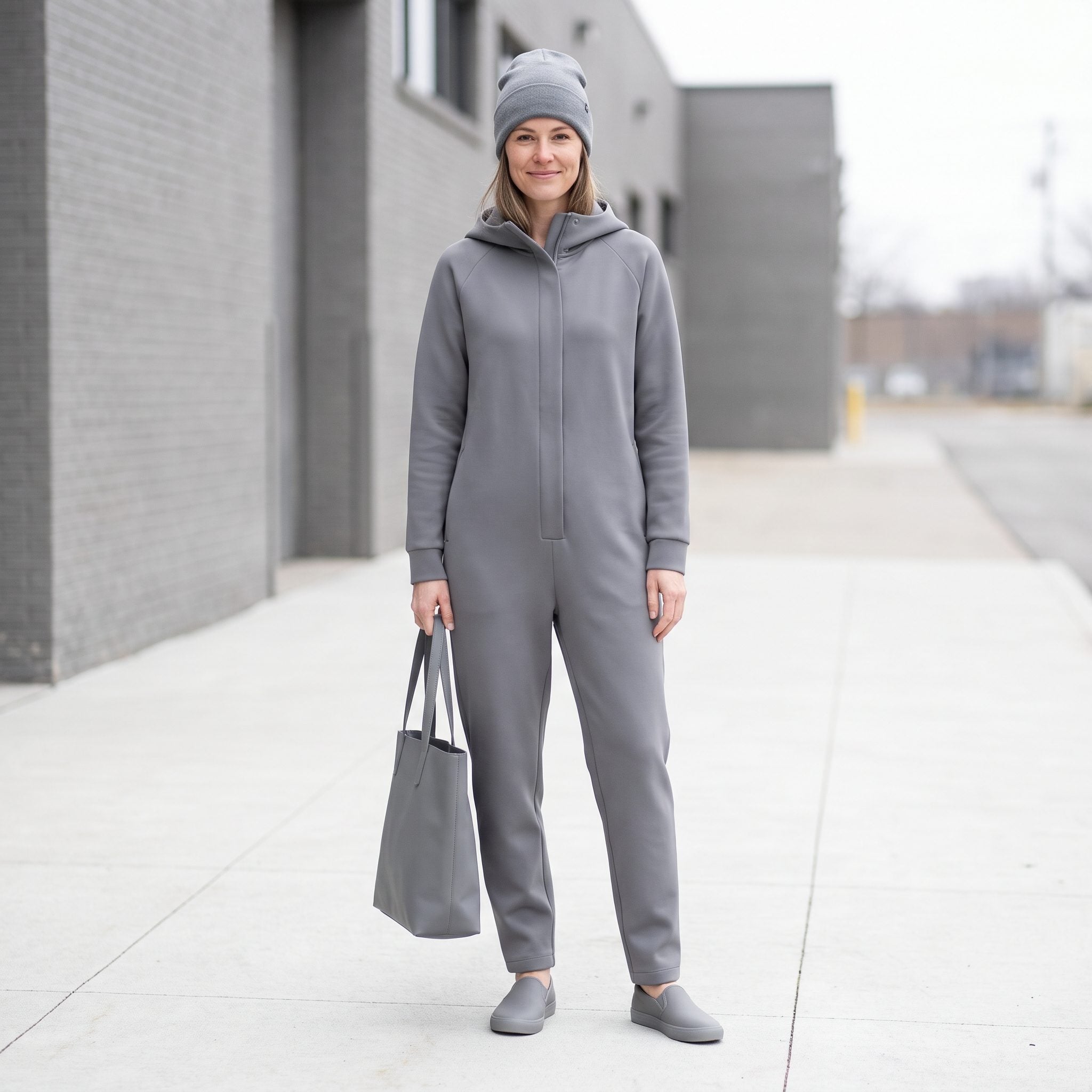
The fit works. The gray is consistent. Every surface, however, has roughly the same finish, leaving the outfit with remarkably little depth. Nothing catches the light differently, and the separate pieces begin merging into one flat expanse.
Keep the gray and change the materials. A ribbed knit against tailored wool, suede against polished leather, or a brushed coat over a crisp shirt would introduce dimension without another color entering the picture. Monochrome can be quiet without becoming visually mute.
24. Powder Blue Meets a Handbag With Main-Character Energy
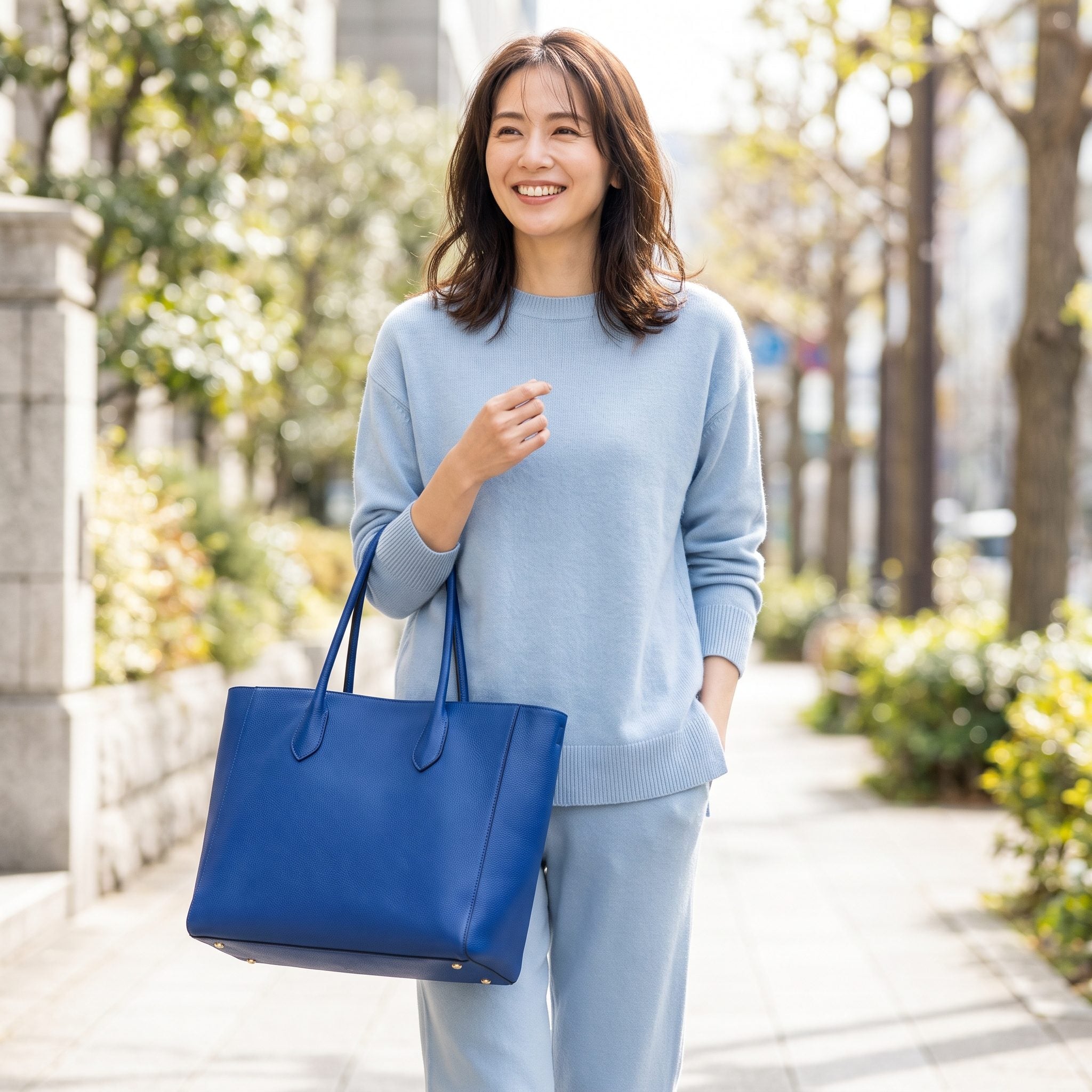
Powder blue whispers. Cobalt delivers a speech. The handbag belongs to the same broad color family as the clothes, yet its saturation makes it the first thing anyone notices. The delicate blue layers become supporting players in their own outfit.
That arrangement works beautifully when the handbag is meant to command attention. For a quieter tonal effect, slate blue, dusty periwinkle, or a deeper muted blue would create a gentler progression. Cobalt doesn’t clash with powder blue so much as seize control of the conversation.
What Our Readers Say
- Asked where the statement piece should go, our readers split almost evenly between the top and the bag, with shoes further behind and bottoms barely registering.
- Prints are an occasional thing for most ThreadCurve readers: 80% said they rarely wear them, which helps explain why solid single-colour dressing gets so much attention.
From ThreadCurve reader polls and votes.
23. Espresso Brown, Interrupted at the Ankle
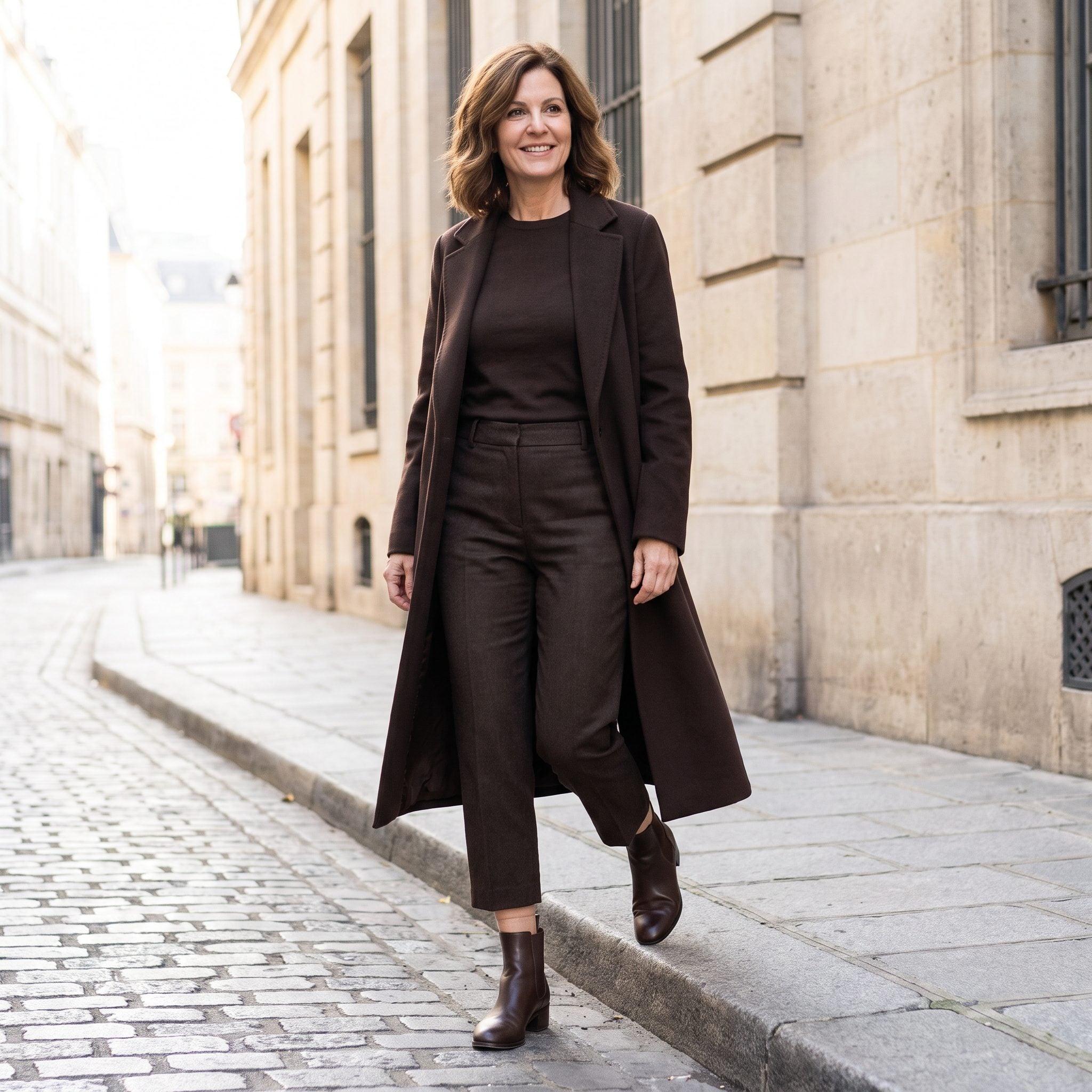
The coat, knit, trousers, and boots belong to one deep-brown family. Then the trousers stop above the boot shafts, revealing a narrow strip of skin. Against the surrounding dark fabric, that small opening becomes unexpectedly prominent.
For a continuous leg line, extend the trousers over the boots or bridge the gap with espresso trouser socks. An exposed ankle can be deliberate, especially with cropped trousers and lighter outerwear. Beneath this long coat, however, a continuous espresso line would give the silhouette greater visual length.
22. Five Blacks Exposed by Daylight
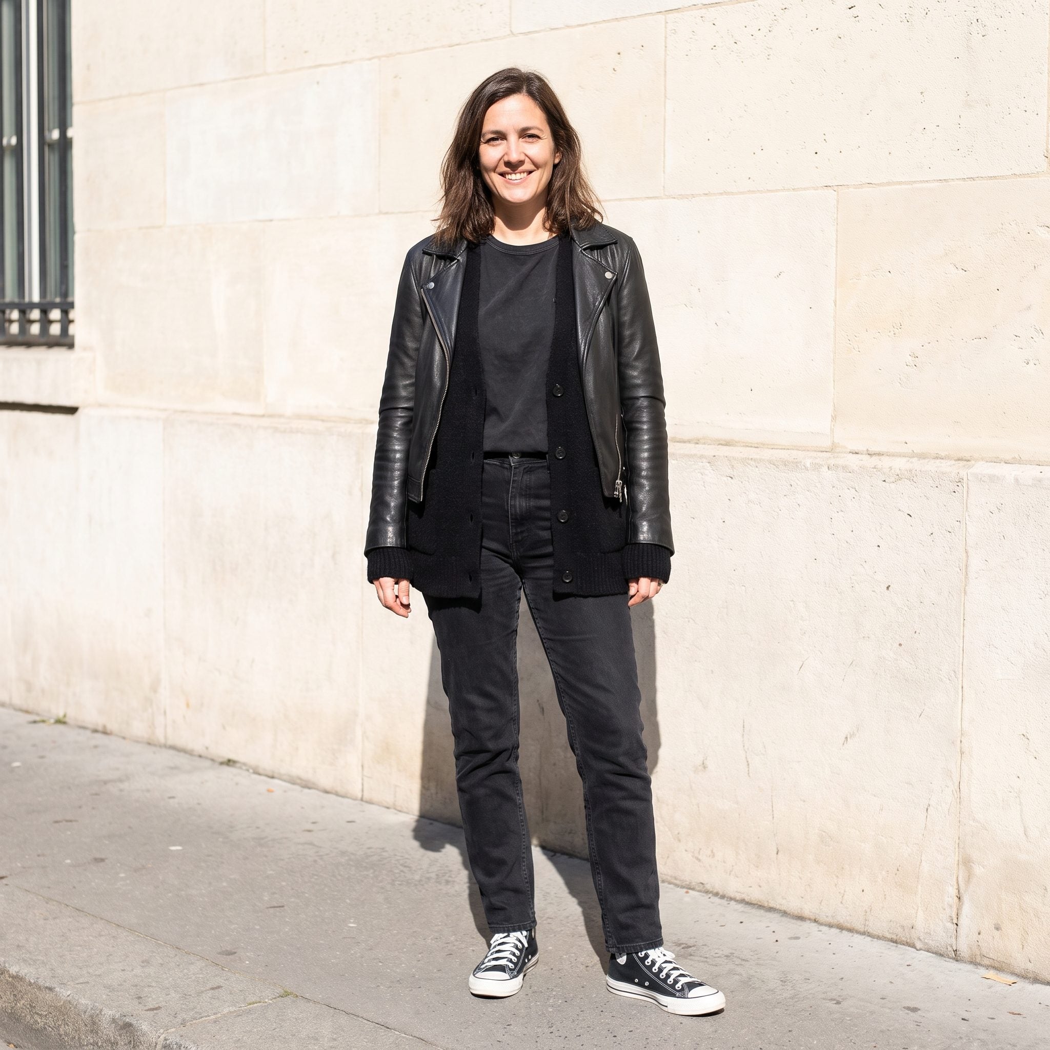
Black has an impressive talent for concealing its differences indoors. Outside, the faded cotton top reads charcoal, the trousers reveal a blue cast, and the blazer retains a deeper jet-black finish. What appeared coordinated under artificial light becomes a negotiation between distinct blacks.
Matching their depth would produce a sharper, more uniform suit. Deliberately layered charcoal, ink, and faded black could be equally sophisticated, particularly with contrasting textures. Different fibers, dyes, finishes, and laundering histories affect how black garments appear. The trouble begins when those differences are discovered only after leaving the house.
21. Blush Pink Meets an Orange-Red Lip
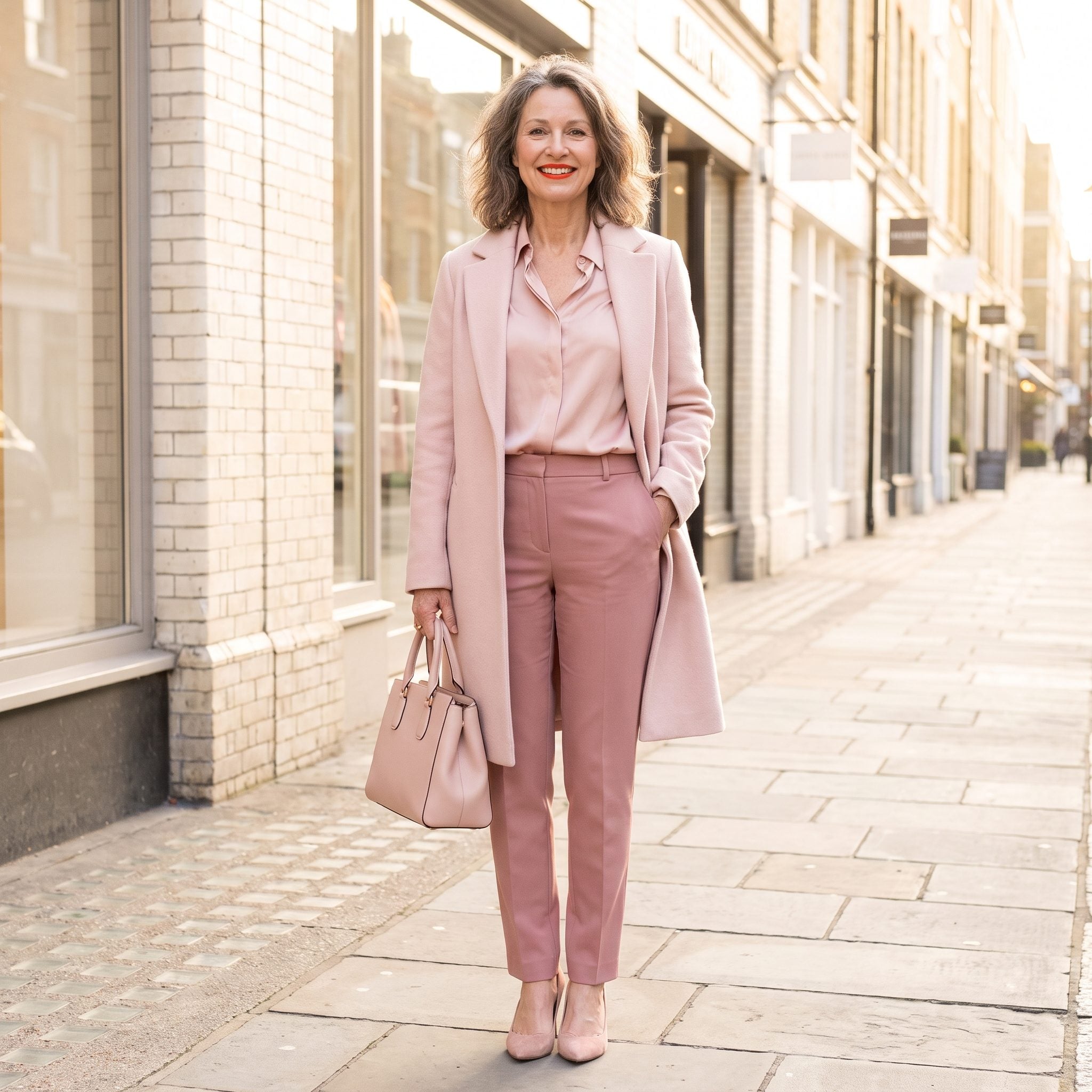
The clothes move through blush, dusty pink, and pale rose. The lipstick takes a different route, introducing saturated orange-red against those cooler, muted shades. Suddenly the strongest color in the outfit is concentrated around the mouth.
That can be striking when the intention is to frame the face. For a quieter tonal finish, muted rose, mauve, or berry would relate more closely to the clothing. The bold lip isn’t a styling error. It simply changes the visual hierarchy, proving that monochrome dressing extends beyond the clothes themselves.
20. Chocolate Brown Gets an Unexpected Turquoise Guest
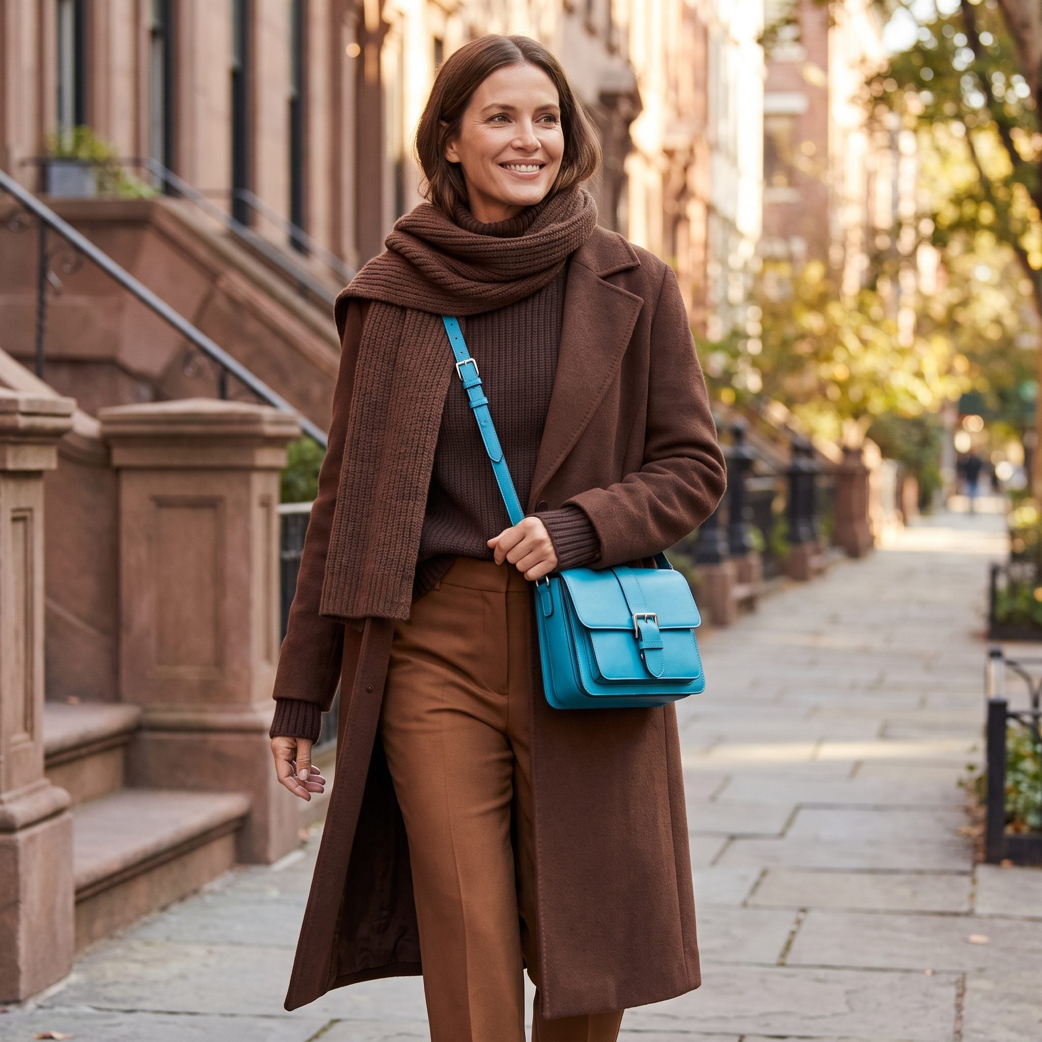
Cocoa, chocolate, and espresso create a rich sequence of browns, reinforced by warm gold jewelry. Then the turquoise handbag arrives and changes the entire proposition. The outfit is no longer primarily about brown; it’s about the collision between brown and blue.
Turquoise and chocolate can make a superb combination. A cognac leather handbag, bronze, or deep olive would preserve the warmth and let the tonal layering take center stage. The turquoise makes a bolder argument. Keep it when the contrast is the point; change it when the browns deserve the attention.
19. The Whites That Don’t Quite Agree
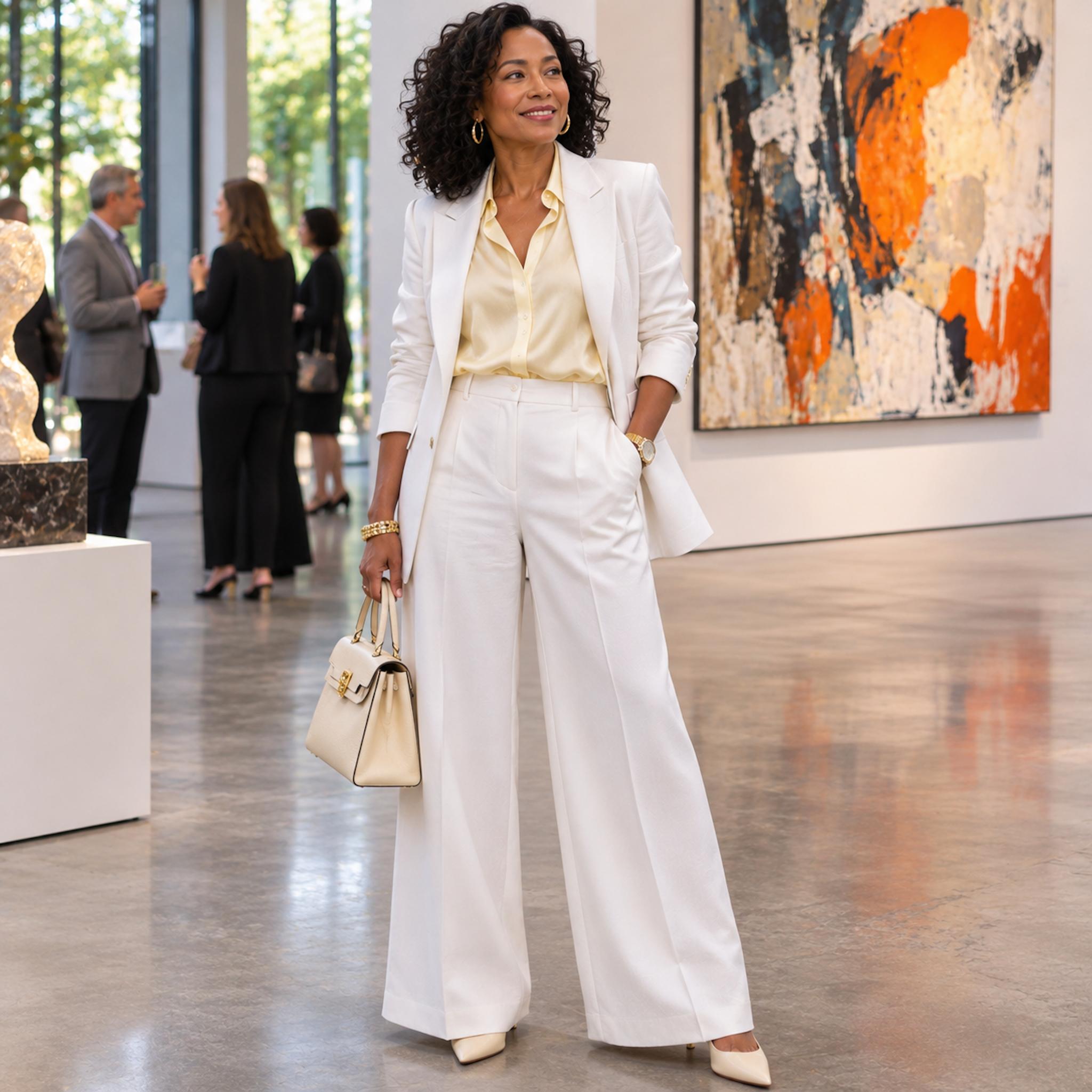
White isn’t a single destination. The blazer and wide-leg trousers have a crisp, cool brightness, while the blouse carries a warmer yellow-ivory cast. The accessories introduce still softer cream notes. Under the art gallery’s daylight, every shift in temperature becomes visible.
Mixed whites can look exceptionally refined when their differences form a deliberate progression. Here, the blouse draws attention because its warmth contrasts with the cooler tailoring. A cooler ivory blouse would make the suit more uniform; repeating the blouse’s warmth in another element would establish a stronger tonal relationship. White-on-white dressing succeeds when its variations feel connected rather than coincidental.
18. When Every Shade of Cobalt Matches a Little Too Well
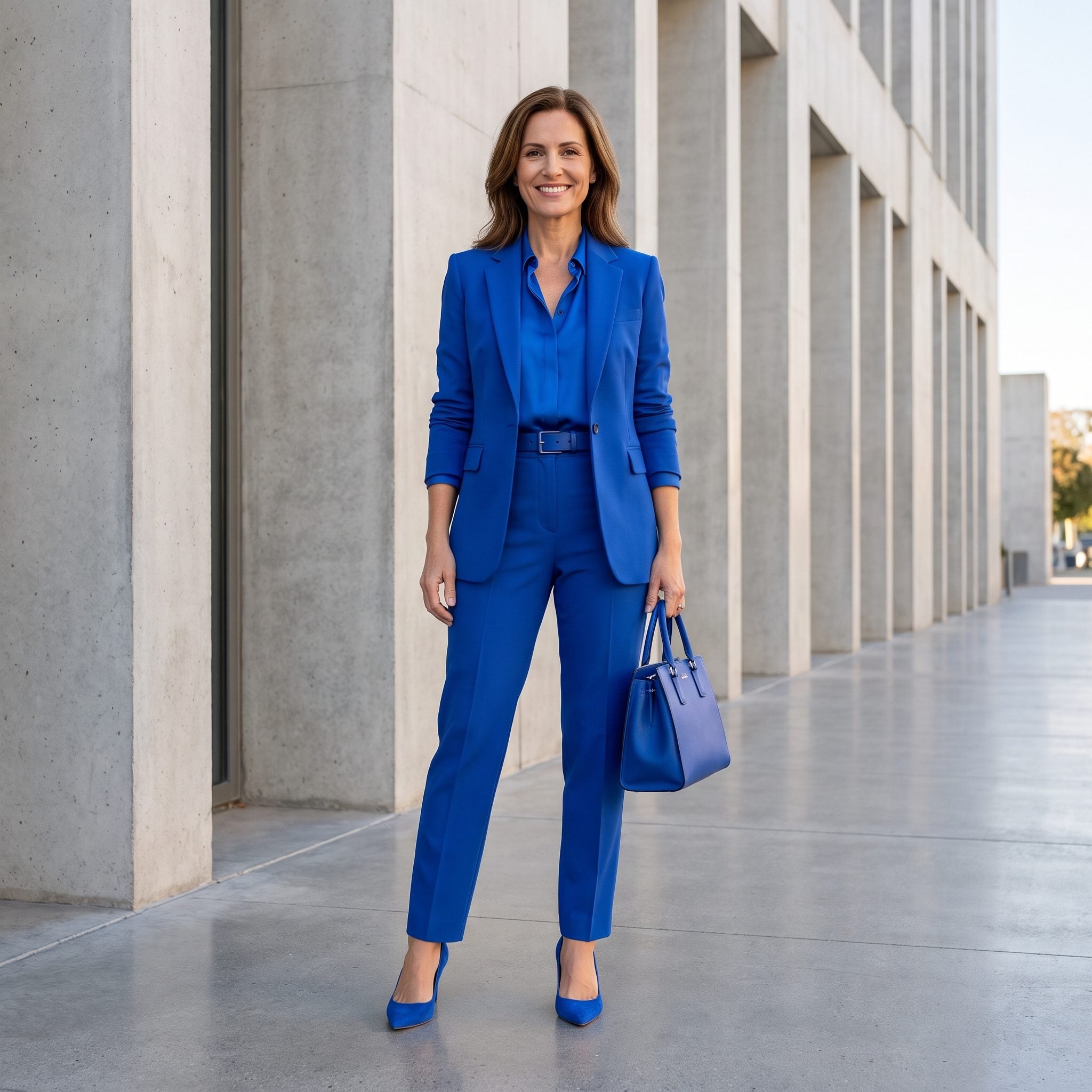
Every component arrives in cobalt: blazer, blouse, trousers, belt, bag, and pumps. The color is confident, yet the nearly identical finishes make the pieces look purchased as one complete set. Consistency is abundant; dimension is harder to find.
Introduce a change in surface rather than another hue. A ribbed knit beneath the smooth blazer, suede accessories, or slightly deeper blue trousers would give the pieces some individuality. Exact matching can be a powerful statement, particularly in such a saturated color. Texture would give that statement more depth.
17. Golden Beige Meets a Cooler Set of Neutrals
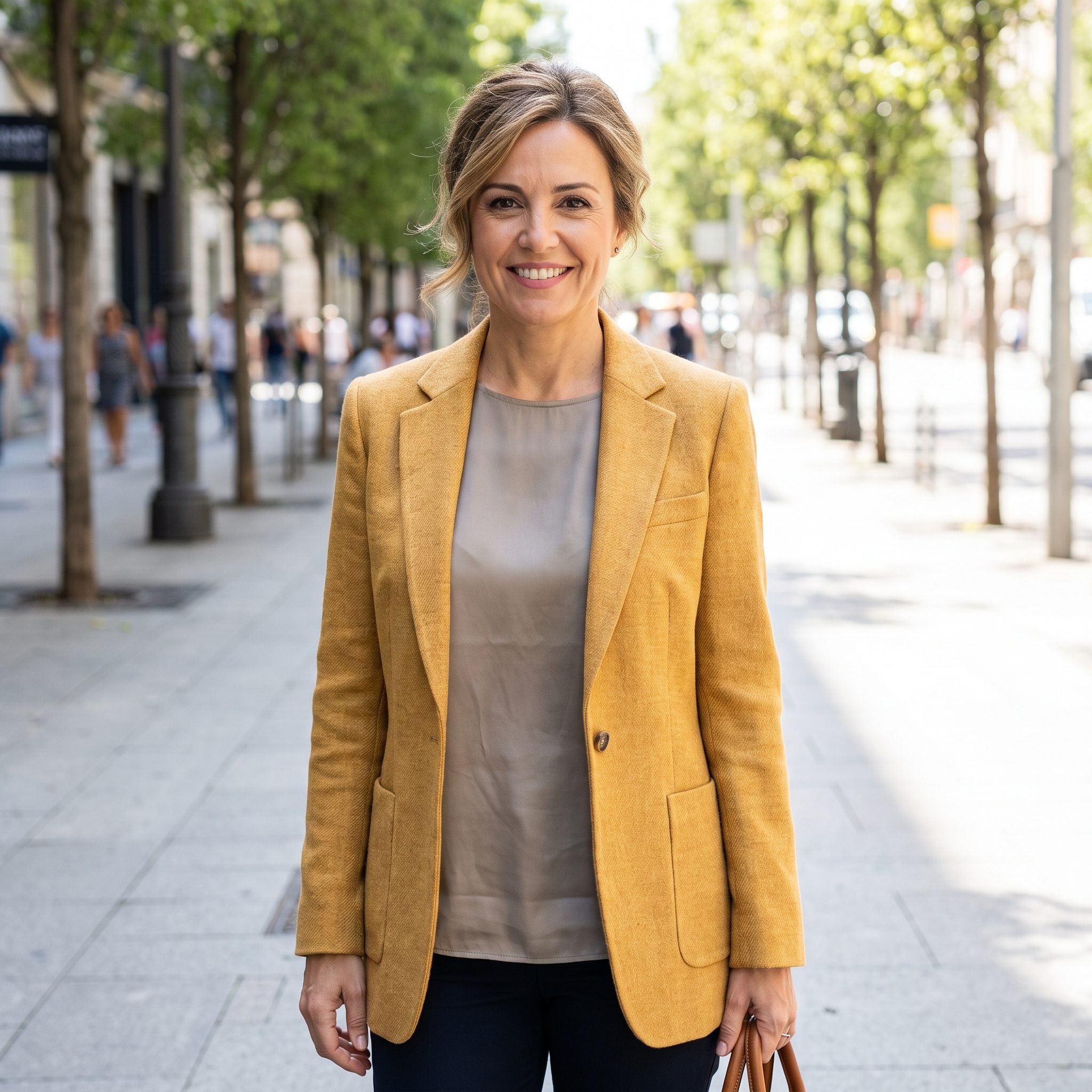
The trousers and loafers occupy the gray-beige territory of taupe and greige. The blazer carries a stronger yellow-gold undertone. Rather than continuing the subdued palette, it introduces a warmer layer that attracts attention.
Warm and cool neutrals can coexist beautifully when their differences are balanced. A cooler oatmeal or stone blazer would produce a more consistent tonal effect. Alternatively, a warm accessory could connect the golden jacket to the rest of the outfit. The shades needn’t be identical. They do need a convincing relationship.
16. Plum Has Competition From Two Mirror-Bright Boots
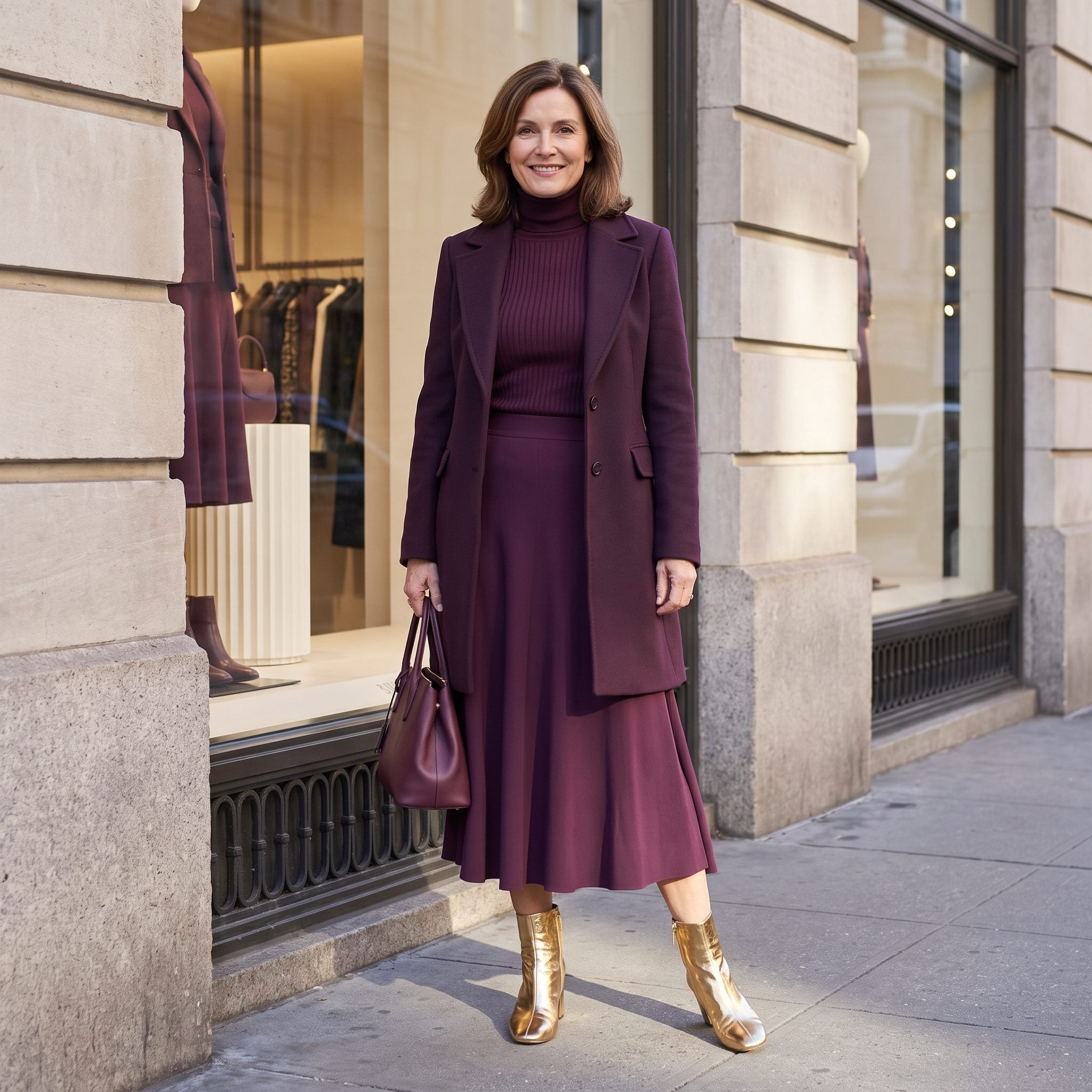
Plum, aubergine, and deep berry create a luxurious dark palette. The gold boots deliver an entirely different sensation: brilliant reflection against fabrics that absorb most of the light. They become the outfit’s unmistakable finale.
Gold and plum are compelling partners. Scale determines the result. A small metallic accent would enrich the purple; mirror-bright boots make a theatrical statement. Plum suede or deep-berry leather would extend the tonal silhouette. Keep the gold when the drama is the point.
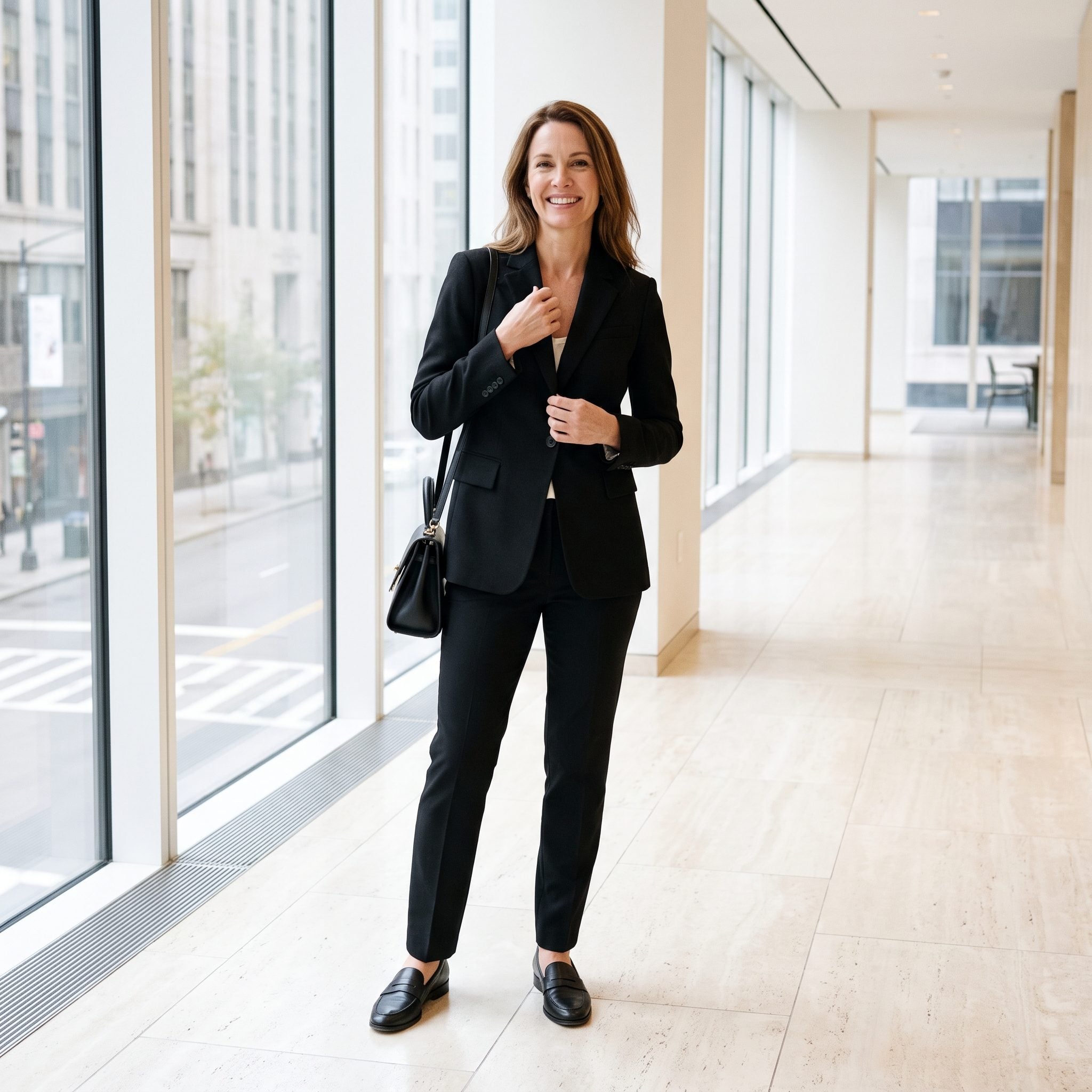
15. A White Camisole Changes the Language of a Black Suit
❤️ Would you like to save this?
The black blazer, trousers, and loafers create a sharply tailored foundation. A white camisole appears at the neckline and through the jacket opening, introducing a crisp black-and-white contrast where an entirely tonal outfit would remain dark.
That white underlayer can make black tailoring look exceptionally sharp. For a more continuous silhouette, a black silk camisole would keep attention on the cut and fabric. Charcoal offers a softer alternative. The white isn’t misplaced; it gives the suit a different visual rhythm.
14. Warm Olive and a Handbag That Runs Cold
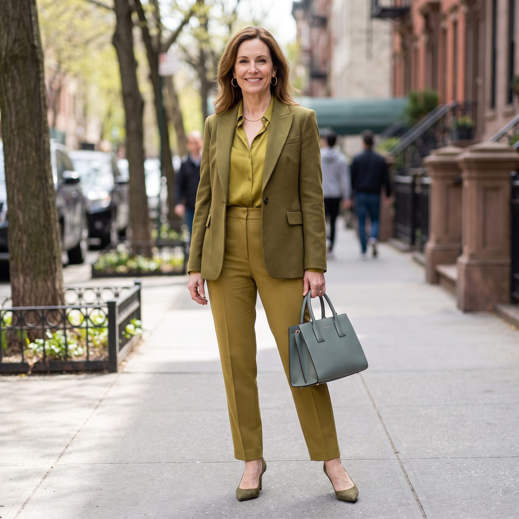
The blouse, trousers, jacket, and shoes share an earthy olive character. The handbag is green as well, although its gray-blue undertone makes it noticeably cooler. Two colors with the same family name end up speaking different dialects.
A warm olive or caramel leather handbag would reinforce the palette. Alternatively, another cool element could give the existing bag an ally. Mixed undertones can be sophisticated, especially when repeated deliberately. Here, the cooler green stands somewhat apart from its warmer companions.
13. Patent Boots Give Matte Brown a Sudden Shine
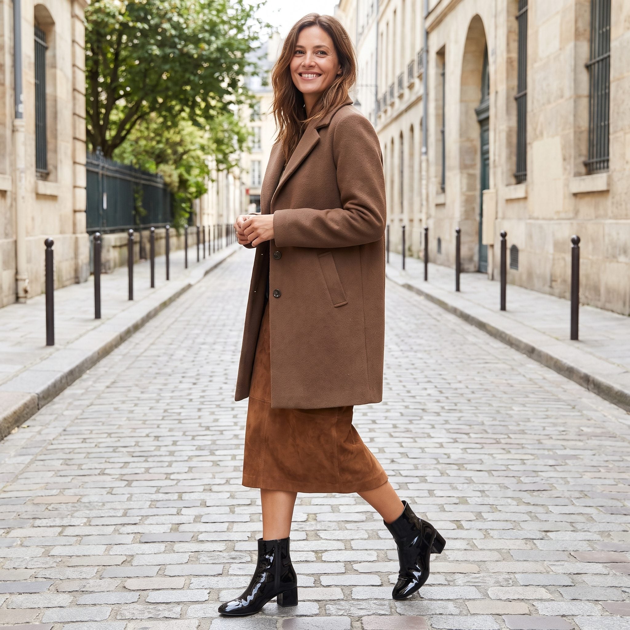
Chocolate wool and suede absorb light softly. The patent boots reflect it sharply. Although the browns belong together, the contrast in finish makes the footwear considerably more assertive than the clothing above.
Texture variation usually strengthens monochrome. Mirrorlike patent leather, however, creates a much stronger contrast than lightly polished leather. Another glossy accessory could make the boots feel more integrated, while matte brown footwear would preserve the subdued character of the outfit. Both approaches have their merits; the difference lies in how much attention the shoes deserve.
12. A Navy Column Meets a Scarf Full of Geometry
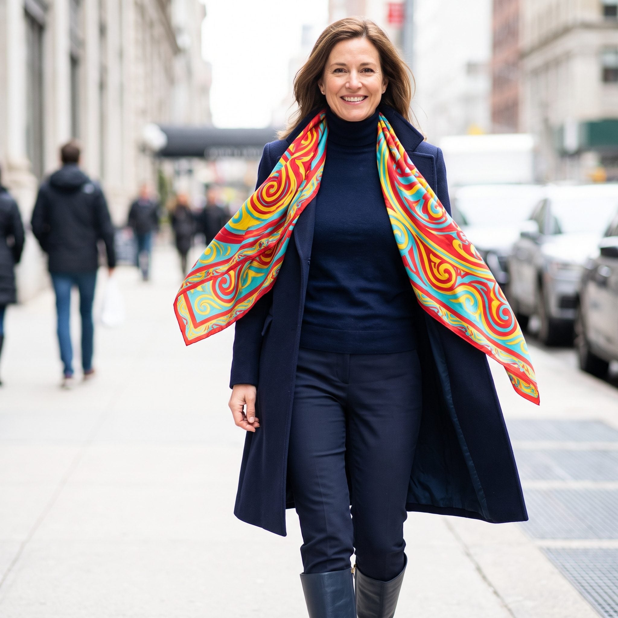
Deep navy runs through the outfit, creating a disciplined silhouette. The scarf shares the navy but adds bright white geometry around the neckline. Suddenly the most active part of the composition sits directly beneath the face.
Pattern near the face can be flattering and purposeful. A navy scarf with a low-contrast design or a different texture would offer interest without the graphic interruption. The existing scarf makes a more assertive choice, turning the neckline into the centerpiece of an otherwise quiet ensemble.
11. A Garden-Party Outfit That Turns Transparent in Daylight
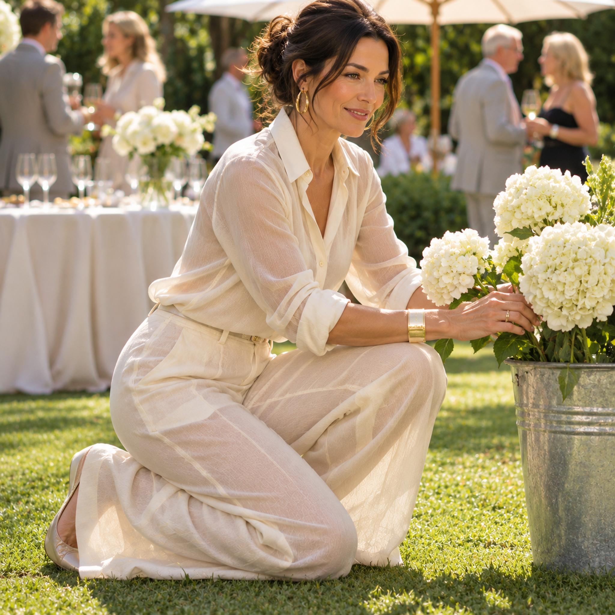
From a distance, the cream shirt and trousers create an airy, beautifully coordinated summer silhouette. Up close, daylight changes the equation. The lightweight trousers reveal the legs beneath, introducing variations in tone that the rest of the pale outfit doesn’t share. Instead of reading as one continuous cream composition, the lower half becomes noticeably more transparent.
Sheer fabric can be a deliberate fashion choice. For a polished, opaque monochrome look, however, the material needs to support the color story. A denser weave, suitable lining, or trousers designed for coverage would preserve the light palette without allowing transparency to dominate. Pale-on-pale dressing makes changes in opacity particularly noticeable.
10. Indigo Denim Meets a Vest From Another Wash Cycle

Deep indigo gives the shirt, jeans, and accessories a strong visual connection. The faded vest introduces a washed, grayish blue across the torso, changing the character of the entire combination.
Contrasting denim washes can look excellent when the difference is decisive. A distinctly lighter, sharply structured vest could become an intentional centerpiece. A dark indigo vest would preserve the saturated palette. This pale version occupies an uncertain middle ground, drawing attention without offering much contrast in shape.
9. The Dark Belt That Divides a Long Beige Line
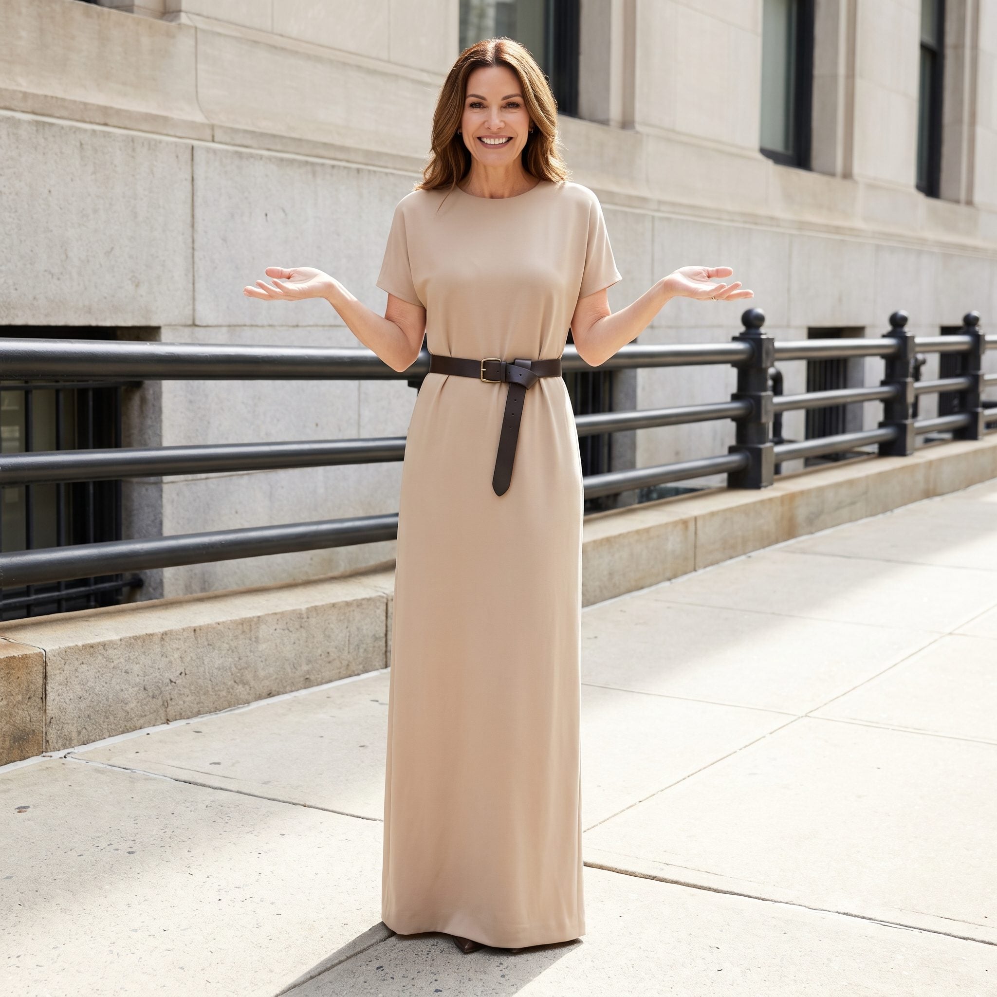
Beige runs from shoulder to shoe, building one long, uninterrupted silhouette. Then a thick chocolate belt draws a decisive horizontal across the waist. The proportions change immediately: less continuous column, more clearly defined upper and lower halves.
For maximum visual length, beige leather or a fabric self-belt would define the waist more discreetly. For stronger hourglass emphasis, the chocolate belt has an obvious advantage. One accessory can change the apparent proportions of an entire monochrome outfit without changing a single garment.
8. White Socks Turn Charcoal Into a Graphic Outfit
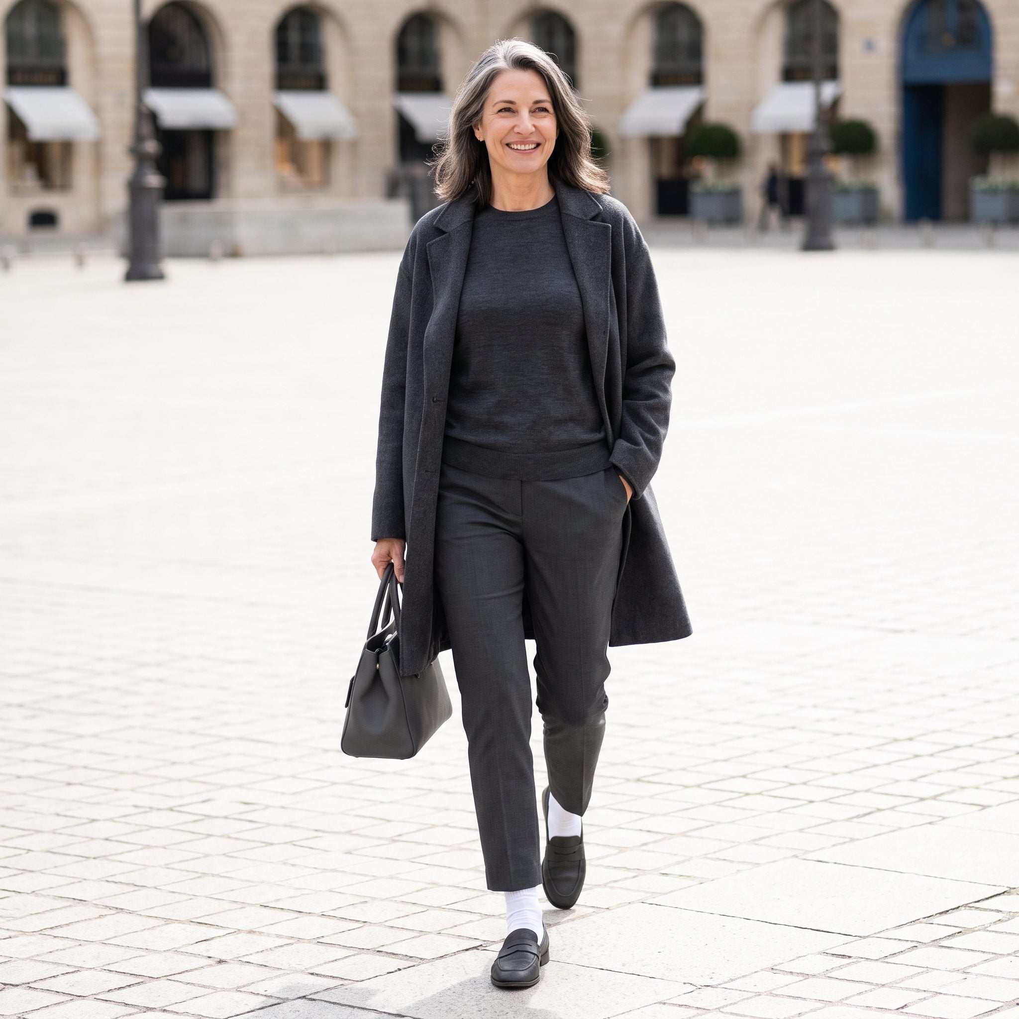
Charcoal clothing and dark loafers establish a subdued foundation. Then two bands of optic white appear above the shoes. The socks introduce a sporty, graphic detail that changes the character of the lower half.
White socks with loafers can be excellent styling, especially when a preppy or playful note is intended. For a longer, quieter line, charcoal socks would connect the trousers and shoes more discreetly. A detail occupying only a few inches can still alter the entire silhouette.
7. Neon Lime Turns a White Outfit Into a Color-Block Experiment
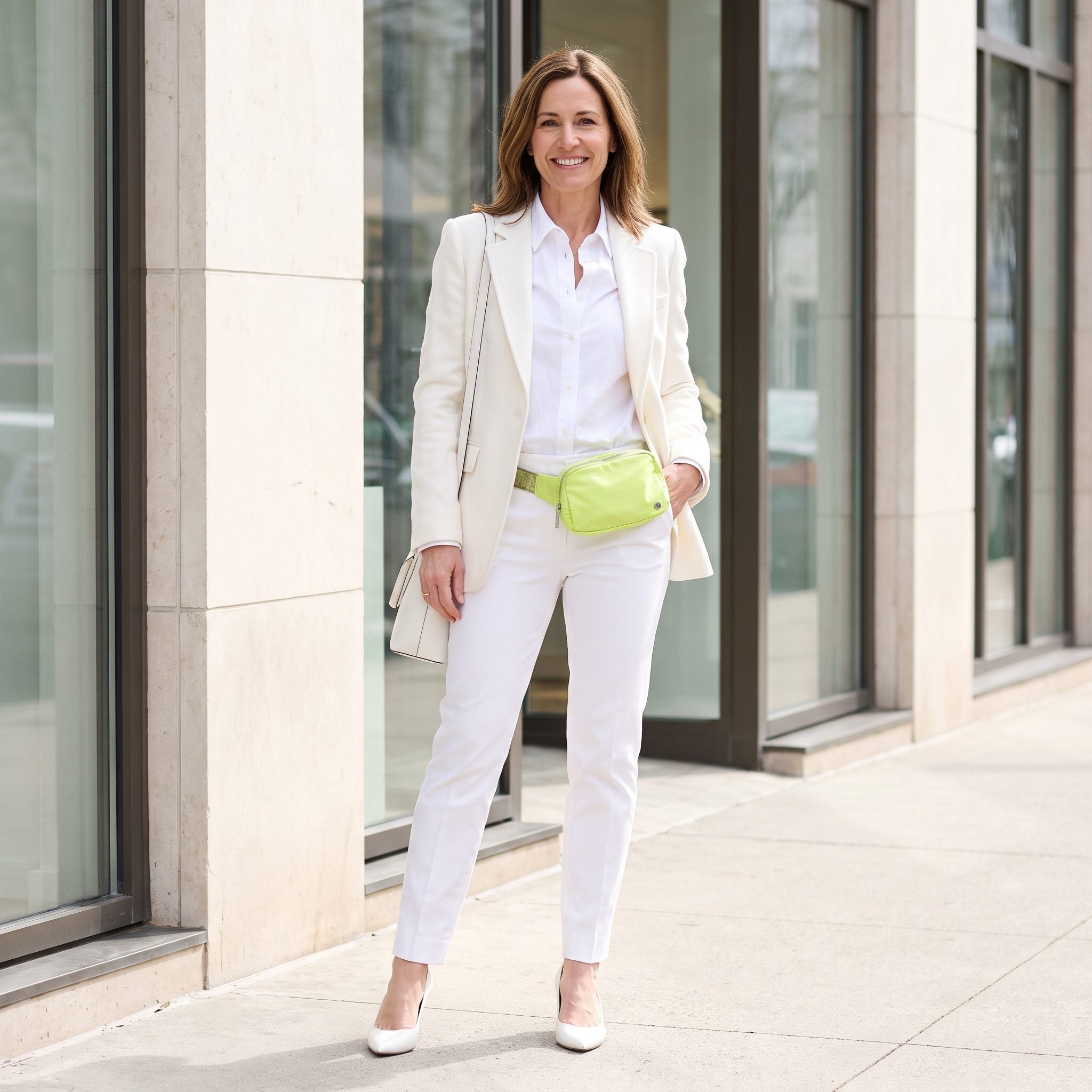
White provides the cleanest possible background for neon lime. The belt bag cuts diagonally across the torso, transforming a minimal outfit into something graphic and energetic. Its color and placement make it considerably more than a small accessory.
A bright accent doesn’t require a matching companion. Here, though, the bag dominates the composition. A narrower design or softer green would reduce its impact, while ivory or tan would return the outfit to its tonal roots. The lime works as a statement; subtlety was never part of its assignment.
6. Five Browns With No Clear Leader
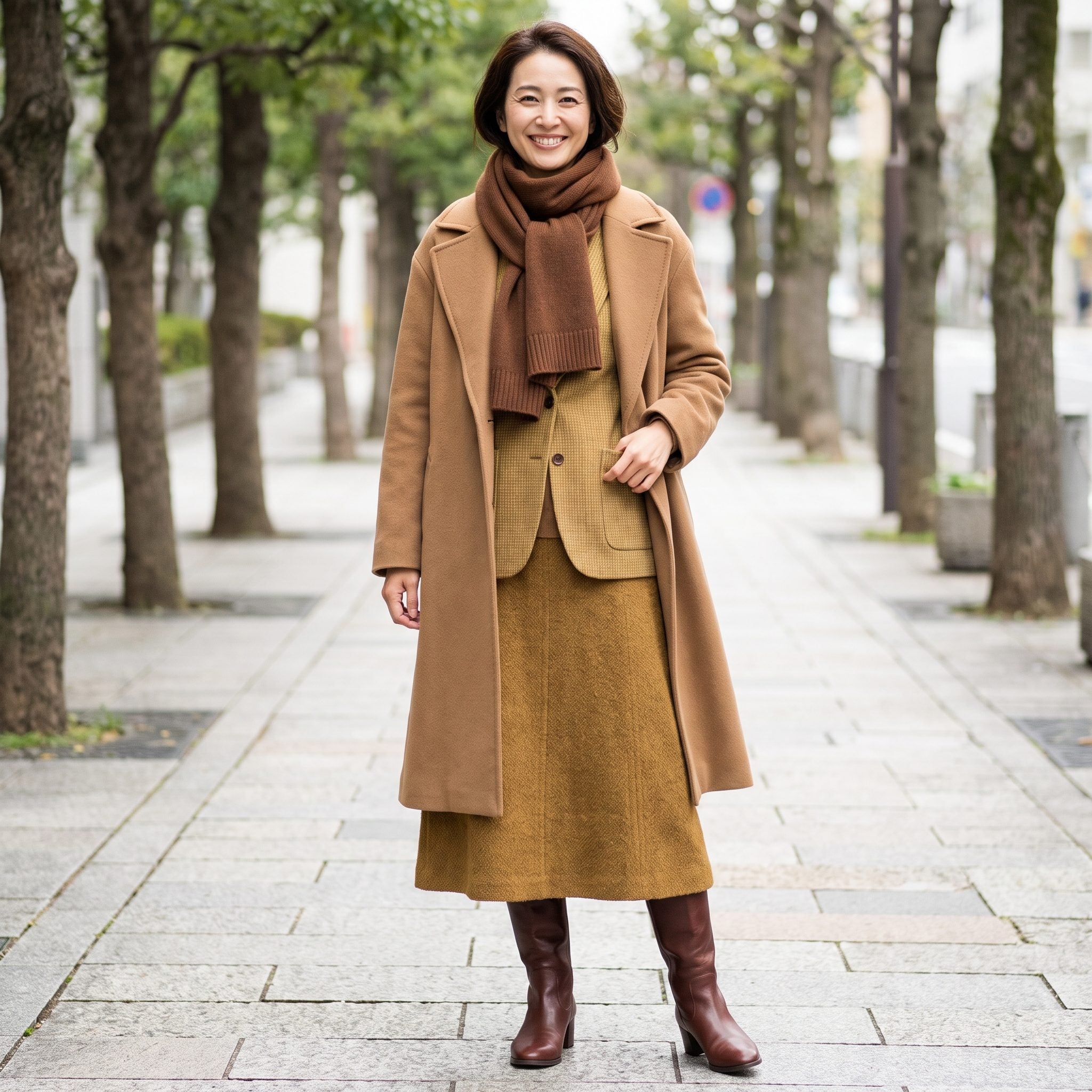
Chestnut, yellow camel, cool taupe, and orange-leaning cognac make this outfit more complicated than its all-brown description suggests. The shades differ in warmth, depth, and saturation, yet none establishes an obvious direction for the others.
Mixed browns can look rich when they form a recognizable progression. Deep chocolate with cognac and camel is one possibility; taupe with mushroom and espresso is another. A dominant undertone or more decisive contrast between the pieces would give this combination greater coherence. Without either, the palette seems undecided.
5. White Sneakers Give an All-Black Outfit a Different Ending
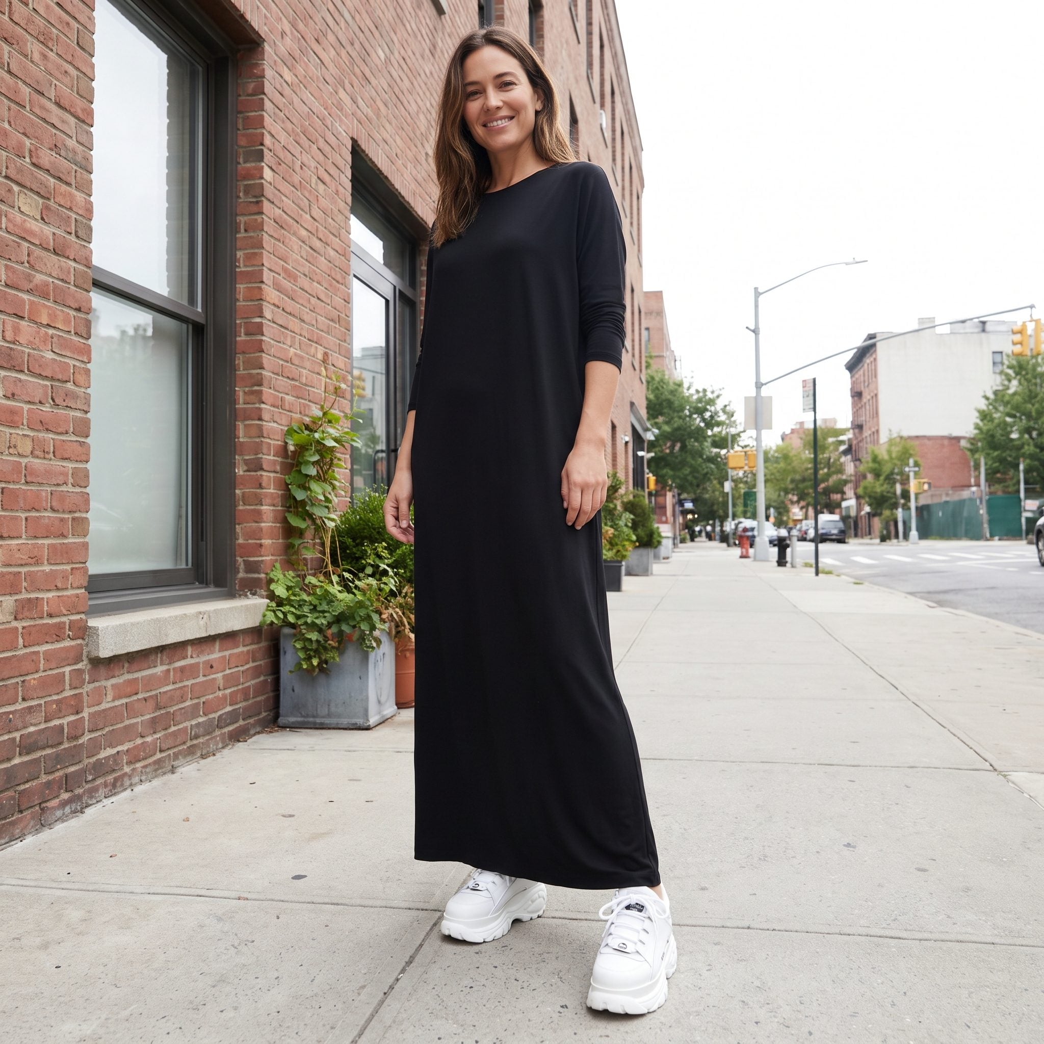
The black leather coat establishes a sleek, elongated silhouette. At the bottom, chunky optic-white sneakers introduce both a sharp color change and considerable volume. The outfit shifts from streamlined tailoring to something deliberately sporty.
White sneakers with black are hardly a fashion offense. Their shape makes the difference here. A slimmer off-white sneaker would soften the transition, while black footwear would preserve the uninterrupted line. The chunky pair creates a more casual, graphic finish, making the shoes part of the outfit’s identity rather than an afterthought.
If you do go for contrast sneakers, white is the slight favourite: in our reader polls, 53% picked white sneakers over coloured ones.
4. Dusty Rose, With Black Lingerie Making an Unplanned Appearance
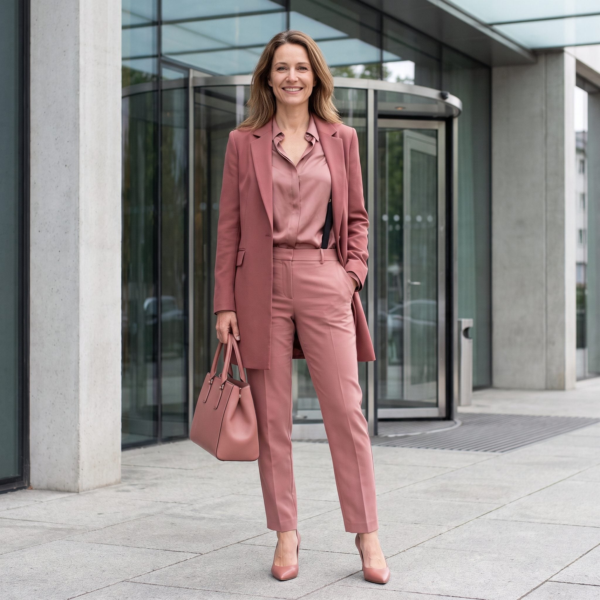
Dusty rose moves gently through the blouse, trousers, and blazer. Then black bra straps appear at the shoulders, with darker areas visible beneath the lightweight fabric. Unlike a deliberately contrasting belt or handbag, these details have a less clearly defined role in the composition.
A seamless bra close to the wearer’s skin tone would be less visible beneath the pale blouse, allowing the rose palette to retain its soft finish. An intentionally exposed black bra could create a completely different look, provided the clothing supports that contrast. Here, the underlayer introduces a sharper note than the rest of the outfit suggests.
3. Black, Interrupted by a Wide Camel Belt

❤️ Would you like to save this?
The black turtleneck, blazer, and trousers create a strong vertical silhouette. The wide camel belt introduces a warm horizontal accent, making the waist the focal point and dividing the dark outfit into distinct sections.
That definition can be flattering, particularly when the belt’s proportions suit the jacket and trousers. A slim black belt or fabric self-belt would emphasize the waist more discreetly. Camel gives the outfit a pronounced center; black would allow the tailoring to remain the main attraction. The same clothes, two entirely different impressions.
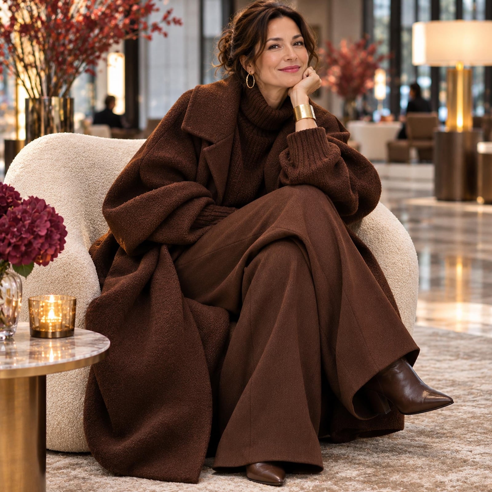
2. When Monochrome Volume Becomes the Whole Statement
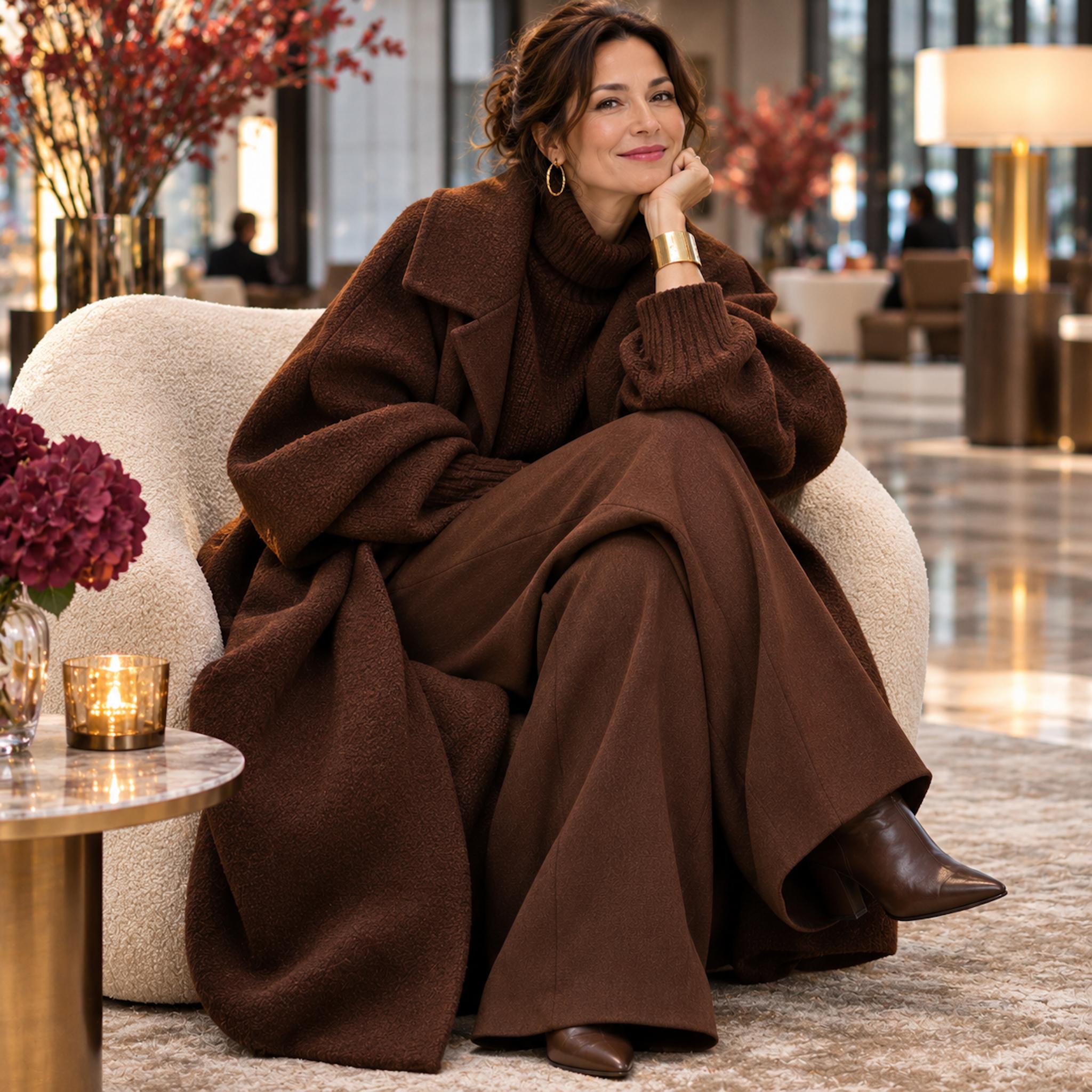
Chocolate brown has taken over the entire silhouette, and the effect is unapologetically dramatic. The generously cut coat, substantial knit, and wide trousers create an enveloping shape that feels luxurious rather than conventionally tailored. The rich color holds everything together, while variations in fabric give the layers their individuality.
There is a trade-off. A fitted knit beneath the coat would introduce definition. Narrower trousers would sharpen the lower half. Neither adjustment is compulsory: the generous proportions are central to the outfit’s character. Monochrome can make dramatic volume feel cohesive, although it cannot decide how much shape the wearer wants to reveal. That remains a matter of proportion, preference, and intent.
1. Cream From Head to Toe, Black Pumps at the Finish
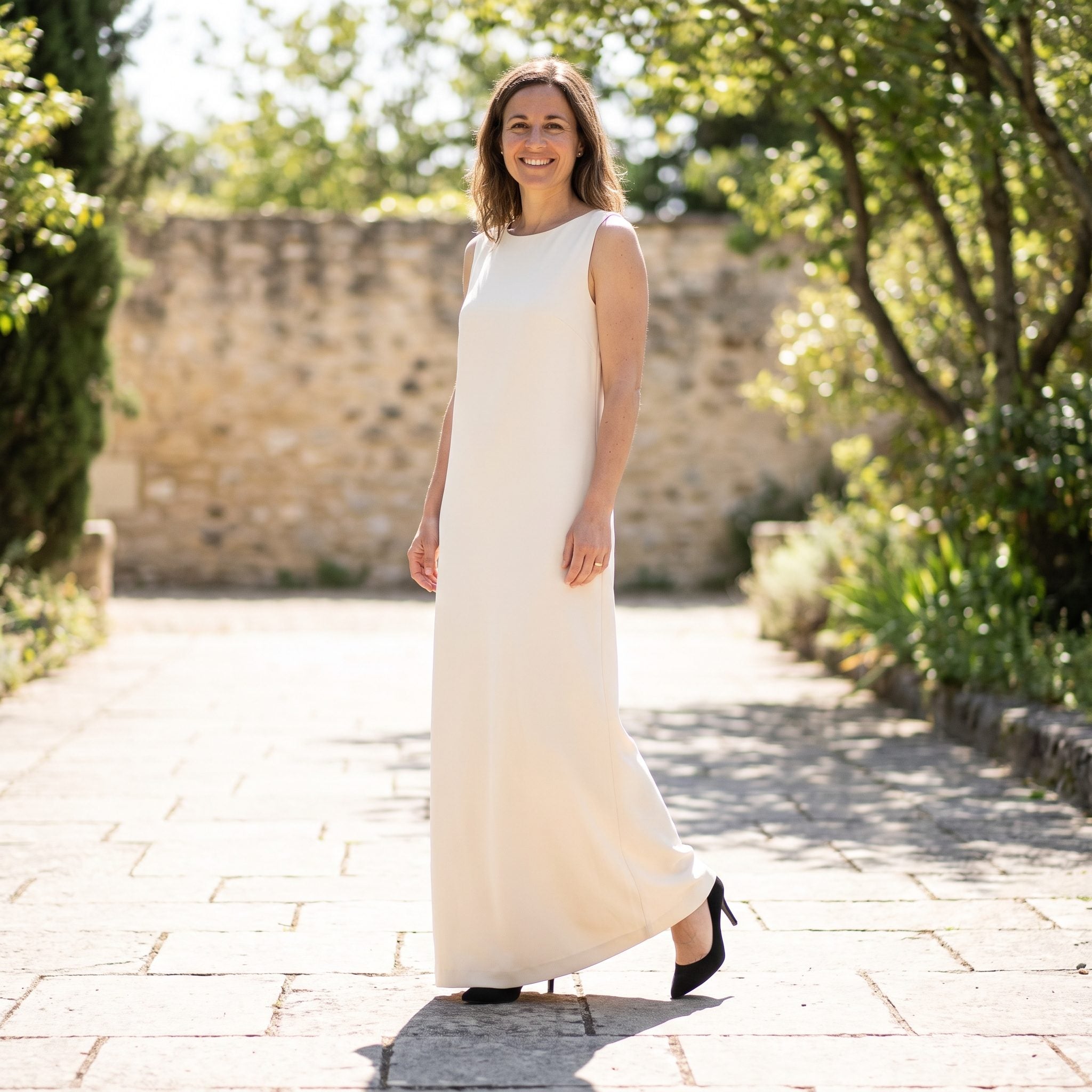
The cream coat, knit, and trousers establish a pale, uninterrupted silhouette. Black pointed-toe pumps introduce a dramatic finish, drawing attention to the feet and creating a stronger division between the trousers and footwear.
Black pumps can give cream clothing a sophisticated graphic edge. For a softer, more elongated tonal effect, cream leather pumps, beige, or shoes close to the wearer’s skin tone would produce a gentler transition. Neither choice changes the quality of the clothes. One makes the footwear the final punctuation mark; the other lets the cream silhouette continue uninterrupted.