❤️ Would you like to save this?
Winter is all about bundling up and looking effortlessly chic—but let’s be honest, not every color combo works when the temperatures drop. Stylists say that some shades can make even the most glowing skin look dull, tired, or straight-up ghostly. The problem? Many of us reach for the same “safe” hues without realizing they’re secretly sabotaging our look.
To save your winter wardrobe from the fashion graveyard, we’ve rounded up 30 color pairings that stylists swear can drain your complexion instantly. From frosty blues that make you look like you belong in The Walking Dead to beige-on-beige combos that scream “beige personality,” here’s what to avoid (or fix fast).
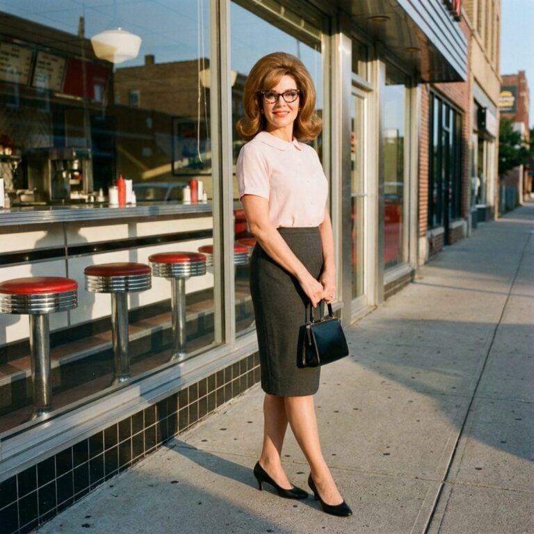
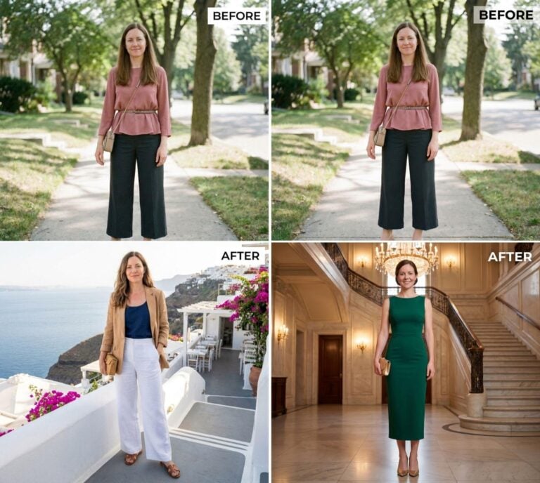
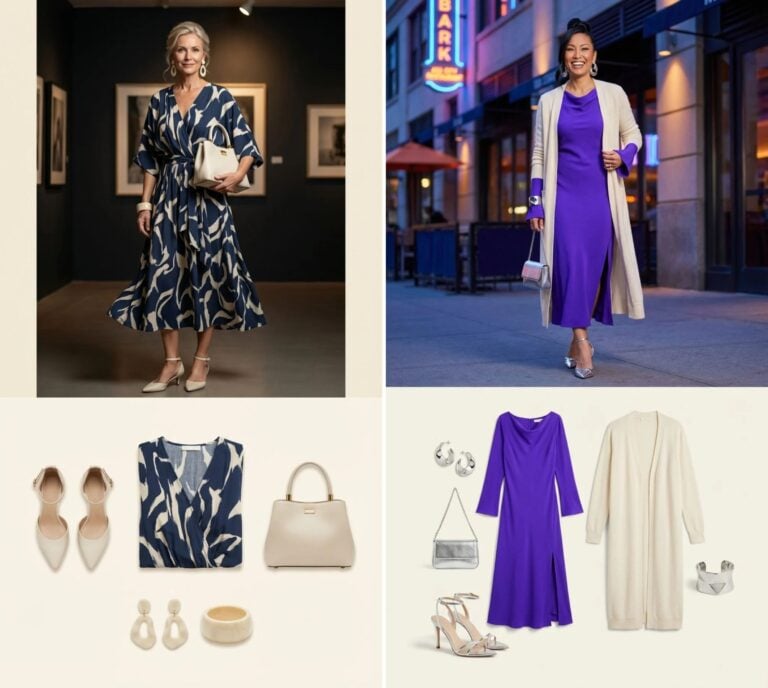
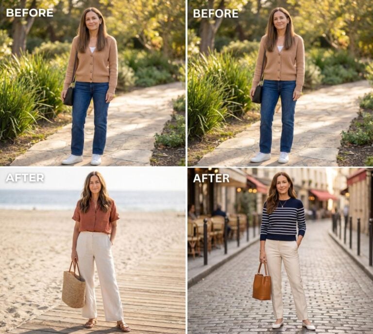
FYI, thanks to AI imagery software, we’re able to create very specific fashion and hairstyle examples to illustrate the points being made. In some cases, imagery is exaggerated to hammer home the point. Also, assume links that take you off the site are affiliate links such as links to Amazon. this means we may earn a commission if you buy something.
30. Frosty Blue + Silver: The Elsa Effect Nobody Asked For

This icy pairing can leave you looking more snowstorm than snow queen. The blue and metallic tones bounce off cool skin tones in all the wrong ways. Add warmth with cream or blush accents to bring life back to your face.
29. Charcoal Gray + Black: The Vampire Office Combo

It’s sleek on paper, but in practice, this mix can make your complexion look like it’s been on a night shift since 2003. Without contrast, everything blends into one moody blur. Stylists recommend a pop of color—anything that suggests you’ve seen sunlight.
28. Beige + Olive: The Military Fatigue Misfire

🔥 Discover how people are putting together the perfect wardrobes and outfits with this new method =>
While chic in theory, this earthy duo tends to flatten the face and erase definition. Instead of edgy, you end up looking camouflaged into your coat. Lighten up with gold or ivory to restore some human warmth.
27. White + Pastel Pink: Washed Out and Worried

It’s giving “laundry day meets baby shower.” The softness of both tones can fade your natural glow completely. Swap the white for a deeper neutral like camel for instant revival.
26. Burgundy + Forest Green: The Festive Hangover

A great December combo—until January hits and you still look like holiday décor. These heavy tones can cast shadows on your skin. Break them up with lighter neutrals or metallics for balance.
25. Dusty Lavender + Gray: Grandma’s Couch Chic

This muted mix drains color from the cheeks faster than a winter wind. It’s all undertones and no energy. Stylists say to add contrast with crisp white or navy.
24. Brown + Mustard: Cozy but Complexion-Killing

This combo screams “pumpkin spice regret.” Warm tones can clash with pink undertones, making skin appear splotchy. Go for caramel or honey instead of dark brown.
23. Pale Blue + White: The Frostbite Special

Sure, it’s “clean,” but this pairing can make your skin look freezer-burned. Both colors lack depth, leaving your face looking flat. A rich navy or cream sweater can thaw the look instantly.
22. Taupe + Mauve: Fifty Shades of Meh

This muted mix looks sophisticated in theory, but drains life from medium and warm skin tones. The problem? Zero contrast. Add a punchy accessory—berry, coral, or even metallic—for rescue.
21. Camel + Gray: The Boardroom Blah

These neutral giants cancel each other out and leave you looking “office beige.” Without dimension, your skin tone gets lost in the monotone mess. Swap gray for navy or camel for chocolate brown.
20. Olive + Black: The Swamp Thing Situation

Stylists agree this pairing can make your complexion look murky, especially in harsh lighting. The darkness of both shades sucks warmth from your face. Try breaking it up with cream or gold accents.
19. Navy + Maroon: The Moody Academia Trap

This combo feels smart but can look severe on anyone without strong contrast in their complexion. Too many deep tones equal “drained and distant.” Add crisp white or tan to break up the gloom.
18. Charcoal + Lilac: Soft Goth Gone Wrong

❤️ Would you like to save this?
These colors look cool until you realize they’re washing your face into oblivion. The muted violet absorbs light while gray reflects none. Introduce something bright—like silver jewelry or plum lips—to bring it back.
17. White + Tan: The Ski Lodge Mirage

It’s the “I just came from Aspen” palette that looks chic only on paper. In reality, the warmth of tan next to stark white can make your skin appear sallow. Opt for off-white or camel instead.
16. Black + Khaki: Tactical, Not Trendy

Unless you’re joining a minimalist SWAT team, this combo can make you look drained. The contrast is too harsh and brings out greenish undertones. Trade khaki for cream or tan for better balance.
15. Ice Gray + Baby Blue: The Glacial Disaster

This wintry pair turns anyone’s complexion to frostbite chic. Pale tones on pale skin equal no dimension. Stylists say a hit of navy or warm beige can warm up your aura.
14. Cream + Blush Pink: The “I’m Fading” Formula

Both hues are too similar to natural skin tones, erasing definition entirely. Instead of “soft and romantic,” you get “accidentally ill.” A swipe of berry or bronze saves the look.
13. Olive + Burgundy: The Holiday Leftover Combo

It’s elegant in theory, but the undertones fight for dominance. The result? A face that looks shadowed and tired. Stick to lighter greens or richer reds instead.
12. Charcoal + Brown: The “Did You Fall Asleep in the Closet?” Pair

Dark on dark leaves no room for vibrance. Stylists call it a “dimension destroyer.” Add a crisp shirt or bright scarf to remind people you’re awake.
11. Dusty Blue + Beige: Cloudy with a Chance of Meh

The soft pairing drains warmth from your skin like it’s paying rent. You end up looking washed out even with perfect makeup. Swap beige for ivory or a deeper neutral.
10. Gray + White: The Laundry Day Disaster

This “clean aesthetic” combo makes you look like you’ve just lost a fight with a snowstorm. Both colors highlight undereye shadows. Toss in a warm accessory or rich lip to fix it fast.
9. Forest Green + Navy: The Invisible Glow

Both tones are deep and cool, which can make skin look flat in winter light. Without brightness, even the healthiest glow disappears. A pop of cream or tan can lift everything up.
8. Beige + Blush: The Skin-Tone Sandwich

Stylists groan at this one because it blends right into your complexion. Unless you’re aiming for mannequin chic, you’ll need contrast. Throw on gold jewelry or a bold lip for survival.
7. Chocolate Brown + Plum: The Moody Overload

It’s rich, but not in the good way. These shades together can turn warm undertones muddy. Try pairing one with cream or gold for balance.
6. White + Silver: The Polar Bear Problem

❤️ Would you like to save this?
This high-shine duo bounces too much light, exaggerating cool undertones. Instead of glowing, you get ghostly. Swap silver for pewter or white for ivory.
5. Black + Purple: The Bruised Aura

Stylists say this edgy combo works for vampires, not real life. The cool darkness around your face can make your complexion appear sullen. Lift it with lavender or lighter neutrals.
4. Charcoal + Navy: The “Corporate Funeral” Ensemble

It’s meant to look sleek, but it mostly looks like you forgot to separate your laundry. Both colors flatten skin tone and create zero brightness. Add white or camel for life support.
3. Pale Yellow + Gray: The Smog Surprise

It’s giving “polluted sunshine.” The gray dulls the yellow and your skin along with it. Stylists suggest pairing yellow with cream or tan to keep it flattering.
2. Beige + White: The Ghost of Winter Past

This tone-on-tone look wipes out definition, especially in dull winter light. You’ll blend into the walls faster than you can say “oat milk latte.” Bring it back with texture or contrast.
1. Pale Gray + Pale Pink: The Eternal Flu Face

Stylists unanimously agree—this combo is a one-way ticket to looking tired. The muted tones mimic the exact hues of low blood pressure. Save yourself with coral, navy, or literally any color with pulse.