❤️ Would you like to save this?
You’ve done it before. You spotted someone across a restaurant and, before a single conscious thought formed, your brain whispered: that looks like 2008. Not the cut. Not the shoes. The colors. Something about that specific pairing of hues acted like a date stamp printed on the inside of your eyelids. The whole read took less than a second.
Here’s what’s strange: you probably can’t explain why that combination felt locked to a particular era. You just knew. And so did everyone else in the room who grew up absorbing the same visual culture you did. Your brain is running a color-dating algorithm you never installed and can’t fully override. It pulls from advertising, film palettes, retail displays, and thousands of forgotten outfit sightings stored in your visual memory.
What follows is the psychology behind that instant read, why certain pairings trigger it, and the surprisingly emotional reasons some of us keep returning to the “wrong” colors anyway.
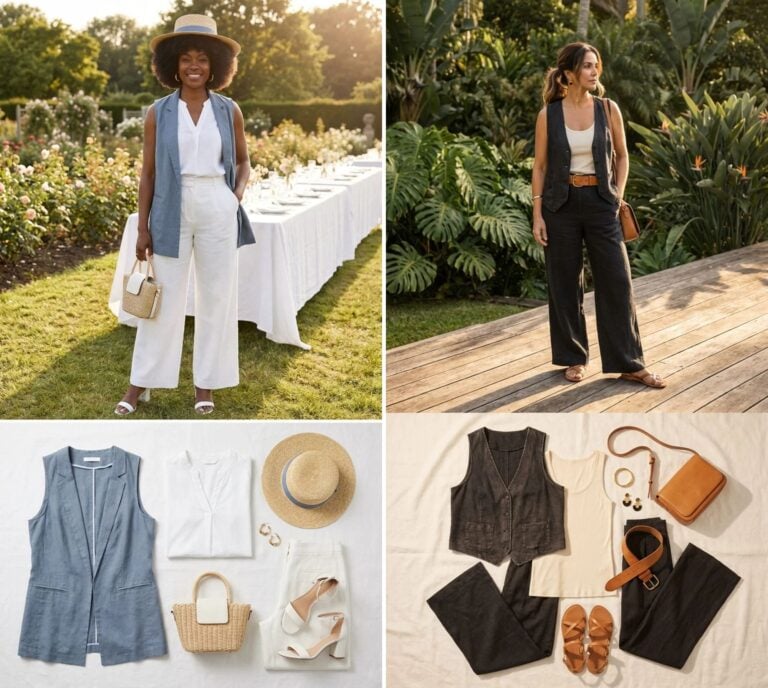
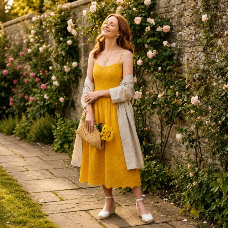
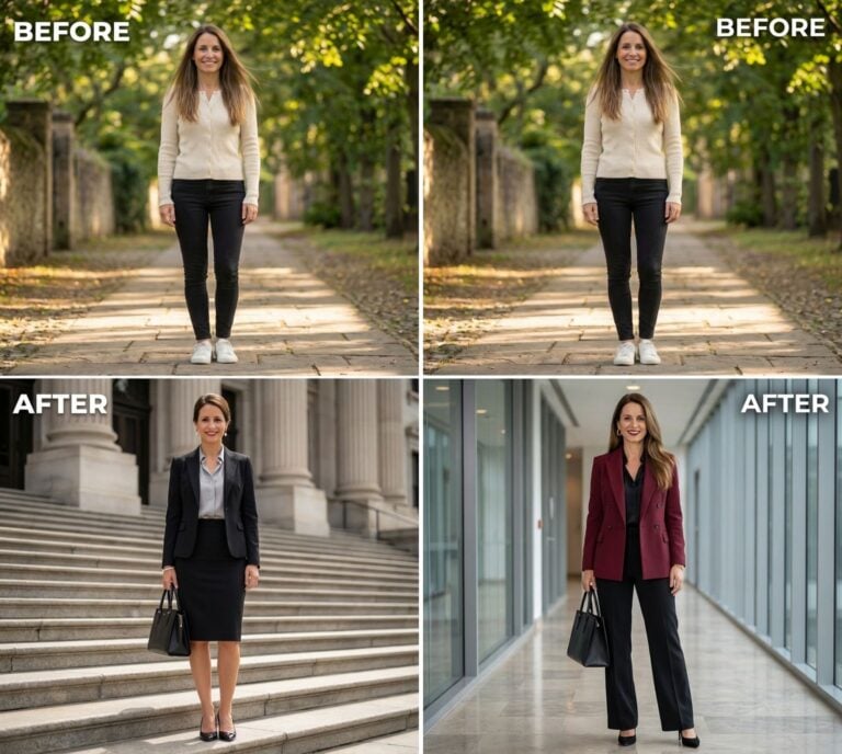
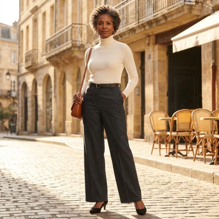
FYI, thanks to AI imagery software, we’re able to create very specific fashion and hairstyle examples to illustrate the points being made. In some cases, imagery is exaggerated to hammer home the point. Also, assume links that take you off the site are affiliate links such as links to Amazon. this means we may earn a commission if you buy something.
The Silent Era Code Your Brain Reads in Under Half a Second
Your brain is faster than you think, and it’s judging color before your conscious mind even registers the outfit. Research from MIT’s Brain and Cognitive Sciences department found that the human brain can process entire images in as little as 13 milliseconds, far faster than the 100 milliseconds scientists previously believed (Source). That means the color combination on your blouse and trousers has already been categorized, filed, and assigned an era before you’ve finished walking through the door.
Color pairings carry temporal codes the way accents carry geography. A particular shade of teal next to a specific mauve doesn’t just read as “two colors together.” It reads as a decade, a sensibility, a cultural moment. Your brain cross-references that combination against thousands of stored visual memories, and the verdict arrives almost instantly. The person across the room doesn’t think “that’s a 1992 palette.” They just feel something is slightly off-tempo, like hearing a song in the wrong key.
Why Certain Pairings Trigger an Involuntary ‘Time Stamp’ in Your Memory
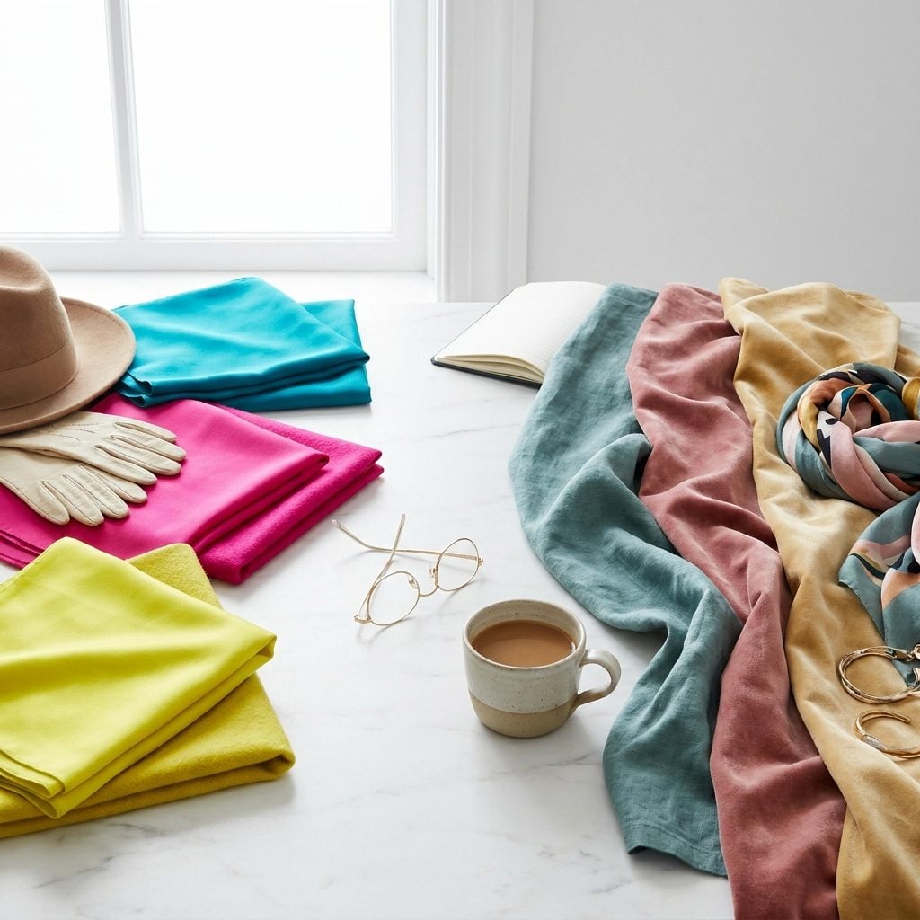
Think about avocado green and harvest gold. Before you even finish picturing them together, you’re in a 1970s kitchen. That reaction isn’t random; it’s the result of what neuroscientists call “color-era binding,” where specific palettes become permanently fused with the cultural moments that saturated us in them.
Retro colors carry what one analysis described as “cultural weight” because they aren’t just aesthetic choices but “time capsules of entire eras’ hopes, fears, technological capabilities, and social movements” (Source). Before digital color correction and modern synthetic dyes, each decade’s palette was constrained by available materials and printing techniques. Those limitations created color combinations so specific they became temporal fingerprints. Your brain stored them alongside every TV show, magazine cover, and department store display from that period. Now, decades later, encountering that exact combination triggers an involuntary recall so specific it functions like a date stamp pressed into the fabric itself.
The Decade Your Color Instincts Got Locked In (And Why You Keep Returning There)
🔥 Discover how people are putting together the perfect wardrobes and outfits with this new method =>
There’s a window, roughly between ages 15 and 25, when your aesthetic sensibilities crystallize. Psychologists call it the “reminiscence bump,” and it explains why you still gravitate toward the color palette of your formative years even when you know, intellectually, that it’s no longer current. Fashion psychologist Shakaila Forbes-Bell has observed that nostalgia cycles are shortening, with consumers increasingly drawn to “near vintage” items from their own childhood rather than eras before they were born (Source).
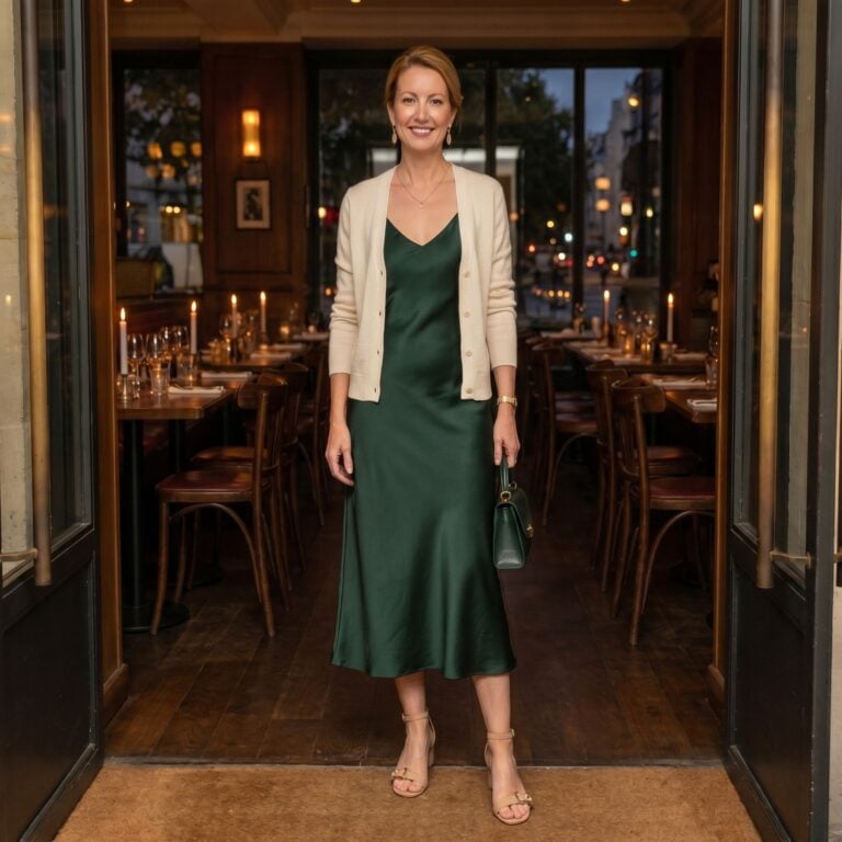
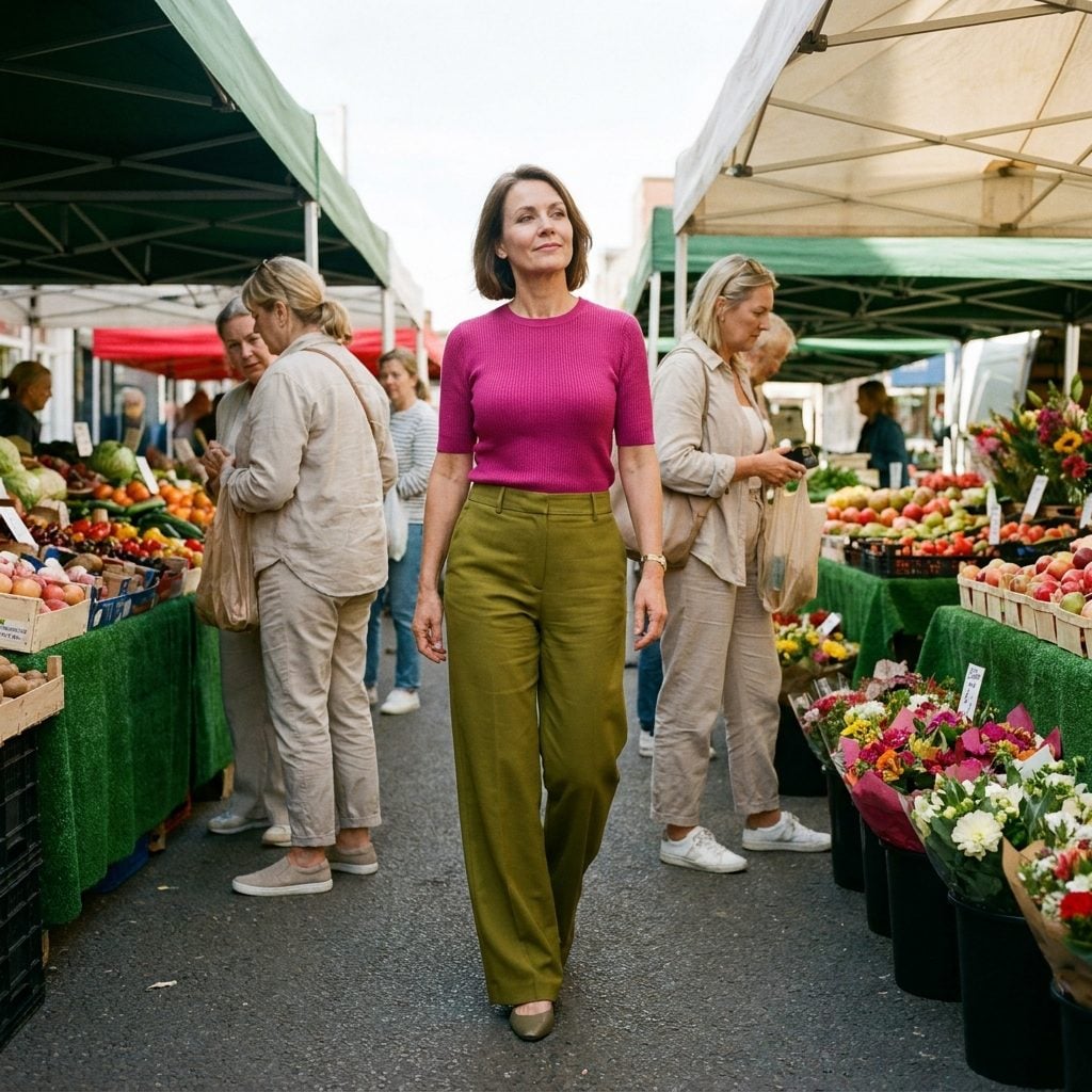
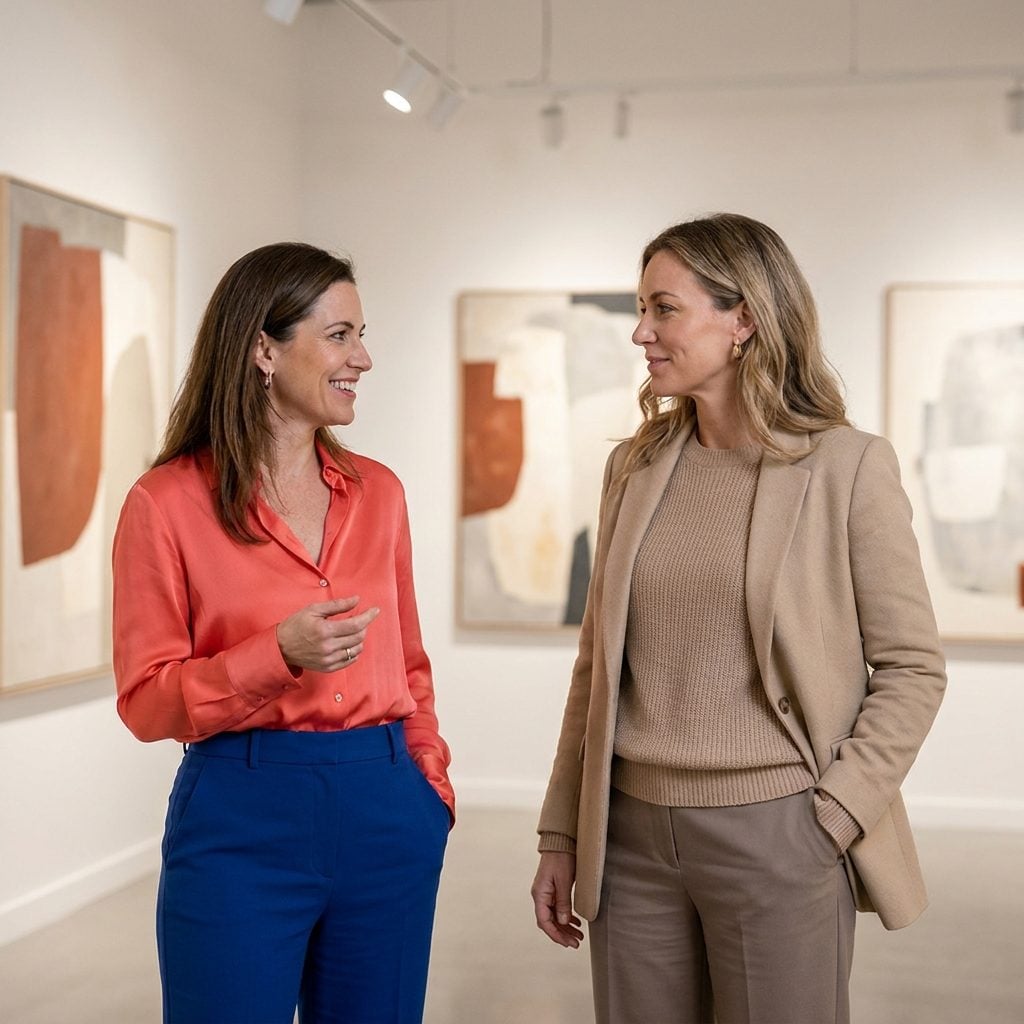
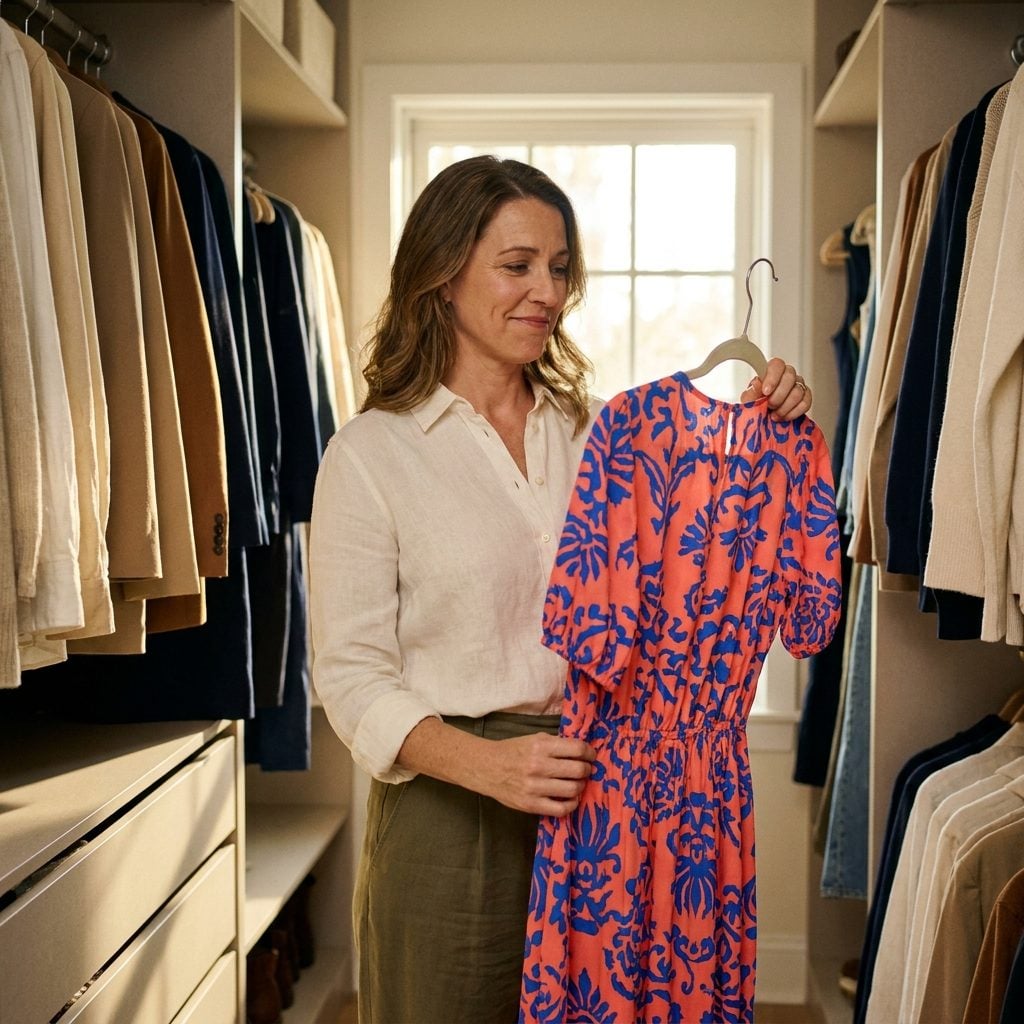
For women over 40, this creates a fascinating tension. Your locked-in palette might be the jewel tones and power brights of the late 1980s, or the muted earth tones and grunge-adjacent burgundies of the early 1990s. You reach for these combinations because they feel like home. They feel like you. But here’s the puzzle piece this section adds to the larger question: the very color pairing that makes you feel most like yourself might be the one that announces your generational coordinates to every woman in the room who shares the same visual vocabulary.
The Neurological Shortcut That Makes Some Combinations Feel ‘Off’ Without You Knowing Why
Your brain is a pattern-completion machine. It doesn’t evaluate each color in an outfit independently. Instead, it reads the combination as a single gestalt and then runs it against an internal database of “currently acceptable” palettes. A landmark study published in PLOS ONE found that people judge outfits most favorably when colors are “moderately matched,” following what researchers called a Goldilocks principle that balances simplicity and complexity (Source).
But here’s what that study doesn’t quite capture: “moderately matched” is a moving target. The combinations that felt balanced in 2004 don’t register the same way in 2026 because the reference pool against which your brain compares has been completely refreshed. A coral and cobalt pairing once felt like a perfectly calibrated contrast. Now your brain flags it, subtly, as belonging to a different era’s color logic. You can’t articulate why it feels dated. You just sense friction where there used to be harmony.
The Color Pairing That Became a Cultural Punchline, And What It Actually Signals About Identity
Some color combinations don’t just date you. They became cultural shorthand for an entire identity.
Psychologists Jonah Berger and Chip Heath demonstrated in a 2008 study that people actively abandon cultural tastes when dissimilar outgroups adopt them, specifically to avoid being misidentified (Source). Their research found that people “diverge to avoid signaling undesired identities,” sometimes dropping a preference they genuinely enjoyed rather than risk being grouped with the wrong crowd. In fashion terms, this is how a perfectly good color pairing becomes radioactive. It’s not that the colors stopped looking nice together. It’s that wearing them started to say something about who you were, or more painfully, who you weren’t.
Consider how certain neon-on-black combinations became permanently coded as “trying too hard” once they migrated from club culture to suburban mall culture. The colors didn’t change. The signal did. And for women over 40, this dynamic cuts both ways: you might be avoiding a combination you love because it now signals a group identity you don’t want to claim, or you might be wearing one without realizing it already carries that freight.
The Reason Your Eye Immediately Jumps to One Woman in a Room Full of Similar Outfits
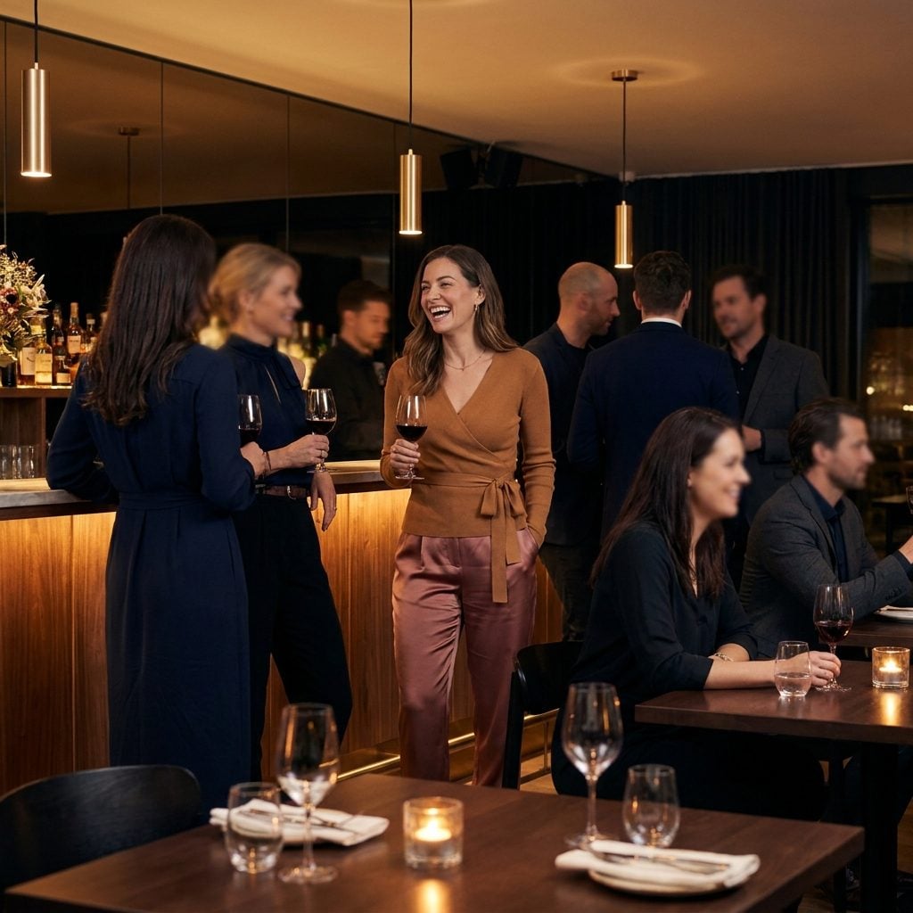
In a room full of women wearing navy, black, and grey, your eye will land on a specific person almost immediately, and it won’t be because she’s the loudest dresser. It’ll be because something about her color combination creates what perceptual psychologists call a “pop-out effect.” Color information activates brain regions tied to visual semantic memory, helping us not just see but categorize and assign meaning to what we’re seeing almost instantaneously (Source).
The woman your eye finds first is often the one whose palette is slightly asynchronous with the room’s collective color grammar. Not wrong, exactly. Just different enough to create a tiny spark of neural interest. This is the paradox at the heart of the article’s central question: the combination that dates you is often the same combination that makes you visible. And visibility, for women over 40, is a deeply loaded psychological proposition. Do you want to blend with the current palette and risk disappearing? Or do you wear your own color truth and accept the timestamp it carries?
How the Fashion Industry Weaponizes Color Fatigue Against You
Here’s something the industry doesn’t advertise: the reason last season’s “it” color feels unbearable this season is manufactured. It’s called perceived obsolescence, and the fashion industry has refined it into a precision instrument. The constant introduction of new colors, silhouettes, and trends creates what researchers describe as “a sense of urgency and inadequacy, prompting consumers to discard perfectly functional clothing” (Source). The mechanism is simple: saturate the market with a color combination, promote it relentlessly for two seasons, then abruptly pivot. Your brain, wired to respond to novelty with a dopamine hit, now associates the old palette with staleness (Source).
Brands like Zara and H&M release 12 to 24 collections annually, at least twice the traditional industry pace. Each new drop resets the color baseline. The combination you bought eight months ago isn’t worn out. It’s been psychologically decommissioned. For women over 40 who have watched this cycle spin for decades, there’s power in recognizing the mechanism. The pairing that “dates” you might simply be the one the industry decided to abandon, not because it failed aesthetically, but because your continued satisfaction with it was bad for business.
The Psychological Cliff Between ‘Vintage’ and ‘Dated’, And Where It Actually Falls
Vintage is aspirational. Dated is accidental. The difference between the two lives almost entirely in the mind of the observer, and understanding where one ends and the other begins is the key to this entire article’s question.
The Intent Signal
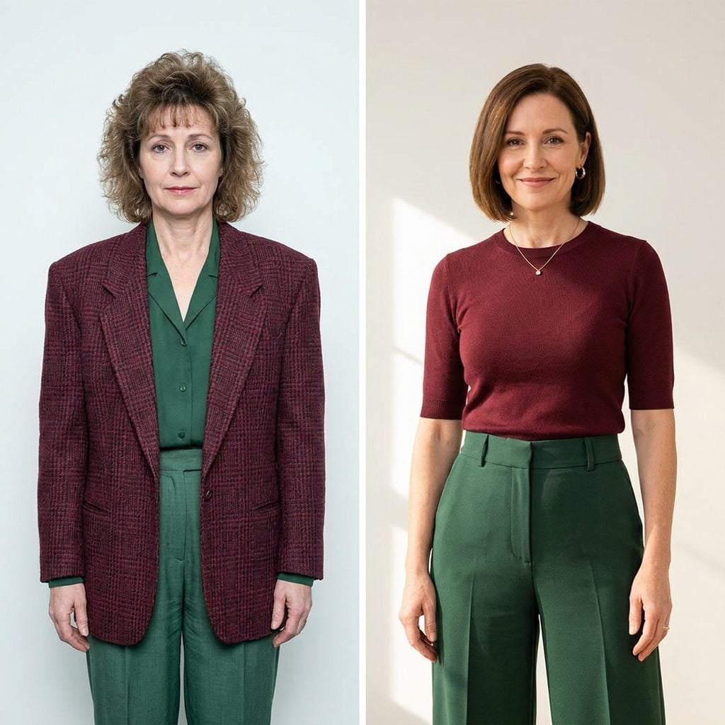
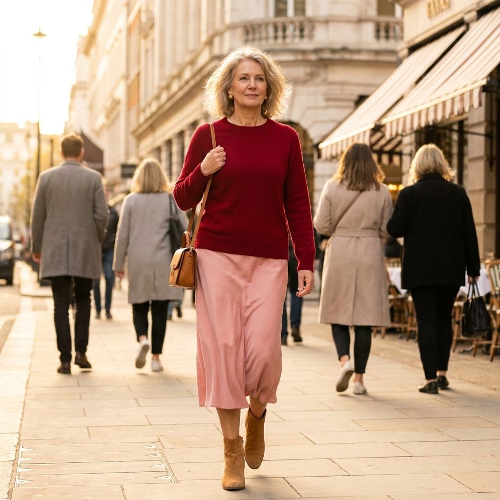
Research on nostalgia in fashion suggests that nostalgic style works when it feels chosen rather than defaulted to. As one analysis puts it, successful retro fashion is “less costume, more conviction” (Source). A woman wearing a deliberately 1970s color palette of burnt sienna and cream with modern tailoring reads as intentional, knowing, in command of her references. The same colors in an outdated cut with no contemporary anchor read as someone who stopped updating her visual vocabulary sometime during the Carter administration.
The cliff, then, isn’t really about the colors at all. It’s about context signals. Proportion, fabric quality, fit, the texture of the pieces. A color combination from 1995 styled with 2026 proportions says: I know where this came from, and I chose it anyway. The same combination in its original silhouette says: I never left. For women who’ve spent 40-plus years building a relationship with color, this distinction is everything. Your look isn’t dated because of the palette. It’s dated when the palette is the only thing doing the talking.
Why the Combination You Loved at 25 Activates a Completely Different Emotion at 45
That coral-and-cobalt pairing you wore to every summer party in your twenties? It didn’t just fall out of favor. Your brain actually reassigned its emotional meaning. Color psychologist Faber Birren documented this shift extensively, finding that “with maturity comes a greater liking for hues of shorter wavelengths (blue, green, purple) than for hues of longer wavelengths (red, orange, and yellow)” (Source). Your nervous system processes color differently at 45 than it did at 25, not because you’ve lost your edge, but because your psychological needs have genuinely changed.
There’s also something deeper at play. The colors you once associated with freedom and recklessness now carry the emotional residue of a specific chapter of your life. A combination doesn’t just look dated on your body. It feels dated in your nervous system, triggering a tension between who you were and who you’ve become. That tension is the real reason you recoil from certain palettes, and it has almost nothing to do with what’s currently on the runway.
The Sneaky Way Trend Forecasters Train Your Brain to Reject Colors You Once Adored
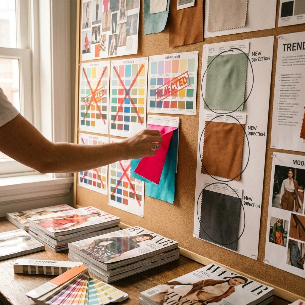
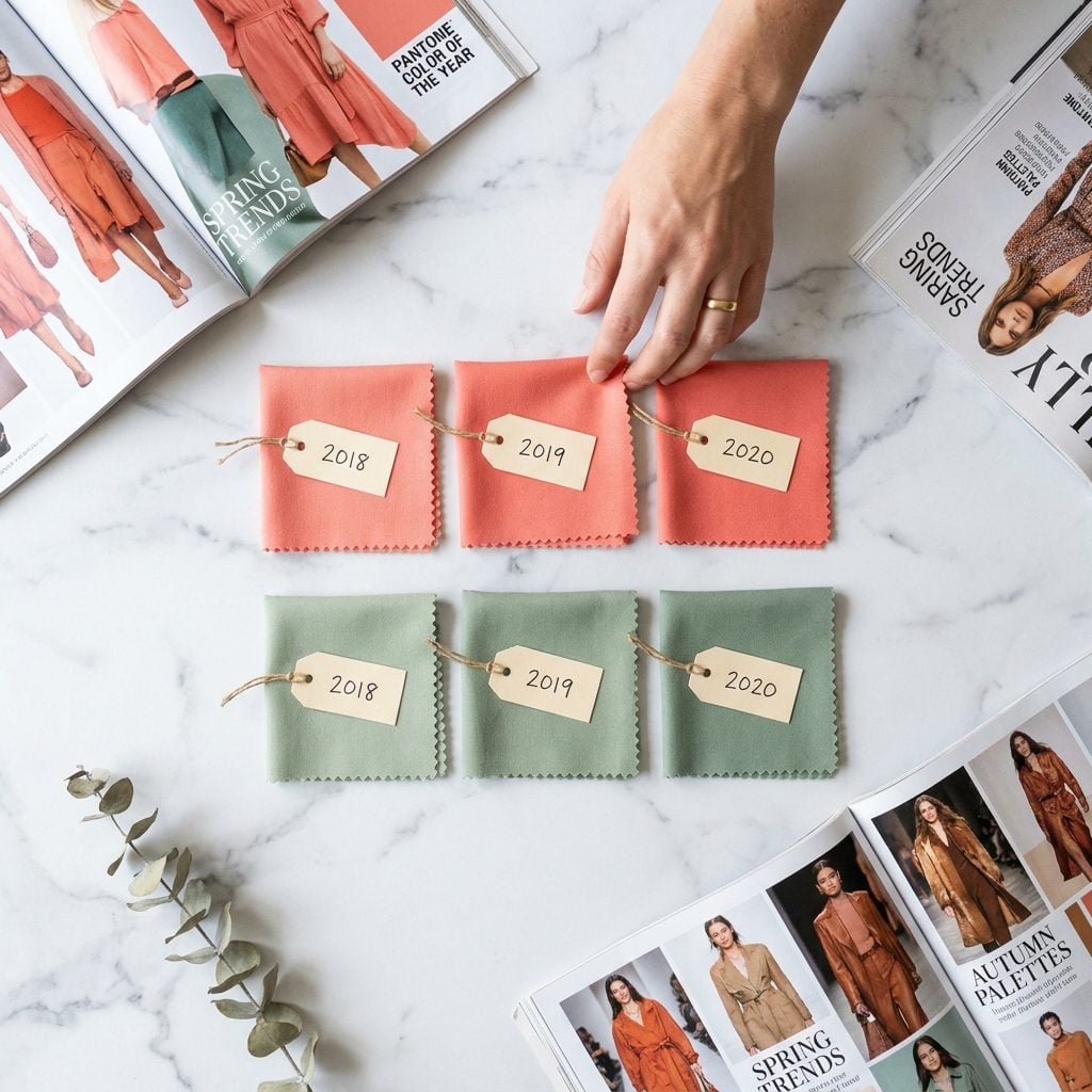
You didn’t decide to hate those colors on your own. The trend forecasting industry, led by organizations like WGSN, the Pantone Color Institute, and Heuritech, operates 18 to 36 months ahead of retail, carefully engineering which color stories will dominate each season (Source). By the time a palette reaches the clearance rack, your brain has already been primed, through editorial imagery, social media, and store displays, to register it as “over.”
This is a textbook example of the mere exposure effect working in reverse. Psychologist Robert Zajonc demonstrated in the 1960s that repeated exposure to a stimulus makes us like it more (Source). But here’s the twist: when exposure stops abruptly and is replaced by a competing stimulus, the old one starts to feel actively unpleasant. Trend forecasters don’t just introduce new colors. They systematically withdraw the old ones from your visual environment, training your eye to perceive yesterday’s palette as wrong before you’ve consciously processed why.
The One Proportion Trick That Makes Any Color Combination Feel Current
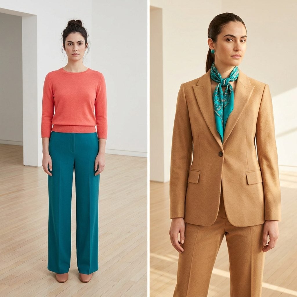
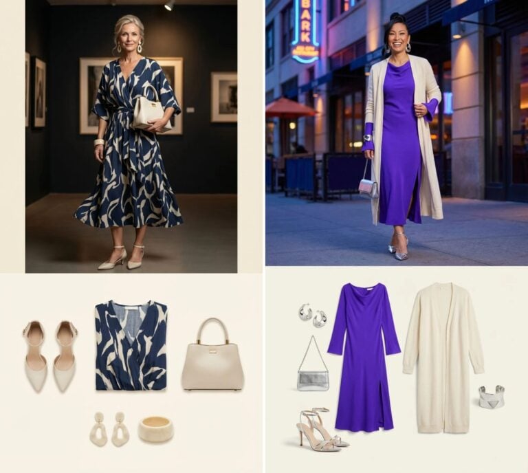
Here’s what separates a color combination that reads “2008” from one that reads “right now”: proportion. The specific ratio of color within an outfit determines whether it feels grounded or gimmicky. A 50/50 split between two bright hues almost always signals a past decade. The current psychological sweet spot? Roughly 70/30 or 80/20, with the dominant shade anchoring the eye and the accent creating a controlled moment of visual surprise.
This works because of how your brain processes visual information. According to research on color perception, the brain responds to contrast and proportion before it registers individual hues (Source). When one color overwhelms, the outfit reads as intentional. When two compete equally, the brain struggles to assign hierarchy, creating a subtle cognitive discomfort that reads, to most people, as “dated.”
Why Some Women Wear ‘Dated’ Palettes on Purpose, And the Power Move Behind It

Reaching for a color combination that the fashion establishment has declared “over” can be one of the most psychologically sophisticated style choices a woman makes after 40. It signals a refusal to outsource taste to trend cycles, and the people who notice it tend to be exactly the people worth impressing.
There’s a psychological framework for this. In enclothed cognition research, Adam and Galinsky established that clothing’s influence on the wearer depends on both the physical act of wearing it and the symbolic meaning assigned to it (Source). When you deliberately choose a palette that carries personal significance, you’re activating a different circuit than when you wear what Instagram told you to. You’re dressing from internal authority rather than external permission.
Consider the woman who still wears deep burgundy and forest green together because those colors defined her most powerful professional decade. That combination isn’t dated. It’s loaded with biographical meaning. And the confidence it generates is visible to everyone around her, even if they can’t articulate why.
The Cultural Belonging Signal Hidden in Every Color Choice You Make
❤️ Would you like to save this?
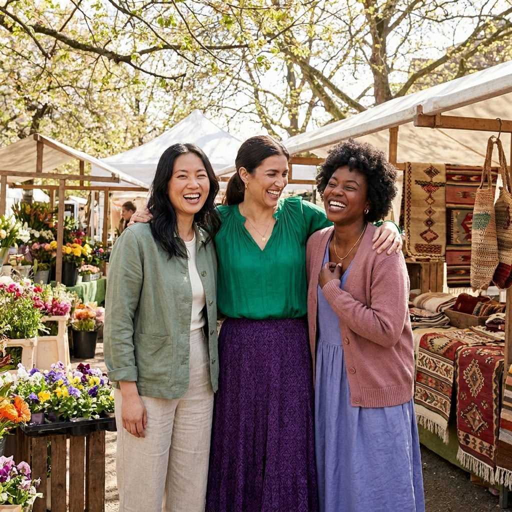
Colors don’t just speak to your personal taste. They broadcast tribal membership. A palette of muted sage, cream, and tan signals one cultural world. Electric jewel tones signal another. And the dated combination in question? It often reads as a time stamp precisely because it points to the values and aesthetics of a specific cultural moment that has since been supplanted.
Research on color perception across cultures shows that color meanings are “based both on learned associations and on biological responses” (Source). This means that wearing a particular color pairing isn’t just a visual choice. It’s a declaration of allegiance, conscious or not, to the era and community that popularized it. The color combinations that date an outfit fastest are often the ones that were most tightly bound to a specific subculture or moment in time.
The Specific Saturation Level That Separates a Modern Palette From a Time Capsule
It’s rarely the colors themselves that scream a specific decade. It’s the saturation. A dusty, muted terracotta reads completely differently from a screaming tangerine, even though they occupy the same color family. The psychology behind this is surprisingly well documented: research on visual perception and aging shows that colors with high lightness and moderate saturation tend to be perceived as more sophisticated, while high-saturation combinations can trigger associations with specific past eras (Source).
Think about the palettes that feel most frozen in time. The electric teal and fuchsia of the late ’80s. The acid green and purple of the early 2000s. What links them is a shared saturation intensity that the contemporary eye has been conditioned to read as excessive. Pull that same hue family down to 60% saturation and the combination suddenly feels modern. The actual colors didn’t change. The volume knob did.
The Dopamine Trap of Rediscovering a Combination You Swore You’d Never Wear Again
There’s a particular thrill in pulling a forgotten color combination out of your closet and realizing it might actually work again. Fashion psychologist Dr. Dawnn Karen describes this phenomenon through the lens of mood enhancement dressing: the idea that clothing chosen for its emotional resonance can genuinely shift neurochemistry (Source). When you rediscover a palette linked to a specific joyful memory, your brain doesn’t just see colors. It replays a feeling.
But there’s a trap inside the thrill. The mere exposure effect, first studied by Robert Zajonc in the 1960s, shows that familiarity breeds preference (Source). So the warm rush you feel when you see that old color combination isn’t necessarily your taste evolving. It might be your brain confusing nostalgia with relevance. The palette feels good because it feels known, not because it actually suits the person you are right now.
This is the tension at the heart of cyclical fashion. Something comes back, and we assume it’s because it was always good. Sometimes that’s true. Other times, we’re just reaching for the neurochemical reward of recognition.
Why the Most Timeless-Looking Women Actually Break This Rule Constantly
Here’s the contradiction that nobody talks about: the women who appear most immune to dating themselves through color are often the ones wearing combinations that technically break every current rule. They pair navy with black. They wear red and pink together. They put camel next to lavender. And none of it reads as dated, because their confidence in the choice overrides the viewer’s trained response.
Professor Carolyn Mair, author of The Psychology of Fashion, has explained this dynamic well: “When we feel good in what we’re wearing, when we tell ourselves ‘this dress is going to make me feel incredible,’ we’re more outgoing, more expressive and more gregarious” (Source). The psychological mechanism is circular. Conviction about a choice changes how you carry it, which changes how others perceive it, which reinforces the conviction.
So the real answer to the question of which combination dates an outfit? It might be less about the specific colors and more about the degree of intentionality behind them. A palette worn with uncertainty reads as a mistake. The same palette worn with authority reads as a signature. The difference between dated and distinctive isn’t in the swatch. It’s in the spine.
The Psychological Cost of Letting Other People’s Color Rules Dress You
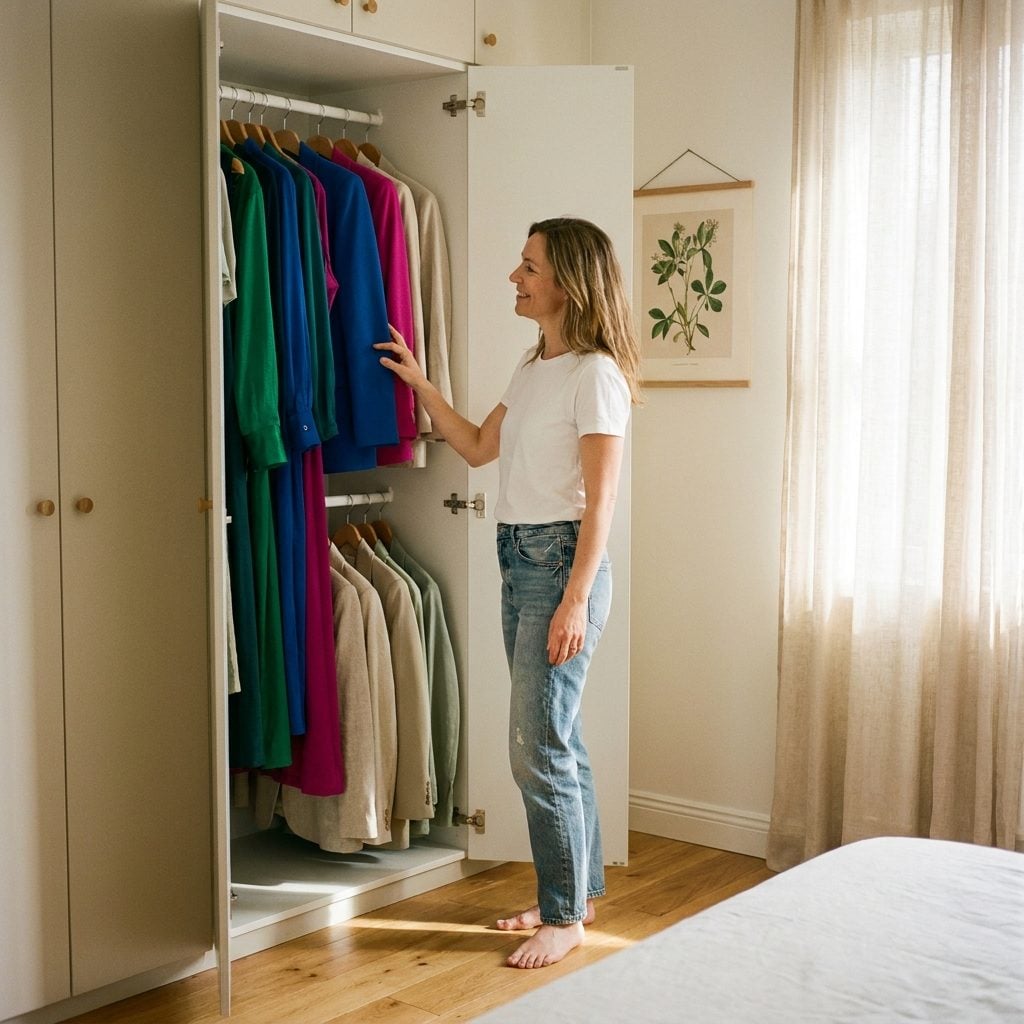
Here’s a question worth sitting with: how many of the color combinations in your closet did you actually choose, and how many were chosen for you by a seasonal color analysis quiz, a magazine spread, or a well-meaning friend who once told you that you “can’t wear” orange?
The tension between conformity and individuality in fashion is one of the oldest in psychology. According to (Source), fashion is driven by two competing motivations: the desire to fit in and the desire to stand out. Color rules, whether they come from a stylist or an algorithm, push hard toward the first. They create guardrails that feel safe but can quietly erode your sense of personal authority over your own body.
For women over 40, this is particularly loaded. Decades of absorbing directives (“don’t wear bright red past 50,” “neutrals are more age-appropriate”) can calcify into a wardrobe that reflects everyone’s opinion but yours. Research highlighted in (Source) found that when clothing choices are driven by external judgment rather than personal feeling, the result is increased appearance anxiety and a cycle of persistent dissatisfaction. The date on a color “rule” matters less than whether the combination makes you feel like yourself.
The real cost isn’t wearing the “wrong” colors. It’s losing touch with the instinct that knows exactly what feels right.
The Bottom Line
Your brain isn’t reacting to whether a color combination is objectively good or bad, it’s reacting to when it last saw those exact hues together, at that exact saturation, in that exact ratio. Every outfit you wear broadcasts a timestamp, and the only women who look like they exist outside of time are the ones who stopped asking permission from the current decade. The next time a pairing makes you hesitate, ask yourself one honest question: are you rejecting it because it looks wrong, or because it looks like someone you used to be?